We have all seen on HGTV those amazing kitchen renovations where it literally doesnt look like the same house. Then we sigh that it will probably never be a part of our reality. Well, luckily for me, I was able to see/help design a transformation of this magnitude over at my in-laws. Yesterday I showed off the living room before and after, and as astounding as that is, the kitchen is literally to die for.
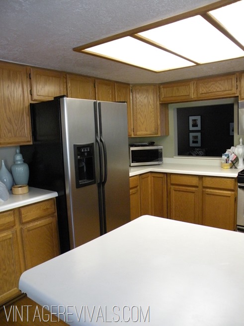
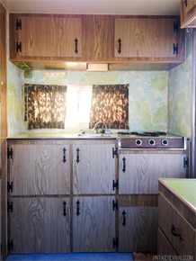
This is what it looked like before. My MIL pretty much despised it from the day they moved in. It was plagued with the worst that the early 90’s had to offer. Oak Cabinetry, drop down ceiling, florescent lights, off white Formica countertops. It felt teeny and crowded and drove her crazy.
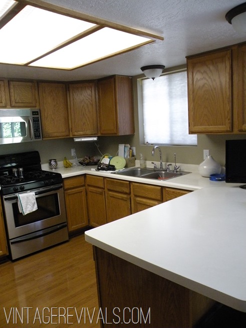
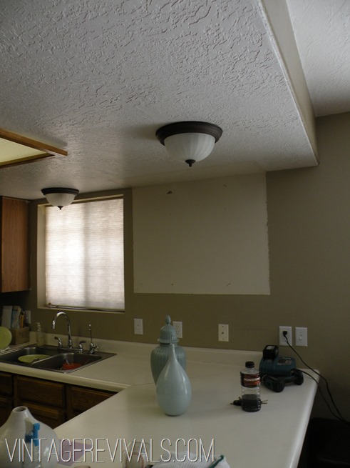
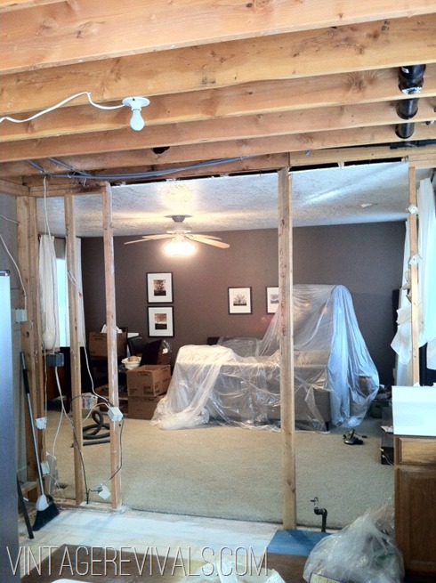
Working through the design we decided that the first things that had to go were the wall separating the kitchen and the living room, the peninsula, and that freaking drop down ceiling.
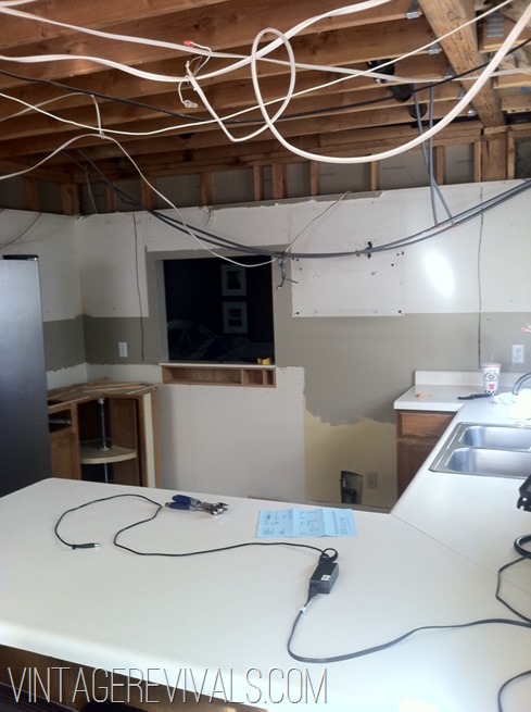
So the men got to work demoing, removing cabinets, and other manly things.
And since this isnt that type of blog there wont be any tutorials on how to remove a wall. So sorry folks, but I am not an expert at that.
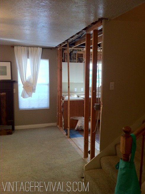
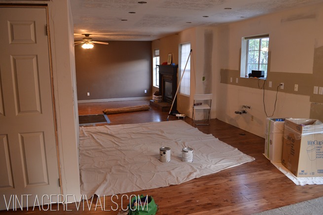
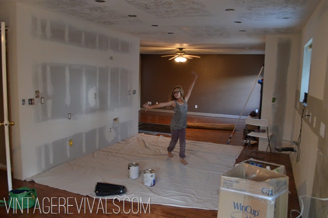
Then like magic we move on to this:
Oh look! A new ceiling, can lighting and floors!
And from there we go to this:
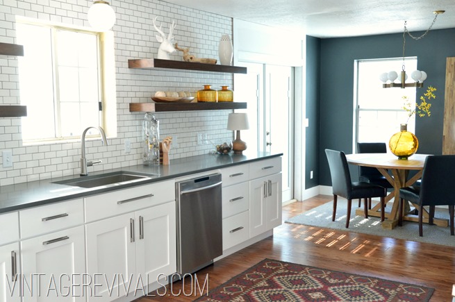
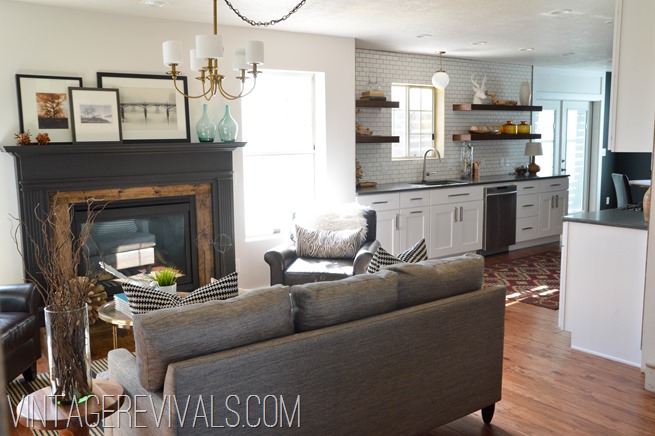
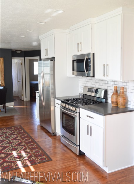
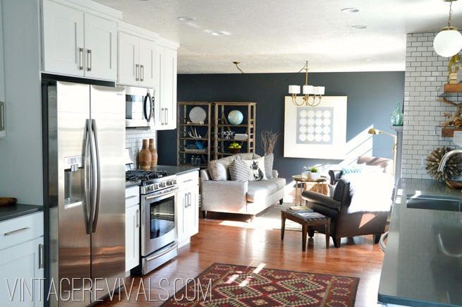
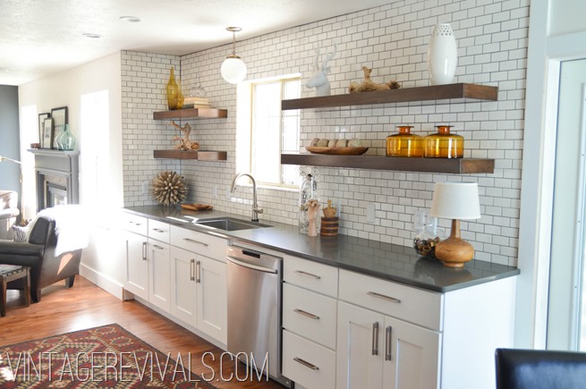
Anyone with a pinterest account knows that white cabinetry and subway tile are all the rage, but sometimes it can just be so white. To balance the whiteness we used dark gray countertops (Concrete by Caeserstone) and dark grout in the tile.
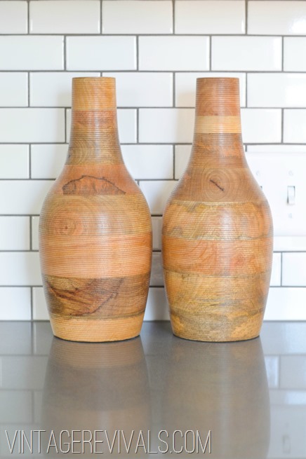
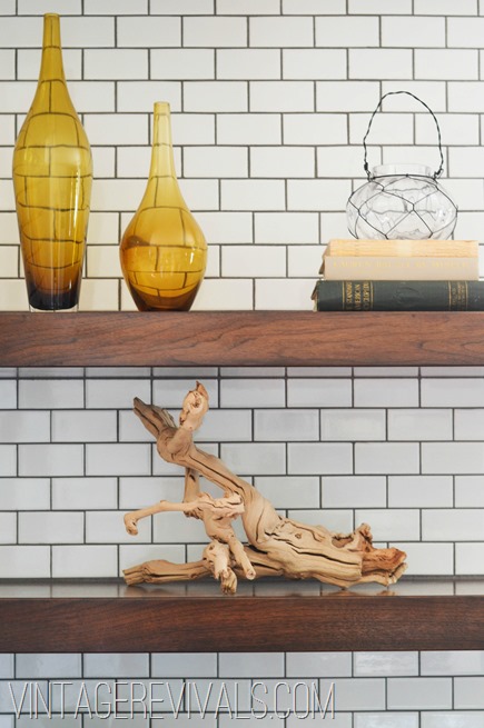
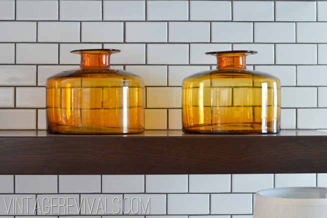
The floating open shelving is made out of dark walnut and totally warms up the white.
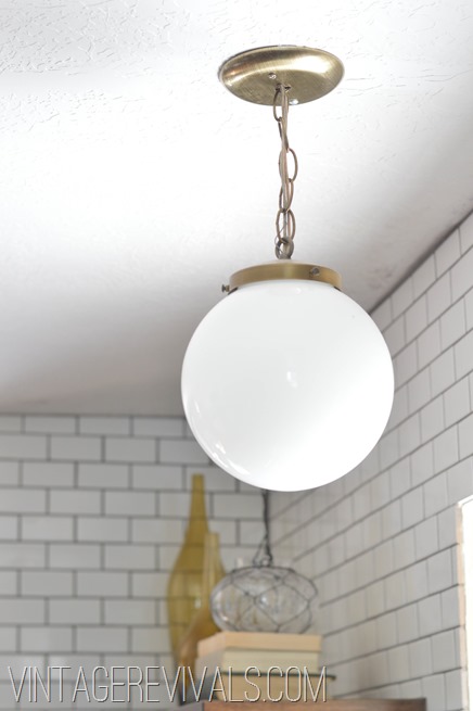
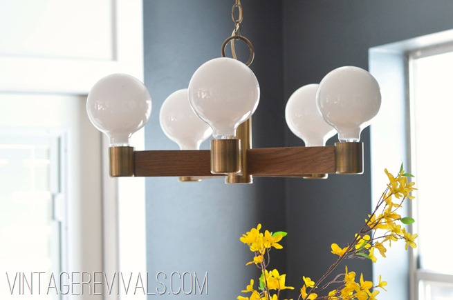
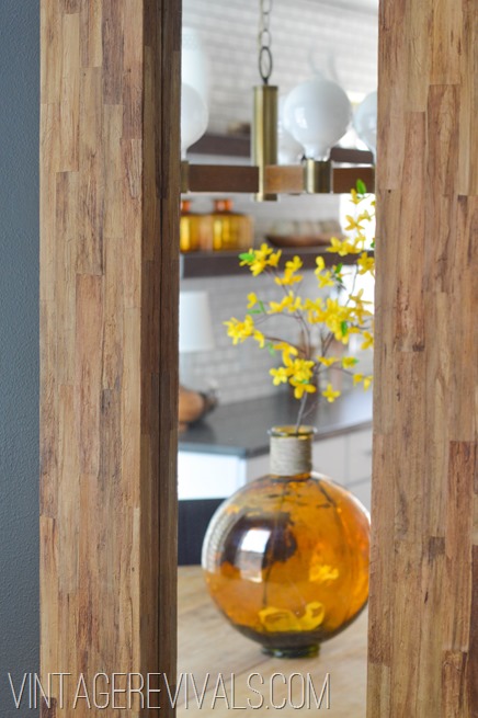
Both of the vintage lights are thrift store scores (of course they are!! Would you expect anything less?)
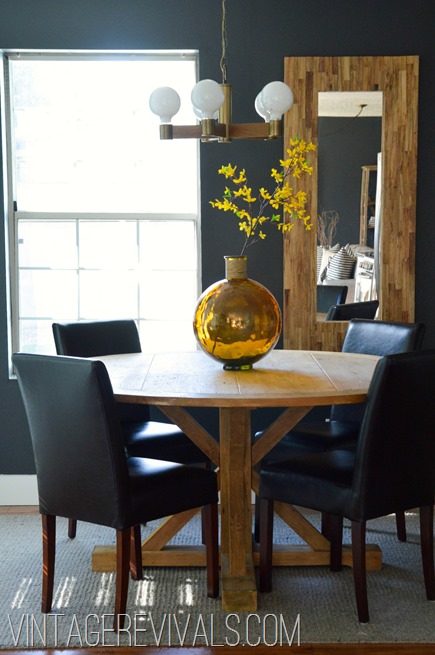
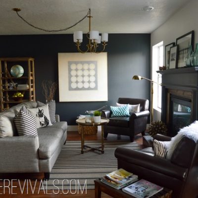
We painted the wall at the far end of the kitchen with Sherwin Williams Iron Ore to tie it into the living room, and to tone down the white a little.
Before the reno this living room was never used (there is a TV room that is off the entry that we used WAY more) but now this gorgeous area is the center of the home.
Dont forget to check out the Living Room Reveal too! Questions? Leave them in the comments and I will be more than happy to answer them!!





That is a pretty major difference! I really like it. Despite having a lot of the “trendy” things, like white subway tile, etc, it looks really unique! I think it’s the layout. Plus I totally bought that same chandelier at goodwill, sprayed it shiny chrome and used it in my old laundry room 🙂 Amazing job, you really have an eye for design.
Great job! I love seeing kitchen makeovers and this one is stunning!
Amazing transformation! We have the same light fixture you’ve got over the table in our own kitchen (from a salvage store for $10! yay!) but were stumped about what to replace the boob lights over the sink with. Now I know–thanks!
My 12 year old daughter and I were…for once…rendered absolutely speechless upon looking at the after.
A-M-A-Z-I-N-G! What a huge difference this is! The layout of this kitchen is really unique!
holy crap. well done!!! GLORIOUS!!!!!!!!!!!
Wow! Just wow… It looks like a completely different home. I especially like the subway tiles and all the pieces selected for the floating shelves. I think they really help to pull everything together and bring that great style from the living room in. It makes me want to go start ripping apart my kitchen…
That is amazing! I am just in awe!!!!!! Love this kitchen. Love the textures and layers of color!
This is AMAZING! I love it so much. We NEED to do some reno in our kitchen, but have a dropped ceiling and air return in the drop. I know it requires more work than we can squeeze into our limited budget, but I have hope. Thank you!
I really ♥ this. Just beautiful. Looks clean and polished.
Absolutely love everything that you did to both of the rooms! I do have one question….Where did you get the dining room table from???
Christina we got it at a store called DownEast they sell PB, West Elm etc. and discounted prices.
xo
m
Thank you, too bad there isn’t a store in Texas. 🙁
WOW what a transformation. I love it all. Perfect staging too. Awesome!!
Love it!! Again my dream home is lived out in this room too! Where are the cabinets and floating shelves from?
Kirsten we used a local cabinet shop to build them. The hardware is from Lowes.
xo
m
Take a bow Mandi! That’s just freakin awesome 🙂
Boy, Mandi. You weren’t kidding! Just gorgeous!! And are you trying to tell me that the tiny young thing with the dark hair in that shelf staging video is your MIL?!
xo
P.S. Your fun, unique, and quirky style is one reason I have come to love you, but I have to say, seeing your more “mainstream” work here is a nice change of pace. Again, gorgeous. xo
Oh I love it. It’s beautiful. Such a difference! I bet the layout feels so much more spacious now.
WOW. So much wow I don’t even know what else to say. Wow.
I am speechless bc my jaw is still sitting on the floor!
Okay one question about the shelves…I love them!! Were they a DIY or purchased as shelves? How did you hang them? Maybe a dumb question but I’ve been wanting to do floating shelves in our kitchen and didn’t know how it was done! Don’t want them falling off of the wall…
I have to say, that I remember your style way back when you were on the Nate Berkus show. And I loved it! I thought, It can’t get any better than this… it’s fun and different (in a good way) and attainable. And lately your style has been changing, for example your living room, and now your MIL house. Word to your mother, I’m in love with this style MORE! You just keep evolving and it’s beautiful! You are a design force to me reckoned with.
I really love the design concept! The space planning is sort of wigging me out, though. The kitchen seems more like a wide hallway than a room now… What is it like to cook in there? If it was me, I would have done a half island for the sink or something like that to suck up that work triangle, but I also do a lot of cooking at home.
OMG no way!!! I love love love it! Perfection in my eyes.
XO
Kristin
What is the flooring? We need to lay hardwood in part of our house and this floor is the exact mid-tone floor I’m looking for! I LOVE this room and the Iron Ore paint color!
Holy moly! Why am I not your MIL?!?!
Gorgeous transformation! Love all of the little details, including the thrifted lighting and those floating shelves!
jaw droppingly beautiful!!
WOWZA~~
Holy &%$#!!!! That is one serious transformation!!!! Wow, it’s awesome!
seriously ridiculously gorgeous! i want it!
Can I even tell you how grateful I am for this post? I have a walk through kitchen in my house with a small dining area to the side just like the redo that I have cursed! Now I know how to make it look awesome and fresh! Who did the new cabinetry?
The is the most beautiful kitchen and living room I have ever seen. Absolutely incredible.
OH MY FREAKING WORD!!!!! That is SUCH an incredible transformation, I can’t even begin to describe it!!! WAY TO GO Mandi!!!!!! UBER impressed….I mean, I’ve ALWAYS been uber impressed with your skills…but this takes it to another LEVEL!!!!!
LOVEEEE!! Seriously DYING over that kitchen table! Does DownEast have an online shop?
WOW! That is absolutely beautiful!
Breathtaking is the word for it!
Outstanding!
I’m jealous! I want BOTH of those rooms! They’re amazing, seriously. You are so awesome at what you do and such an inspiration!!
Just STUNNING!
I had to laugh out loud when I saw the light over the dining table–I have that exact same light and HATE IT! hahaha Of course it would look amazing here and completely ridiculous at my house! 😉 The transformation of course is amazing, I love the dark walls, really rich looking, and the kitchen shelves are staged beautifully! The amber color really adds a lot! Great job!
Sooo Beautiful!
Beautiful! Loving those tiles, wish I could find them in my country.
Love it. I love the simplicity. This is how I want my house to look.
I love it! Can I live in your house? (;
stop it! I cannot handle how awesome it is! just wow!
Ah! Love it. I have been dreaming of concrete counters and white subway tile with dark grout. I’m renting now but someday I will make it happen!
Good grief granny! That really IS an amazing transformation!
SHUT UP. SHUT UP! I’ll trade kitchens, now, thank you!
wow wow!!! i really can’t believe its the same space!!!! and ahhhhhh- at all that work! it makes me tired just thinking about it! lol it looks amazing and im sure she is head over heels in love with the new space! GREAT JOB!!!!
oh, and i can’t wait for tutorials!!! those floating shelves!
Insanely amazing. You did such a great job!
Oh my, you did a wonderful job. I love the modern, rustic look of it. Hope you’re enjoying it too and just feel like smiling when you enter the space.
Oh. Wow. (Just give me a minute to get my jaw off the counter….) LOVE LOVE LOVE!
Absolutely AMAZING!!! Love EVERY detail. wow wow wow!!
Absolutely love it!!!
I love the pass-through kitchen layout!! It’s like you don’t even notice there’s a kitchen there! The upper open shelving helps it look less kitcheny too. Genius! Yet again! 🙂
O.M.G. is what I literally said outloud. Holy crap that kitchen is absolutely spectacular. Talk about a complete overhaul. Open…check! Updated…check! GORGEOUS…check! Wow…I’m inspired!
LOVE!! We are in the process of doing our kitchen too (almost done…just tiling left eeek!) Subway tile is the way to go…classic!!
That is a gorgeous room. I love the sight lines between the three rooms! I am dying just a little bit over the one light though. My parents had a chandelier that they hatedHATED, so my mom finally just took the glass shades off of the bulbs… and it looks just like the one you just installed. My mom is going to be excited to know she is a decorating visionary. 😛
Fabulous work, as always!
You can do NO wrong woman! You are heaven sent! haha 🙂
Um, WOW. I’m in love. This is actually pretty similar to what I plan to do in my own kitchen (subway tile with dark grout, chunky wood shelving), so it’s REALLY fun to see it in photos! I adore it.
Can you show a floor plan before and after? I’m trying to figure out which wall you took out. Love all of it.
Stunning! Makes me want to run out and tear down the wall between my living room and kitchen. You did a FABULOUS job 🙂
Ridiculously good.
Wow!
What a gorgeous transformation!
I love these subway tiles – I’m so jealous, seriously!!
Love, Midsommarflicka
Wow Mandi beautiful home! I love the subway tile with the dark grout, looks great!
Beautiful!
Susan
Holy cow! That is amazing! I love the dark grout with the white subway tiles. We just had glass subway tiles (my wallet still hurts) installed in our guest bathroom and I have to say, it is probably my favorite look as far as tile is concerned. You guys did an breathtaking job!
STUNNING!
How GORGEOUS! You absolutely ROCK! (=
LOVE!!!!!!!!!!!!!!!!!!!!!!!!!!!!!!!!!!!!!!!!!!!
Amazing, I love it!! Funny, my mom has a pair of globe lights in her kitchen (just like your MIL) that she picked out in 1982 when the house was built; I tell her how trendy she is now!! Tearing those walls down was HUGE – and made a big difference – good work y’all!!
Are you SURE this is the same house??? I am so glad you got rid of that wall and that ceiling and those cabinets. AH. Love.
love the color of the dinning room. what is the name of it and brand?
your kitchen looks amazing.
thanks
Wow!!! Beautiful,lovely transformation, simply Fabulous. This is how I want my house to look.
Shop renovation
looks AMAZE!
i almost bought that mirror at home goods the other day. i loved it but didn’t know where to put it. waaaahhhh.
Wowzer….what a dramatic differene the renovation made. Boatloads more room. Looks amazing…great job. Thanks for sharing.
Kelly
One lucky in-law mama lives there, it’s fantastic. My favorite touches is the rustic wood on the fireplace and the globe on the dining room table. What did mom say when it was done?
Bliss
I love the shelves on the subway tile! Can you tell me more about their construction and how they are hung?
This is so beautiful! It’s the perfect mix of modern and rustic, which I absolutely love. All of the wood elements against the sleek white is what I’m really into right now. Amazing job!!
Steph 🙂
Excellent work! I want to cook and eat up in there! Such dramatic transformations high five to all of you after I bow before you all!
WOW – I know your MIL is beyond excited! What a gorgeous new space, including the living room and dining area. We’ve been doing much the same to a 1984 brick ranch we downsized into last May; updating, getting rid of, and in general transitioning into a more contemporary look. I’m thrilled all over again every day with the changes and our “new” old forever home. You did an outstanding job!
Truly Stunning!
Holy S#*$… is literally the first thought that came to my mind. WELL DONE, indeed.
Love all the choices, but there is so much wasted empty space, and no work triangle. I have a galley kitchen, and I can tell you how difficult it is to work in one.
The before had a really good work layout, and a place for people to hang out (that L).
Oh my goodness it is beautiful! I do love white cabinets and subway tile 🙂 I scheduled to be pinned on the Better Homes and Garden home projects board for tonight 🙂
It’s a awesome re-do, but do you miss the storage you gave up in putting up the shelves?
Un. Real!! Could you even imagine how much more open it would be. Night and day! Where did you get the stag head?
Absolutely to die for! What an amazing transformation!
Leslie
House on the Way
I love it — and thank you for pointing out the grout and countertop details because I want to copy it in our little galley kitchen!! Very very good work.
Just thought you should know that when I scrolled down to the first “After” photo, the heavens parted and the angels sang.
Holy Moly Miss America! this.is.AWESOME!
HO. LEE. CRAP. Amazeballs.
I am completely blown away. It’s a totally different house. The before picture looks just like my parent’s home. I’m amazed by the transformation. Congratulations.
You guys are NUTS. Completely CRAZY. AND I LOVE IT! So fun to see something like this… of this magnitude…. so daring (not necessarily in design, but in the doing… fearlessness is inspiring). Thank you, not for your obsession with awesome design, or your talent and eye, but for being fearless, having a vision, letting go of reserves and doing something about the vision you have, and then following through to the end and making something beautiful! It is inspiring. I think every one of us, especially women, have a need to create, to make something, to better things (and I’m talking soooo much broader than what people might take from this being posted on a design blog) and I also know that for most of us there is something telling us we can’t, or we don’t do it well enough, or we’ll never this or that… and the feeling of letting go of that…. of ignoring it, of closing the door, and being free to be amazing is a gift and one that I am working on and thank you for sharing! 🙂
holy smokes girl! kudos to you on both rooms, they look great and are a huge accomplishment! how long did the kitchen reno take?
holy moly mandi! it looks amazing! way to go!
Have you ever heard of gel stains when it comes to kitchen cabinets? Wondering how good of results they have?
Um, OMG…yup, OMG. Beautiful
ali @ Forty before 40
Oh my goodness Mandi! You are a giant cup of genius! I can’t get over both makeovers, so insanely amazing. Being knee deep in planning our own kitchen/living room renovation and updates, this couldn’t have come at a better time. I love the look of the subway tile with the darker grout, and the deep grays and gold accents. Just lovely darling!
xoxo,
Jen
head over heals IN LOVE! Insanely amazing Mandi!
Wow! I want to make out with that tile! Gorgeous! You are a genius lady! Beautiful work!
What a gorgeous transformation! But what I’m really in awe of is that your in-laws were open to you helping them! I’ve been dying to help my in-laws with their house…any tips? Well done!
I’m a new fan. Love your mad design skills! So, can you do my house now? 🙂
I love this kitchen! I found this post after trying to find a good example of vintage lighting in a modern setting. I’m trying to convince my husband the vintage brass light fixtures that I found at Habitat are worth keeping and installing in our kitchen…..they are exactly the same as these! Looks great!
This looks amazing! I would love to know where you purchased the large mirror? thanks!
Hey Lisa!
We found it at Homegoods!
xo
mandi
Will you please come to Canada, and Fredericton, NB in particular to help us with our kitchen re-do?! I love what you do, and love that you do it without blowing the budget. It takes a definite skill to accomplish the right look and you do it every time! I like a project to be appropriate for the home owners, as much as the worth and age of the house.
Would love to wake up one morning and find you in my kitchen, designing it’s new look…….:):)
i love your MIL too! This room is totally her! Great job!
What color grout did you use in your kitchen? I am adding white subway tile backsplash in my kitchen that has a white carrera marble type counter top (actually quartz that looks like marble). I am having a hard time selecting the grout color.
I know this is an older post, but I’m new to your blog (and a HUGE new fan) and I had a question about the countertops.
I’m wondering first about the cost. How do concrete countertops compare in price to others, particularly granite?
Also, how are they holding up?
Another question, what company did you use to do the cabinets? I live in S. Utah as well and we break ground on a new house next month. I’m on the hunt for good subs to get bids from and could use suggestions.
Thanks!
Lovely!! Do you have a tutorial for those shelves??
did you put up spendy subway tile, or the cheap stuff from Lowes/HD? Looks great.
Can you tell me how you made the floating shelves?
Beautiful kitchen! Just curious what dimensions of subway tile you used? 3″x6″, or smaller?
Great makeover! It’s funny that I saw this because this is the exact same thing I want to do in my own kitchen! Take the subway tile all the way to the ceiling and remove my upper cabinets and install open shelving! This just might convince my husband! You know men they need a visual!! Extra beautiful!! ***** ~Kathy
I just found your website… I am in LOVE with the lamp on the kitchen counter of Alicia’s kitchen makeover. any chance that is something that anyone could buy or is it just a great find?? THANKS!!
HOLY GORGEOUSNOUS!!! Love the classic old style subway tile w all the newer choices…and the paint colour really grounds everything…let this show the scaredy cats out there to go for it!! It always blows my mind how upset people get about the process and disarray ….it’s worth it!!another. Great. job.
Waouhhhh superbe rénovation !!! Quel travail aussi !
La maitresse de maison ou le cuisinier doivent être très heureux de cette transformation. J’adore les étagères en bois, le blanc des portes, l’inox et le carrelage “métro” magnifique je n’ai pas d’autre mot 🙂
bonjour de Lyon
I am so in love with this whole space! I am drooling over the deer head statue, where is it from?
Mandi, would you care to disclose your process and materials for the header or framing above your door? I , too, have an eat it kitchen whereby the kitchen and eating area share a wall. I would like to paint my eating area a different color, but have tortured myself over what to do about the transition from one color to another on the same wall. Thank you so much!
Love love love this kitchen! What a gorgeous balance between the fresh cabinets and tiles and the accessories of amber glass and beautiful timber adding warmth and depth. Great work! 🙂
Finally! Confirmation that the dream in my head will work and look stunning!
Loves it! Is there a reason u didn’t bring all the cabinetry out to hide the edge of the appliances? Or use counter depth appliances when starting from scratch? Is it cost prohibitive?
GREAT TRANSFORMATION….CAN YOU SHARE WHERE THE RUG IN THE KITCHEN IS FROM? THANKS
Beautiful Kitchen. I love that your designs are so fresh and new. I’m REALLY curious about the walnut shelving. Do you purchase them or make them? I’m doing something similar in my kitchen. Thanks for any help you can offer!!
Hi,
although a regular reader I see that I have to work through your archives. I missed this gem and just found it via pinterest. What a great transformation! Also, btw, for some moments I really thought that your MIL lives in Reno, ha.
Greetings from Germany.