Well this is awkward. Remember like um….6 months ago when we finished up our yearlong makeover of Durango’s? Of course you don’t, cause I never told you about it. Sorry about that….If you’re a St. George local you’ve hopefully been in and enjoyed it. For the rest of the world, let me give you a tour! I feel like I also need to qualify that while it did take us a year, we were only working on Sunday afternoons because we didn’t want to close during the remodel. So. If you’re embarking on something similar just know that it will take a lifetime if you do it like we did! 😉
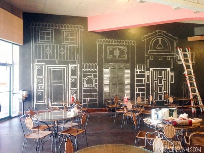
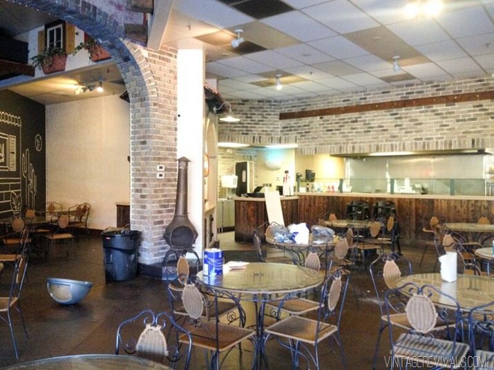
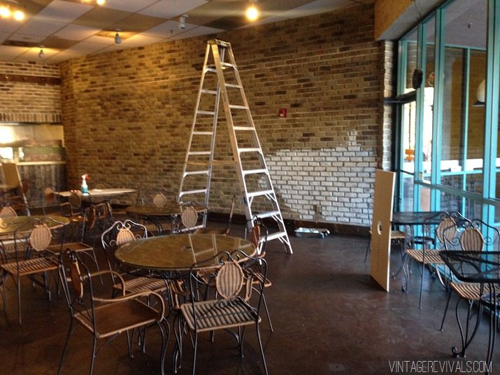
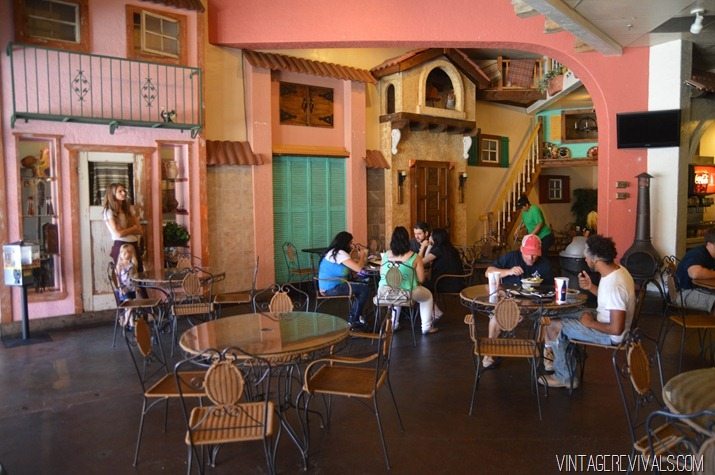
Durango’s is our family’s restaurant. My Father in Law opened it in 2003 and Court has been there since then too. Its sort of crazy to think, man where does the time go!? So for the last 14 years its been like this:

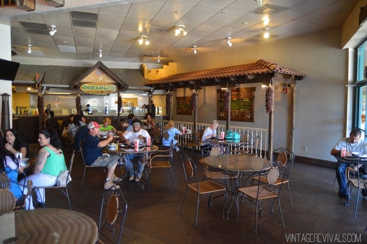
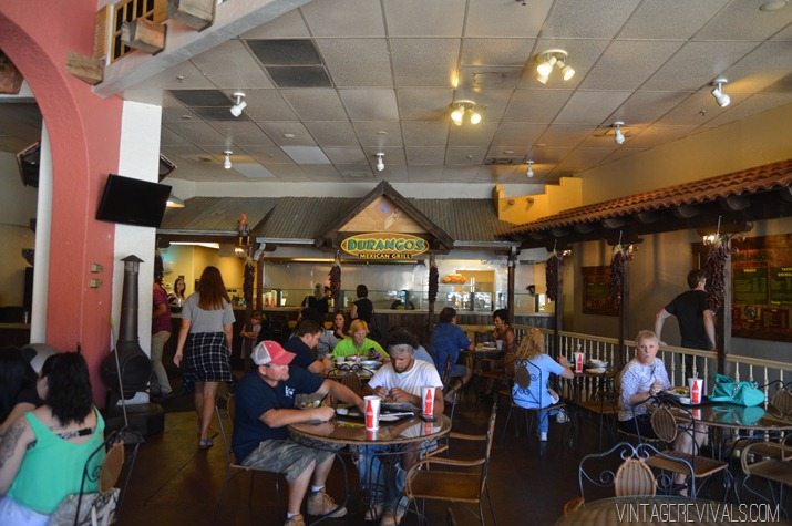
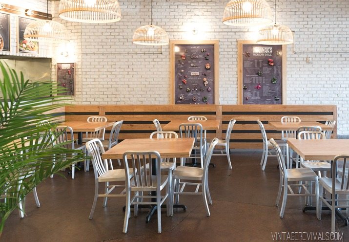
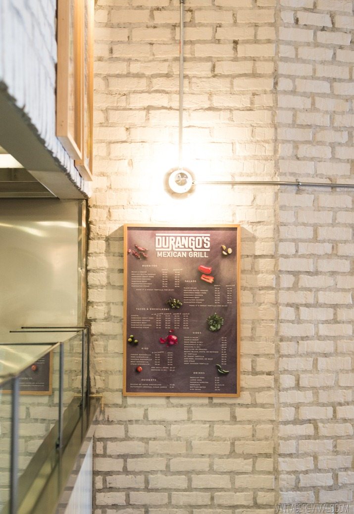
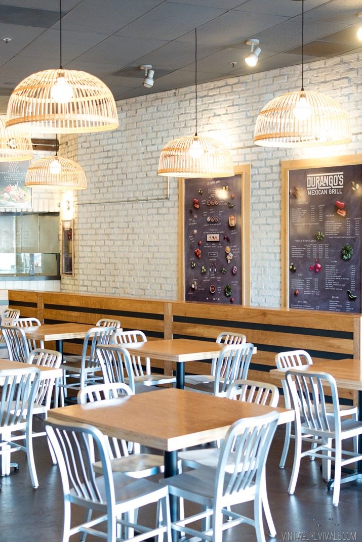
What started off as opening the space up and changing things a little turned into an entire rebrand and honestly we couldn’t be happier about it (that is one good thing about having it finished for a good chunk of time, we can look and see how much business has grown because of it!) The first and most important thing of the redesign was brightening everything up. Not going to lie, Court wasn’t super enthused when I told him that I wanted to paint everything white (because people) but it makes everything feel clean, because it has to be clean.
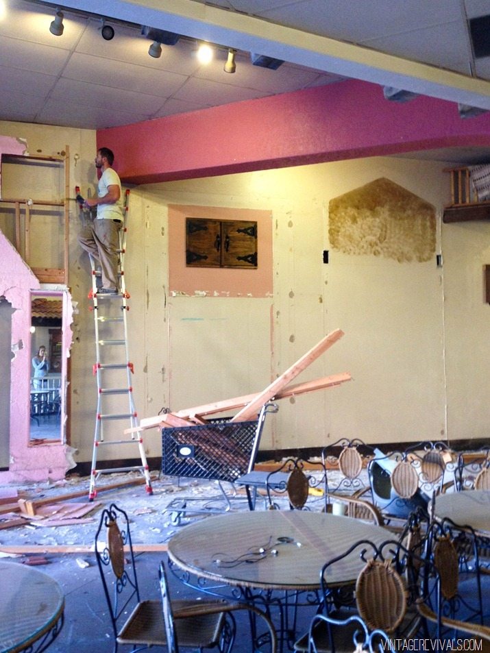
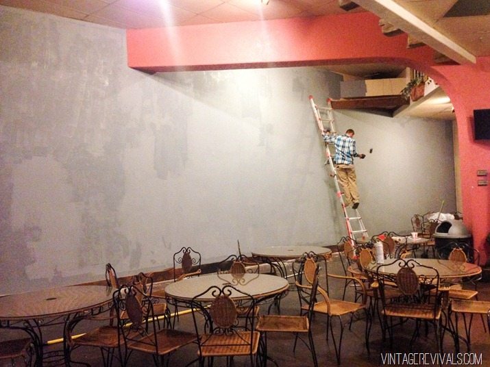
We started with demo, as one does. You can read all about that here.
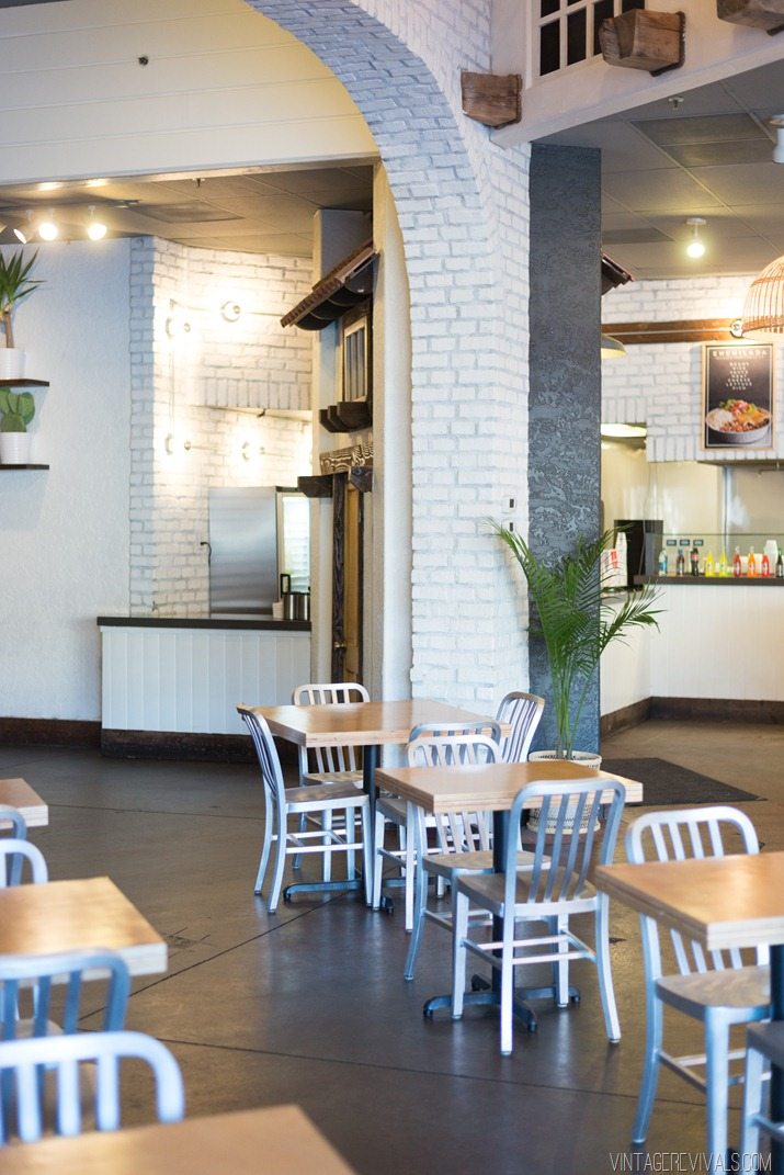
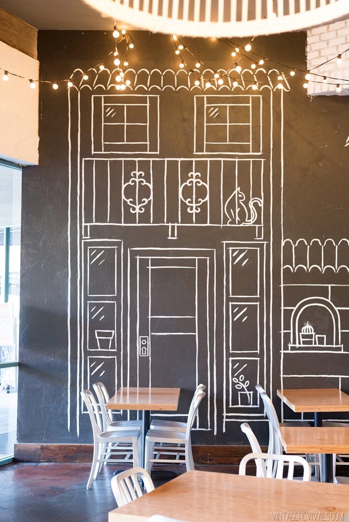
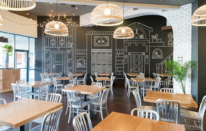
I loved the idea of the wall being the same, just updated, so we painted a simple white line mural of the old facade on the wall.
Then we bricked the wall and the archway (if you need a tutorial on that, check that out here!)
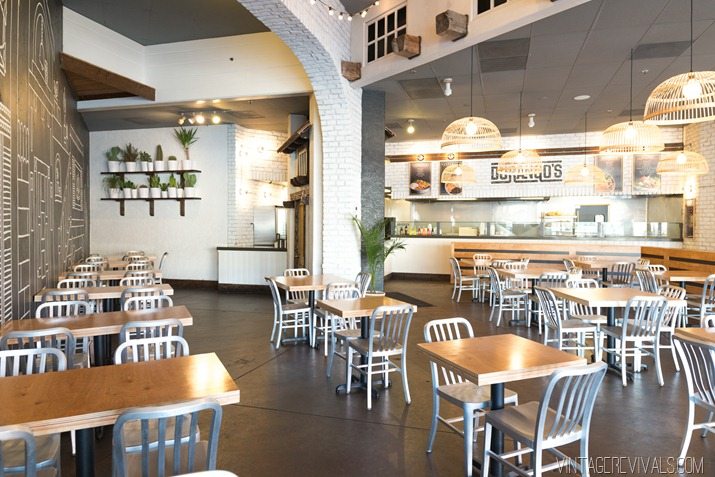
Then we just chipped away project after project, until we ended up with this:
Pretty fantastic right?!
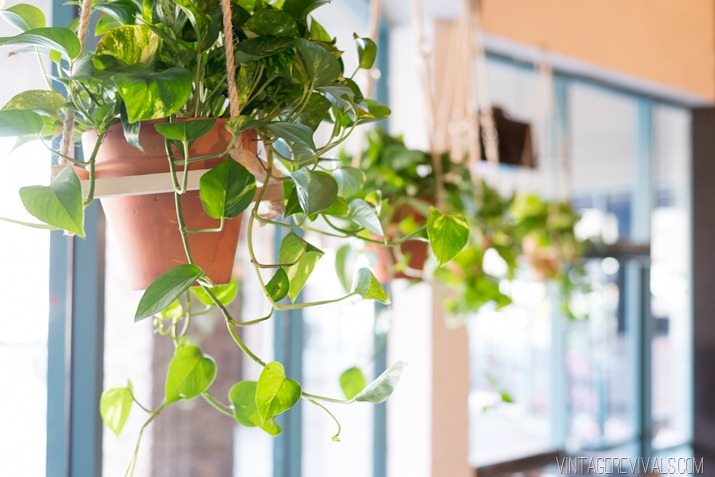
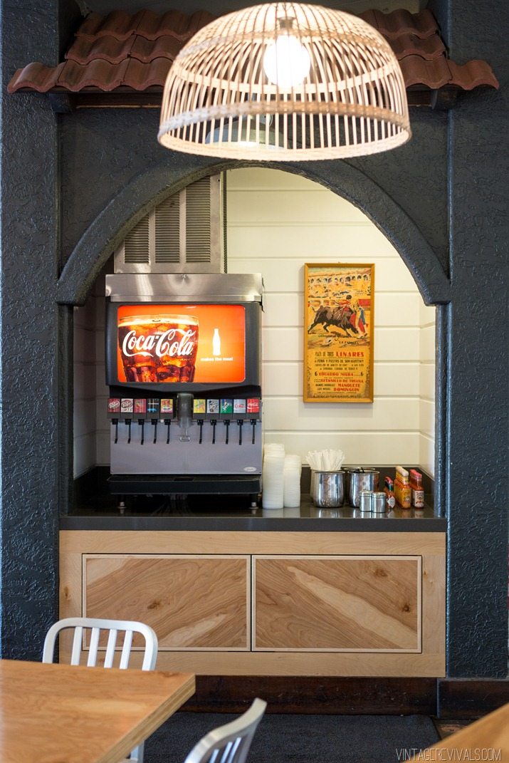
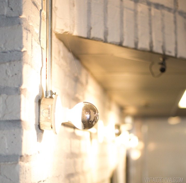
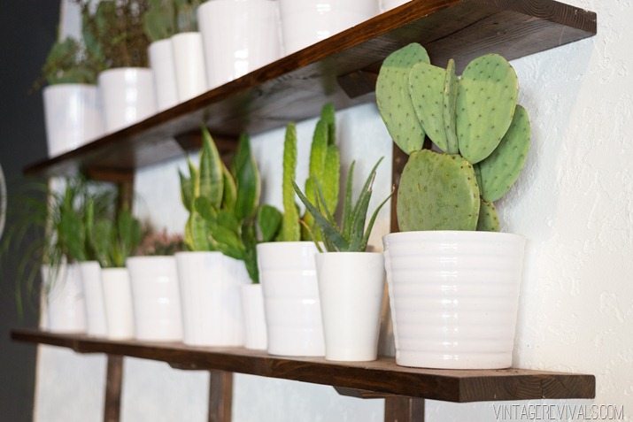
I will say that designing a restaurant was WAY different than a house. Everything has to be completely functional in every aspect before you can even begin to worry about what it looks like. The lights had to be high enough that even the most wonderful of teenage boys wouldn’t be tempted to touch them. Same with the cactus. I LOVE how it turned out and wish that the pictures captured it better, I guess you’ll just have to make a trip to see it yourself!



Looks amazing!! Love the pendant lights. Where are those from?
They’re from IKEA!
Looks fantastic! Thanks for sharing.
It turned out beautiful! Can’t wait to visit next time we are in St. George! Congratulations on all of your successes, professionally as well as personally! Even though I didn’t know you well, it has been fun to watch your growth from afar in a non-stalker-y way!
Fantastic job, Mandi! The new branding and the remodel turned out absolutely amazing. I can’t get over the transformation.
Just out of curiosity, what percentage increase in business has Durango’s seen since the re-branding and remodel? I’m always telling my clients (I do marketing consulting, including re-branding) that they can expect an increase in business after re-branding, so it’s always nice to have real-life examples. If you’re not comfortable sharing, I completely understand. 😉
Wow, this is beautiful! Fantastic job!!
Wow! How cool was it to stretch your brain in a new direction?? It’s so fresh and posh now, brava!
Beautiful!!!
LOVE! What a transformation! It’s amazing what a remodel can do to infuse new life and energy into a place.
My favorite place to eat in St. George! It’s always my first stop! Can’t wait to go there & see the remodel in person when I go home next! It looks amazing!!
MANDI! It is amazing!
This is AMAZING! I love everything, the new decor, the new tables, the fact that you kept the facades’ on the wall but completely updated them in a modern way. Such a very cool place. I also love that they re-branded! Such a fresh and fun feel to everything now!
Thanks for posting Mandi – I have been WAITING to see this! It looks so yummy! Open one in Texas please:)
You did an amazing job!!!!
Wow, it looks so inviting now. I hope they realize how good you are. I think you could do this for a living. Are they letting you change the menu graphics also? You are the best!
Yes, it’s so much whiter and brighter but that’s not what you notice. I see all the different textures in the bricks, the different designs of the IKEA cactus pots and the lights fixtures bring in added color and open texture. Love the repeat of the table top color and the metal chairs are right on point. Awesome job!
It looks really good but please, put some flowers on those tables! Or candles. Or fancy salt and pepper shakers. Or a menu. Anything!
looks good. the wall with the shelves of cactus (including the soffits) looks like it needs to be that same dark color as the adjacent wall with the white outlined bldgs.
Do you want to know what I said, out loud to my computer, when I saw the first after picture? “YAY!” No joke. Great job on the rebrand/remodel. It looks amazing!
Wow! What an incredible transformation! Wish I lived closer, so I could come enjoy the food, and the fantastic decor!
It’s beautiful, airy and modern, and I would eat there in a heartbeat. Great Job!
Love the new look, it’s gorgeous! Next time I’m in St. George I’ll be stopping by!
Damn, girl! That is vision. You rocked it. It is much more alluring now — a professional space that would definitely draw me in much more than its predecessor.
Modern Mexican. You read it hear first. Nice job.
AMAZING!! But I wouldn’t expect anything less! Can’t wait to eat there next time I am in town! Love you and miss you tons! xo
Much much much better!
I love it! Perfectly updated but still warm and cozy. Wish I was closer so I could see it in person!
I love it! Looks great.
WOW! I’m so impressed by your vision for the space and for pulling off such a dramatic update. I LOVE it!
OMG, this looks amazing!! You guys did a fantastic job, bravo! I’m seriously blown away by the transformation! Thanks for sharing ?
LOVE!!!! It looks amazing!
before, it was very cafe rio-esque, and now it is just totally its own space and it looks AWESOME! i will definitely stop in next time we’re down that way.
WOW!! Great job guys!! Beautiful.
Holy cow! what a difference! I love absolutely everything about it.
Congratulations! It’s amazing how you have transformed the place.
Looks amazing! I love that you painted the dropped ceiling, they always look so dated and dirty when they’re white. That’s the perfect shade of grey to let the vents disappear, and a much better solution than ripping out the dropped ceiling for an industrial vibe and accidentally turning the restaurant into an echo chamber (which my boss is contemplating doing, despite me begging him not to). What color of grey and brand of paint did you use?
What a transformation! I love love how it turned out. Your style is so great!
Shonee