Fetchballs I am excited for this post!! You guys are incredible and I cant wait to see what you would do to these pieces!! If you are new or have a horrible memory read this post to see what all of the fuss is about.
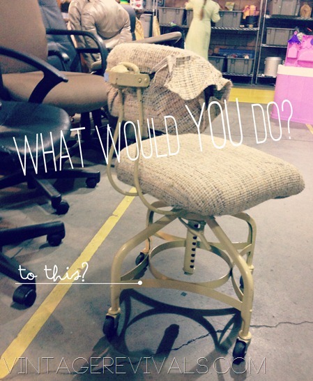
FYI my chair is currently under construction…
Lets get going!
Our first dilemma is from Julie, this is what she said:
Hi Mandi,
I bought these huge 1963 Hollywood Regency lamps (sorry they aren’t industrial 🙂 on craigslist. When I brought them home I noticed that even with my high ceilings in the bedroom they were too huge to be placed next to my bed. Then I wanted to paint them and give them to my sister-in-law who has a crazy circus style taste (that’s what I call it) but again they were too huge and covered all her artwork.
Then my daughter wanted them in her room but that would mean that I’d have to paint the gold and turquoise which I don’t really want to do.
After all this I have no clue anymore what to do.
WHAT SHOULD I DO????
(you can find out more info about them on Julie’s blog!)
My suggestion? Leave them! Recover the lampshades so they are a little more updated and not dirty and leave the bases how they are! I love the tarnished gold and green! See if you can find (or DIY) short tables to put them on so they are off the ground but not very far. You can also possibly perform lamp surgery to shorten them a little!
Up next is Maria from Our Lake Life.
Hi Mandy,
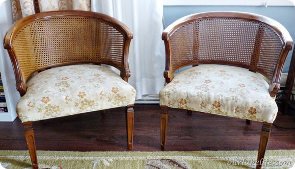
I could really use your readers help with a design dilemma I’m having with two cane back chairs. I scored these chairs off of craigslist from a guy who was looking to clean out his basement, he even delivered them for free.
I love them, but I’ve had them for a while and exactly how I want to make them over has me a bit stumped. There is so many possibilities that I haven’t jumped in and committed to finishing them yet. I’m not afraid of color but I’m having a hard time deciding on these. I know your readers would offer up some great Mandilicious ideas.
So Mandy will you and your readers help me with some fantastic suggestions for the diamonds in the rough?
My suggestion? How about 3? Take a color from your house that you love but dont use very much and reupholster them in that color of fabric! Leave the wood or paint them white. #2 If they were in my house and I had the patience of a saint I would probably gold or copper leaf the caning and leave the wood frame as is and upholster them in white. #3 Paint them two tone with the caning being a different color than the frame and find an old wool coat or Pendleton blanket and upholster the seats. There are just SO many options…
And last but not least is Jennifer
Hi Mandi!
Love the new series you’re doing! Here is my dilemma.
I love shabby chic, subway art, text, whites, tans, turquoise, sanded edges, mix of old and new, etc. My husband loves modern. Like black, glass, clean lines, etc. Must be the graphic designer in him. So we have the hardest time coming up with things that work for both of us. I did just recently redo our fireplace, which might be the first time we’ve ever agreed on something.
https://lifecraftsandwhatever.blogspot.com/2012/12/fireplace-mantle-make-over.html
And I’ve shown him your newest project with the shelves, and he’s agreed that it’s a perfect mix of both of us. So that is next on our to do list.
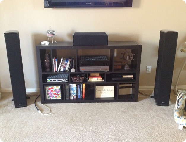
Right now, my problem child is our entertainment area. He has these HUGE speakers, which can’t be covered or disguised with anything since the speakers come out the front and sides. And we bought this center from IKEA forever ago. I just don’t know what to do with it. I hate the color (with our dark brown leather couch, there is just so much dark in the room). I did buy some chunky feet for it, thinking that maybe adding feet would make it look less “I came from IKEA”. My thought are to add a backing to it and paint it cream (I hate seeing the wall and wires through it). But then I’m stumped after that, since he’s so far not budging on color. Maybe add some baskets? I don’t know, I want to make it feel light, which is hard when it’s such a dark spot in our living room.
My suggestion? Put a back on it (you can buy masonite at Lowes and have it cut to the right measurements!) Paint it white or light gray and then paint the insides Emerald except that bottom one with the books, keep that one different.
So my friends, what would YOU do?
Do you have a project that you need a little help with?? Tell us all about it! Send me an email with a few images and the important details and lets get this party started! (Single projects only right now, no room designs please) to vintagerevivalsblog (at) gmail.com with the subject line WWYD Submission.
Love Your Guts, Mandi
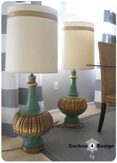


The “Jeannie Lamp” lights: remove the harp and replace it with a shorter one and a shorter shade. This will reduce the overall height.
Darlene
I love the lamps. I agree with Mandi’s suggestion to put shorter shades on them and put them on a short table or cube. I would put one on each side of a couch or love seat. The cane back chairs are beautiful. I would paint them glossy black and upholster in a bright color ( my personal choice would be emerald or hot pink). Last, the entertainment unit: Mandi, I love your idea of adding backing. Its really easy and you can easily add holes for wires. Since you love tans and turquoise, you could paint the backing tan and the unit turquoise, the two colors would look nice together. As for the speakers, if your willing to spend a little money, swap them out for small cubes that will fit in or on the unit.
i don’t have much … but i def. agree about putting a back on that shelving/entertainment center … and painting it a lighter neutral will work wonders i’d think.
I love those cane chairs. I got one last year just like those that I refinished…https://www.thecardswedrew.com/2012/05/cane-chair-makeover.html I love my new cane chair and always get compliments on it in my craft room 🙂
Abbey I LOVE how it turned out!!! Thanks for sharing the link!
xo
m
Those lamps are swoon worhty gorgeous! I wouldn’t do anything to the actual lamp base, those colors are gorgeous, the chippy paint, the gold, oh my. The lamp shades, need a little love. I would go shorter on those! And…. I would see what they look like with a darker lamp shade, instead of lighter, could be really fun.
Hi Amy, I actually tried shorter regular drum shades and they look dwarfed. The bases are really big too.
Thanks for putting my lamps up on your awesome blog Mandy.
I do have to say that I don’t want to paint the bases either. I love the gold and the turquoise green. What do you all think about painting the shade in stripes and the inside gold, cause they are so dirty.
The base is solid and very heavy, almost like concrete. Can’t perform any surgery on them 😉
I think the lamps are cool–but I wouldn’t call them Hollywood Regency style, FWIW. I think they really do need the tall shades for balance.
I love the lamp bases. They remind me of “I Dream of Genie” bottles and perhaps they would go well in that kind of a themed room 😉
Julia, I loved my DIY nightstands that would work PERFECT for these! At Home Depot they sell ready cut tabletops. I got two of them and cut a little off each side to make it so they would fit flat against my wall, then I got “L” hooks and attached them to my wall so I have a ‘floating nightstand”, if you will! Where these laps are a perfect statement I think the very simple tabletops would totally even it all out and you could place them lower than normal tables to make it so the lamps were at the perfect height! Dont you hate it when you find a good treasure and next thing you know, you need two new tables and possibly a new rug! Haha!
XoXo Kayla
Suggestion for Problem #2: I bought a similiar chair at a garage sale this summer. After months of walking around it while I thought over what to do with it… I ended up re-upholstering the seat a mustard color velvet (against everyone’s advice!). Then I used one of those coupons for a free quart of Clark & Kensington paint, (that they often have at Ace Hardware) and painted the wood & the caneback a matte dark charcoal. It looks amazing; like something you’d find in a high end boutique!
P.S. I love Mandi’s idea to paint just the caneing in gold too! I wish I had thought of that!
Suggestion: #1. I would change the harp that holds the shade to a shorter harp and add a rectangle smaller shade. To that shade I would add some trim or upholstery gimp in gold. Since they seem to be focal points more than light sources, a black shade or deep brown could be a nice focal point additon.
Suggestion #2. The cane back chairs. I would go BOLD. Paint the cane black and the frame white (or white cane -black frame) sanding it a bit for some shabby chic. On the prominent design embellishments rub some gold over the high spots, or silver burnish on the frame details and outside edges to highlight it a bit and bring a touch of glam. Here is the product just in case you don’t know what I mean. ( https://www.amazon.com/GOLD-LEAF-RUB-N-BUFF/dp/B0002IXUNY ). Put some strong black and white upholstery in a modern floral or geometric design with perhaps a pop of color such as a leaf that is lime green or….? If you decide to add a color pop in the basic black and white pattern such as the green leaf, paint the bottom of the legs 2 inches up from the bottom the same color as if the legs had been dipped in the accent color. Here is a pattern that might work well as an example at TheDesignFile blog (saw this there, no promotion or affiliation- just credit) https://www.thedesignfile.net/thedesignfile/2011/09/my-quick-upholstery-job-on-four-dining-chairs.html
#3 Entertainment center. I agree with the feet idea. Put some bold colored feet on the console high enough you can see under it so it looks lighter visually. Paint the face only with either an accent color or the wall color to have it either impact you, or disappear. A back will definitely help with the cord issue, it could be as simple as putting fabric stretched tightly across the back with a staple gun, cutting small holes where cords must pass through in a 1.5 inch or so ‘ X’ pattern, folding and pressing the edges back around the cord opening, then spot gluing them to stay. Alternately,for the cord pass through, you could use overside grommets like you see for curtains or shower curtains available at fabric stores. Dritz makes them in assorted sizes and some even snap together.
SPEAKERS: I would put 4 pieces of self adhesive velcro tabs on each speaker side (2 top-2 bottom) then apply some great fabric cut to fit the height and length of the speaker and sewn or glued at the edges to finish. Make sure to pull it tight. I suppose even using pinking sheers to finish the edge would be fine. A side slipcover if you will. That way you could change out the fabric on the sides anytime, any season and the speakers would always be black underneath so your wonderful husband wouldn’t feel like you had “ruined” his towers, yet you don’t have to look at the giant black spaces. Good luck to each of you with a great eye for a design element.
This has nothing to do with this post, but I’ve come on here looking for ideas on how to decorate my ugly extra large planter shelf..I’m thinking you need to dedicate a post to decorating those ugly things without it looking too busy or cluttery! I have a huge wall that needs things hung on it, but when I hang anything on it and add something to the planter shelf it looks lame. My shelf is about a foot deep but then like 4 or more feet tall. its awkward! =)
Julie – I know exactly what you can do with those lamps. Ship those suckers straight to Mississippi and I’ll take them off your hands. 😉 What a great find!
It is in point of fact a nice and useful piece of
info. I’m satisfied that you simply shared this helpful
info with us. Please keep us up to date like this. Thanks for sharing.
Feel free to visit my web site look around this
Thank you for your ideas on my entertainment center, Mandi! I’m hoping that hubby will budge on painting it, fingers crossed! Now if I can just get my mom to watch my four heathens, I can get started. You rock! And thank you to your readers for all the great suggestions!
So this could be a little overly ambitious, but for Jennifer’s entertainment center, I would honestly add a back AND doors. I don’t think it would be that difficult. I love this image as inspiration https://www.westelm.com/products/patchwork-dresser-g788/?cm_src=rel. You can stain each door a different color like the picture, or all the same – the exposed wood would look really great with your new mantle, and I think your man would appreciate the natural warmth of it 🙂 Good luck!!