I repainted the {Seizure Wall}. It is such a rockstar now, it deserves its own blog.
Then I got busy repainting the rest of the walls….I kind of hate them. The design is wonderful but it just looks crappy. The white paint over the gray looks sloppy and uneven and I dont love it enough to repaint 87,492 mini sections. Everyone say it with me…..FAIL!
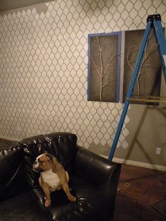
P.s. It looks better in the pic than in real for reals life. And FYI when the stencil was on the wall I thought that it was even mmmkay?
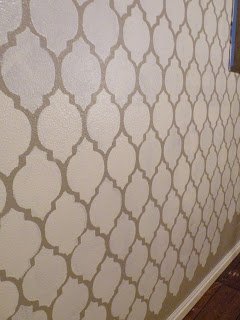
P.s.s. I am sort of design psychic.
I can tell immediatley if something is going to work or not. I should have listened to myself instead of painting the whole afternoon….Whatev.
So on to Plan B…er…anyone have a Plan B?

What do you not like about it? I think it looks good!
Omg! Your last name is eaton! If you ever read the Divergent trilogy there is a character named Tobias Eaton. Please tell me I am not the only one who noticed this. <3
I Likie! I just cant believe you have the patience holy smokes!
It doesn’t look bad in the pics at all! That stencil is really pretty!
I bet you would like it better if you had done grey on white instead of white on grey… maybe using a darker color for the stenciled part, I mean, would make it less obvious where it’s crooked or there are mistakes? I won’t give you a warm fuzzy about it if you already know you hate it – CHANGE it! That’s the beauty of paint. 🙂
i agree with melissa that i think maybe the opposite or tone on tone would have looked better, BUT, i do think it looks good- you are also looking at it as a blank wall, with no furniture and accessories. i bet once it is “filled in” you will feel better.
I agree with Melissa. I think it would look better if the background was white and the stencil grey.
Regardless,you did a ton of work!
You are brave. I cried when I was painting my office white. It took me 2 days and I swore off painting for the rest of my life.
i think it is so cool! oh, the patience you have…
I hope you have a new perspective tomorrow. 🙂
Sometimes it helps to see things with fresh eyes. 🙂
I like it more than I thought I would. I think it looks really cool in the closeup.
keep us posted!
gail
I know you don’t want to hear it, but it does look really good in the picture. Dang it! DANG IT! Really you don’t like it? All that beautiful work? Are you suuuure?
I think you would have liked it better if it was tone on tone. So, if you paint the wall flat, stencil with a glossy of the same color.
Just a suggestion.
I think it looks fine but it’s hard to tell how it looks from pictures.
I think it looks really good in the pictures. I REALLY, REALLY do!! I like it a lot more than I thought I would. I’d never be brave enough or patient enough to do that, but I love that you are so that I can live vicariously. =)
Oh I’m so so sorry you don’t like it!!! 🙁 But I think you could definately do something with it! As long as you had solid things all against it to calm it down, it could definately work! It is a beautiful stencil and you spent all that time. But if you are looking for something else, I do love my diamond bathroom https://gentrilee.blogspot.com/2010/10/oh-my-are-you-so-ready-to-see-my.html
also, my sister did stripes in her living room into the hall using tone on tone but every other stripe was glossy. go here to see what I mean: https://adams-familypage.blogspot.com/2010/10/welcome-to-our-home.html
There are lots of options out there. you could also do stripes part of the way then use a molding where it stops to seperate it. Very vintage. 🙂 Kind of like my room… wow, look at me. Pluggin away. 😛 https://gentrilee.blogspot.com/2010/10/pretty-in-pink-my-room.html
Ok, so I left that huge comment and wasn’t done. Are you sure you don’t like it? Because once it’s all done, with the right furniture, it could look very fresh!!
Mandi. U R NUTS. I love it. But I will sympathize that if the paint job doesn’t look good up close it would bug me too. So I’ll let you change it. But for me and myself, I wanna copy it. (In a slightly different way). Do you mind sharing where you got this rad stencil? Purtty please!
i lOVE the wall. it looks awesome. i wish i wasn’t in an apt. so that i could paint my wall like that. seriously! It looks GREAT!
Oh baby. All of that hard work!
Well, from my screen it looks awesome, but if you say it’s bad, it must be bad.
I like the tone on tone idea–that might be fun to explore.
Hahaha, I love the picture of your pup looking away from your “fail wall”. It kinda made me giggle out loud. In the pictures it really doesnt look bad at all, but YOU are the one that has to see it everyday so trust your gut on this one chickie :0)
OMG! I’m loving it! What don’t you like about it??
Dang! I hate it when that happens! I’m sure your plan B (or C or D…) will be fabulous. You’re a rock star.
I feel for you. Even if others say it looks good, it isn’t going to change how you feel about it. I have done this 100 times. I either suck it up and re-do it or sell it. You obviously can’t sell it though…LOL!! You won’t be happy until you take that roller and go over it with a new color. Just grit your teeth and take the plunge.
Take care,
Lisa
Well, I hate to say it, but I agree that it’s not working. From the start I thought I’d like it better the opposite way with a white base and gray lines. But I’m guessing you aren’t much in the mood to stencil it all again. Is the “seizure wall” done in this stencil? Could you just repaint the wall you don’t like gray and continue to have the “seizure wall” a feature? Good luck.
Mandi, I think it looks great….once you replace your decor, you won’t even notice any flaws…no one knows that but you….I think it looks great…I love the pattern, very classic….you are a rock star!
Hi Mandi, It looks really good in the photos! Hey, please hop on over to my blog to see the challenge I’ve issued to my blogging friends! I’d love to have you on board.
Warmly, Michelle
What if you used it’s sloppiness to your advantage? Age the wall.. intentionally make it distressed? Just an idea that way you don’t have to start ALL over. You could seal your paint and glaze the wall to give it an even more crappy look.
I hate when things don’t work out – but you will figure out how to make it work!
i love it…but I know that if it bugs you…it will continue to bug you…so good luck on plan B..plan A was awesome…..
Dang, I think you might be right. However, when you move the furniture back, your whole world might change. I might at least try it. Good luck. You have great instincts so I’d go with my gut…
I agree with Lindy, once you put the furniture there it might look quite different. BUT if it’s hurting your eyes to look at it then maybe change it so the colours are reversed? Because it’s a great design!
Megs 🙂
I like it!
I bought this stencil and am using to make a kitchen backsplash and OH MY GOSH, you pretty much nailed it, it looks awesome in my pictures, but…. Not so awesome in real life, but I love the idea of it so I’m sticking to it. Did you try touching any of it up with a paint brush, i’m pretty much going to have to!