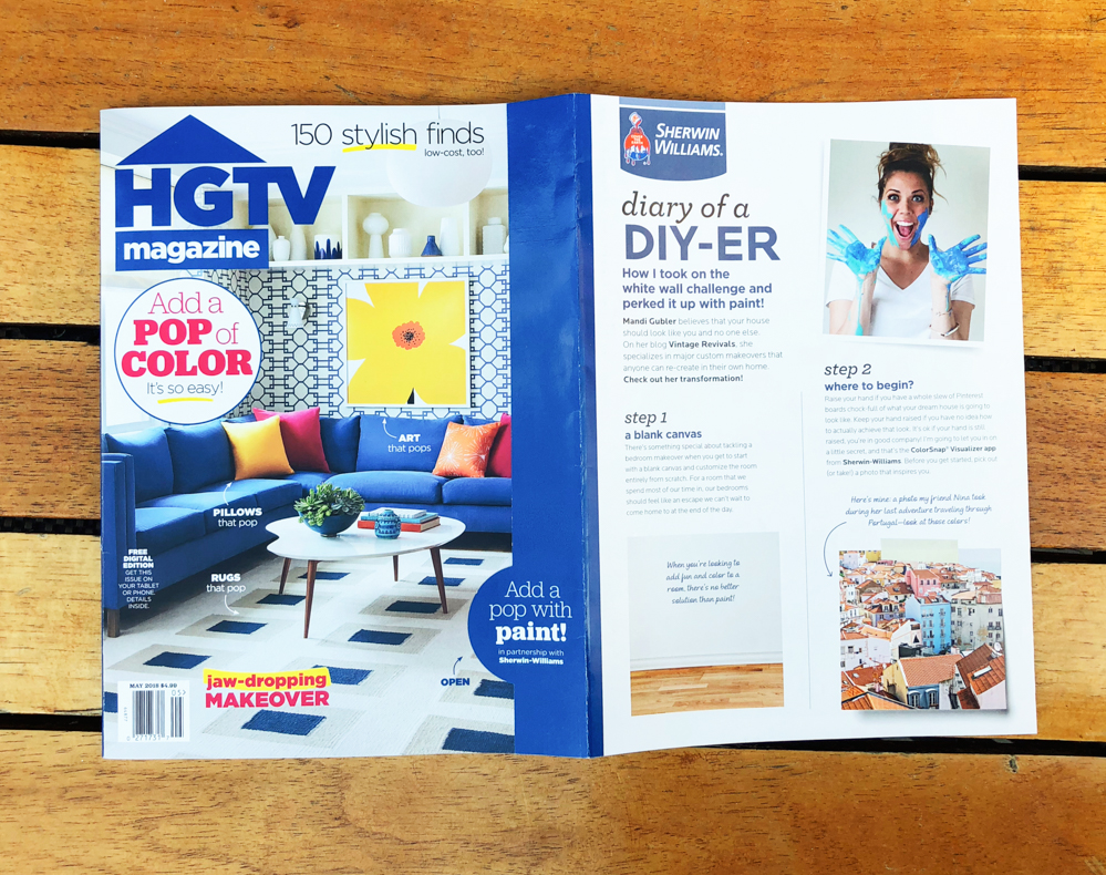
Sometimes as a blogger you have an inbox full of weird pitches and emails asking you to share infographics. It’s a thing, and so very aggressive. And sometimes you have an email from HGTV Magazine and Sherwin-Williams asking you to design a space for their May issue.
Um…what is happening!? That is almost the cover!!! *passes out. (Guys, I don’t know when everyone is going to awaken to the fact that I am making this up as I go, but I hope it’s never!!)
The challenge was to find something that inspires me and use Sherwin-William’s Color Snap tool to help me design the space. We’re talking White Box Challenge style folks.
I have a friend, Nina, that is the most incredible photographer. She is wildly passionate about travel and her images are stunning. (Follow her in instagram, you won’t regret it!) Every time I find myself on her feed I’m inspired and as I was scrolling, this image from her trip to Lisbon, Portugal stopped me dead in my tracks. I call living in the triangle window house!
Aren’t the colors just so good?!
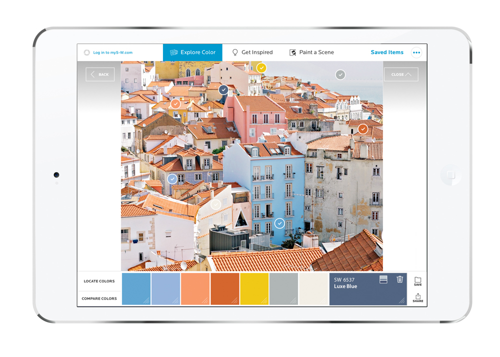
I pulled it into Color Snap, selected a few of my favorite spots on the image and came up with this color palette

Another killer feature of Color Snap is that you can then “paint” your space to get a general idea of what the color is going to look like! Perfect for those that are trying to decide between a few wildly different options.
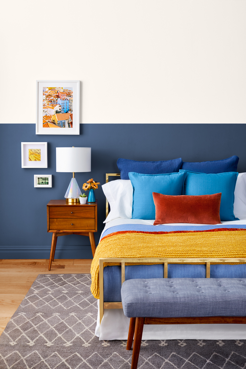
Last was to use the other colors in the palette to finish styling the space!
Did you catch Nina’s print on the wall? It’s my favorite part! You can download your own here!
HGTV Magazine’s May issue is on newsstands now, grab one and show your husband that your best internet friend is in there, which by association makes you automatically cooler and relieves you of laundry duties for at least 48 hours.
Also, the issue includes a $15 off coupon! Buy a copy of the magazine and bring it to your local Sherwin-Williams store to redeem it when you purchase paint!
I just want to say thank you to HGTV Magazine and Sherwin-Williams for giving me this crazy opportunity. I am beyond grateful and humbled to have such cool partners!


Congrats!!!!
I read my copy this weekend and was excited to see your design!! Congratulations!
Wow!
Cool & beautiful as always – congratulations.
That’s my brass bed! So fun to see it styled in a totally different way.
Sooooo very cool! Congrats. 🙂
Mandi, you are desitined for great things!
I saw you when I first opened my magazine! Sooooooo excited for you, my best internet friend ????
I had subscribed to HGTV magazine a couple months ago and May’s issue was my first. When I turned that first page and saw your cheerful face, I was so excited. I’ve been following your blog for years now. It felt like I was seeing a friend. Of course, I bragged to my husband. I did the same when I saw you in Country Living. Congratulations!
Color Snap sounds like a great tool. I often find inspiration for colors in art and Color Snap will make it so much easier to get the colors right without having to guess with the fan deck.
The room looks great, and I really like how you painted only the bottom part of the wall- and placed the artwork between the two colors to break the line.
Great job- as always!
Well deserved!!
Love the colors you used! We close on our new old house Monday morning, and then I’m painting everything Mandi white!! Hope I can find the paper where I wrote down your secret recipe!
You deserve “kudos” my friend and neighbor, I know how hard you work, and it looks fabulous!
What a surprise to see this photo and recognize it. Love the result… as always. Greetings from Portugal.
Wow! Once again, your design and color combo is spot on! Congrats on the “almost cover” 😉