There have been multiple times during the Merc renovation that I said aloud “MY GOSH. How do normal people do this?!” By normal I mean, not the type of people that think/talk/dream about design all day everyday….ya know, people with hobbies. ? There are just so many decisions to make! And they domino, so you can’t screw it up or the whole thing turns out horrible.
Hi. No pressure.
Picking out tile for the Merc has hands down been the hardest thing. Here’s the problem, I love everything. Also I love color. Also pattern ??. Which lead me down a rabbit hole of colorful patterns that were super fun and very thrilling. (Did you know that homedepot.com has got some CRAZY cool tile? You can see some of my favorite patterns here!) But I kept coming back to the authentic style of the Merc. It was built in 1928 and the goal was to keep it in that era, and guess what? Crazy patterned tile wasn’t part of the world in Santa Clara UT in 1928. So I’d scrap those ideas and bring myself back to black and white. But then my mind would start to wander again and I’d get caught up in the crazy fun tiles all over again.
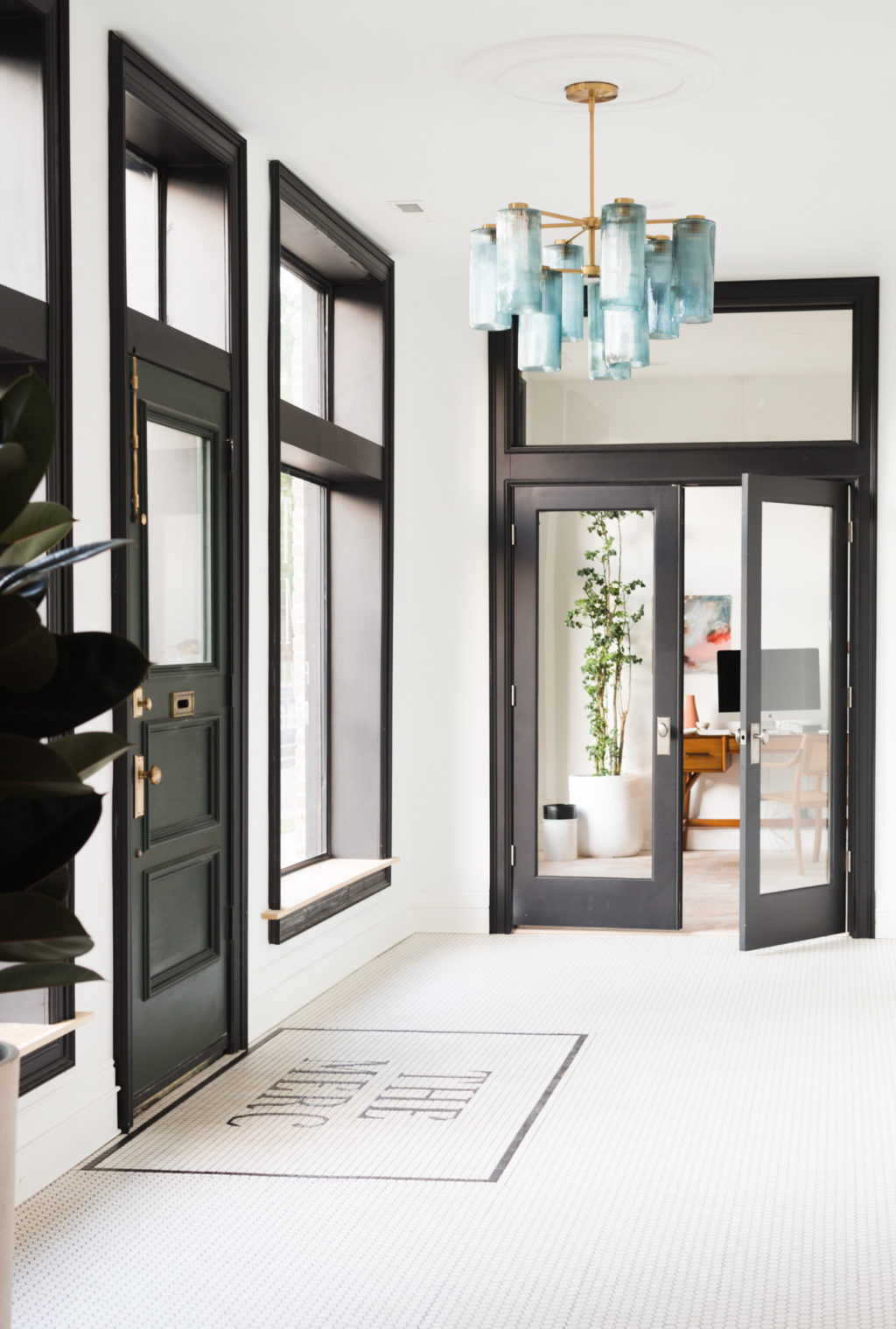
What finally broke this vicious cycle was deciding first and foremost what THE MOST important tile related design was. Was it the backsplash in the kitchen? The bathroom floors? The hallways? If you’re in this cycle that seems to never end, use this trick because it totally worked. Ultimately I realized that it was the Merc logo on the floor in the entryway. It was the single most important tile situation in the whole building, something I was unwilling to compromise on. That was an easy decision, and like it does, everything domino’ed from there.
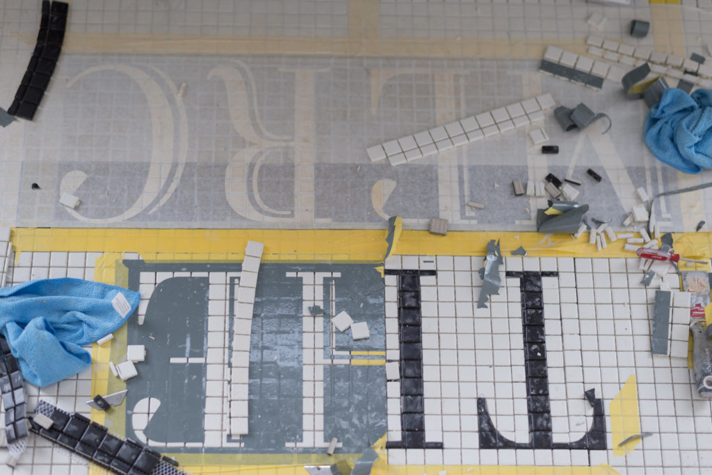
The clarity that I needed to keep the Merc true to her roots came once I stopped looking at allllll of the options and really thought about what was right for the space.
All of our tile (100% of it!) came from homedepot.com. The real question here is have I convinced you yet that Home Depot is the answer to everything?!
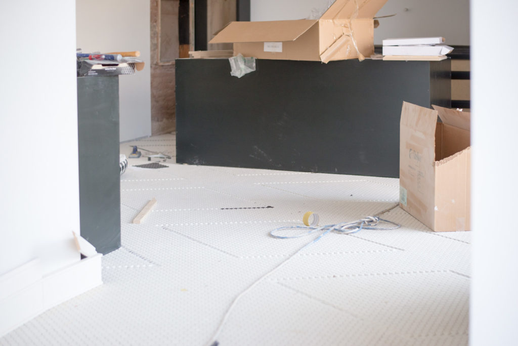
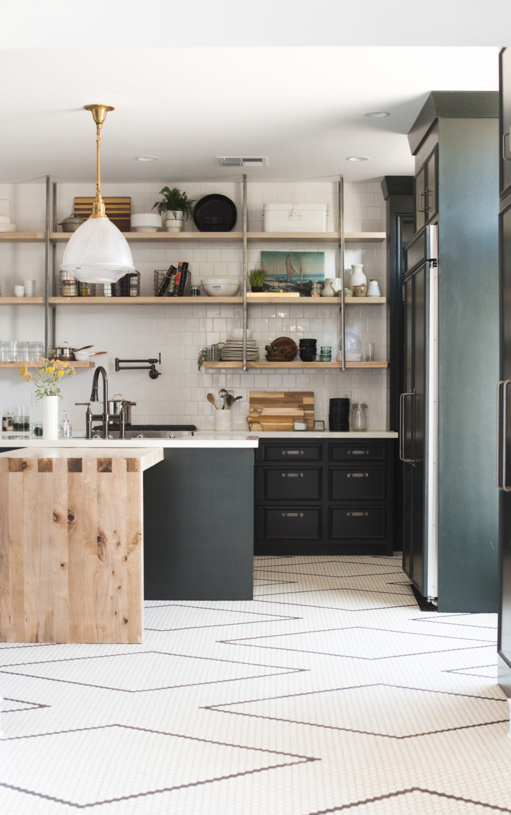
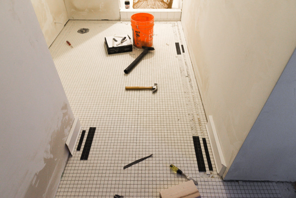
On the floors we ended up with Daltile Keystone in Arctic White. White 1″ Hex tile in the entryway/kitchen/hallways, white 1″ square tile in Ivie’s bathroom and for the Merc logo, and black 4″ matte square tile in the main bathroom. So simple but it left the option for customization wide open.
The way I finally was able to scratch that pattern itch was to hand lay contrasting tiles on the kitchen floor. It kept the vintage vibe I wanted but is so freaking impactful I cant even stand it. The kitchen floor is hands down the star of the show at the Merc. And the best part of all, if you can count, you can do this in your house!
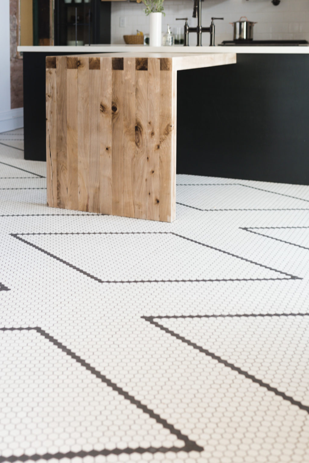
In Ivie’s bathroom I hand laid a border in the white 1″ square tile out of contrasting black tile and it’s just SO good.
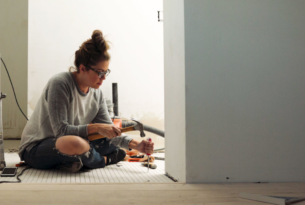
Check out our latest vlog below!!

The links for the tile just take me to Hoke Depot’s Home page 🙁
I love (LOVE) the style you chose for your kitchen and especially the hex tile. Since installing it and living in The Merc, how has the maintenance been on it? I would fear it’s a beast to keep looking clean.
I too love the design I see, but also wonder how it is living with the white floor tile. In my kitchen a few houses ago, I went with a white/black checkerboard floor tile – it was a BEAST to keep clean. As in, down on hands and knees every month to scrub the white tiles and the grout lines. And this space was small, maybe 6′ x 10′ of floor tile.
OK – you know I love the Merc and the tile like crazy but what I really gotta know immediately is where you got your Smokey the Bear shirt!?!?
Haha its from Target!
I never post on blog posts but have to say I LOVE love LOVE love loooooooove the kitchen tile. It’s gorgeous. Genius about keeping it black and white but custom patterned. <3 <3 <3
All I can say is YAY! Glad you are gonna be posting more and why don’t you two have a show on HGTV! You are like Chip and Joanna but in reverse! Mandi is the crazy one and Court is more serious! Love what you have done!!
OH YAH! I forgot to say that I love your haircut!!!!
Did a 100 year old house on first st. In winter garden Fla.15 years ago.talk about crazy!it was a lot of work.but like you said,go with the history of it .the place was a wreck! Major carpentry,new staircase where there was not one to the second floor apartment,that had an outside stircase.dont want to even speak or think about elec.the only thing that made me go forward was a white clawfoot bathtub,that solved everything!black and white 1 inch tile,beautiful! Floors and walls halfway with white subway tile border.kichen same way,love it.
I’m in awe of your floors.
I’ve read every Merc blog over the past few months. I Love Love you guys & The Merc. Okay, so I hands down LOVE the Tile. Like, you’re an evil genius tile layer. It’s crazy good! Butttt Where are the deats on that Entryway Light. I love it more than you should probably ever love a lighting fixture. <3 how many times can you say love in a post, ?
I’m trying to choose tile for a 1860 farmhouse and wanted to know if you are sealing your unglazed tile and if so, with what?