Let’s get painting now, everyone is learning how, come on and get painting with meeeeeeeee! (I literally don’t know why everytime I sat down to write this post that song pops into my head, maybe because the Beach Boys were on Full House this week? But you know, painting instead of surfing because I’m not on a beach-also no coordination.
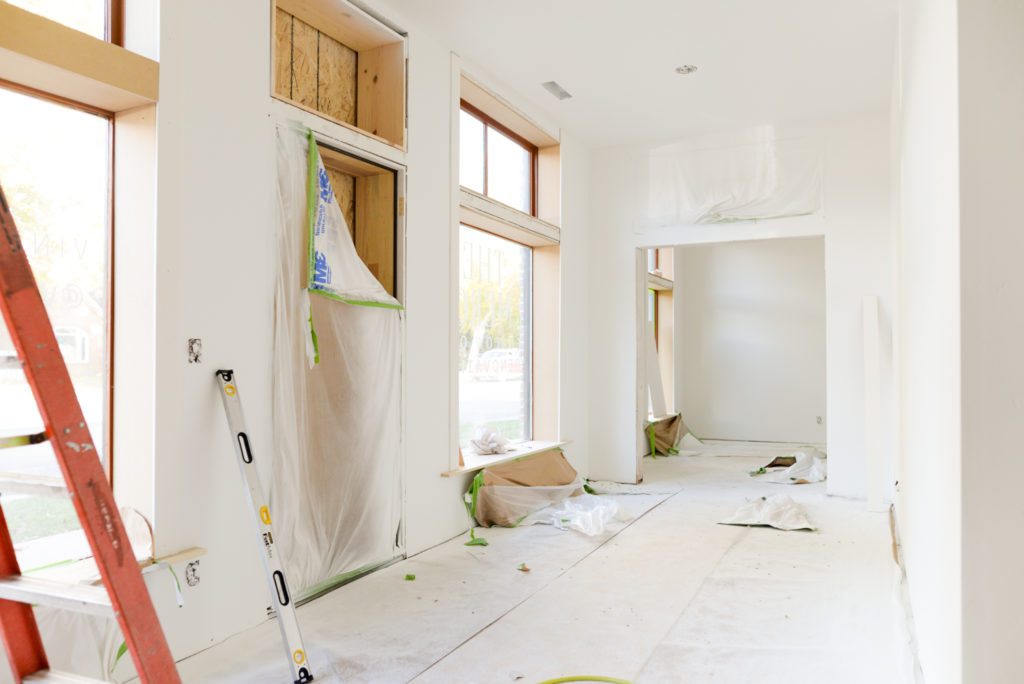
Are you guys ready to dive into the world of painting at the Merc?!! Let me begin by saying that once the paint was on the walls it finally started to feel like our house. It’s crazy to look back and see how much it changed from when we started. This huge open room with no walls and oh so much potential! Painting is where our lives started to get really crazy. Most of the work from the subs is over, its now up to us to bring this puppy over the finish line!

When it comes to picking out paint, I could do it in my sleep, in fact I bet if you called my local Sherwin-Williams store and asked for Mandi’s usual they’d know exactly what colors and type to get. If you’ve followed VR for any length of time you know that I have my go to tried and true that I’ve used on every room I’ve gotten my hands on since 2013 (THAT IS CRAZY!!!!) So if you’re looking for the perfect white, have a seat my friend and let’s chat.
To me the perfect white is just white. Not yellowish, not bluish, not grayish, just white. Its not too bright or too dingy, its JUST WHITE. At my local store its called Mandi White (if you’re in St. George you can go into any of the stores and they’ll mix it up for you!) The formula is extra white base with 3 oz of white pigment added. After 4 years of calling it Mandi White I asked Sherwin Sensei Sam (the manager that answers all of my weird questions) if this was a real Sherwin color and they we’re just humoring me and calling it Mandi White (you know, like when someone calls you by the wrong name for so long that you can’t correct them and will eternally be Mindy when you’re around them?) This is what he said. There is in fact NOT a color with the same formula (YAY!! Who wants to start a petition to have Mandi White added to their official list of colors!?!) But the closest “real color” is Pure White SW 7005. With Pure White they add a little bit of black to the extra white base to grey it out a teeny bit. With Mandi White the white pigment does sort of the same thing, its just a touch brighter.

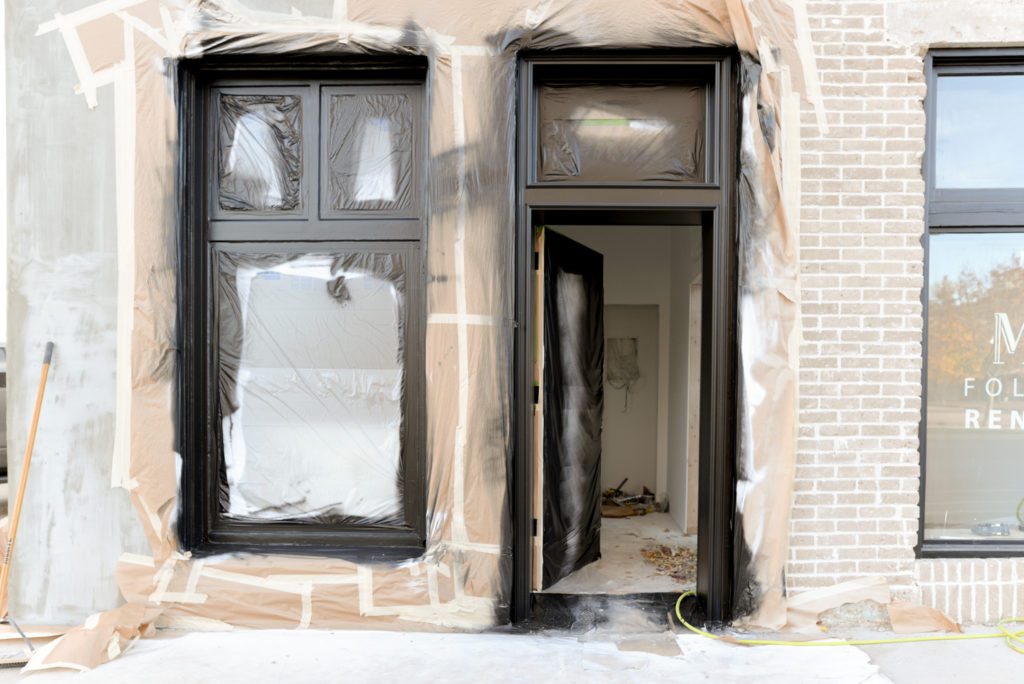
So back to the Merc, like I said before, Mandi White was a complete no brainer for all of the walls and baseboard. Same with using Tricorn Black for the accents. I’ve used it so many times that there are no surprises here. BUT I did venture out to a new color that I’d never used before and i’m pretty thrilled about it -dun dun dun dun dun duuuuuuun- Jasper.

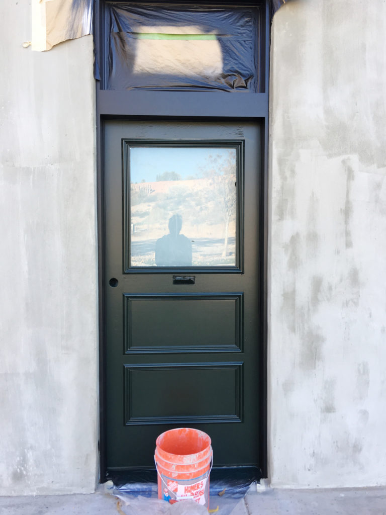
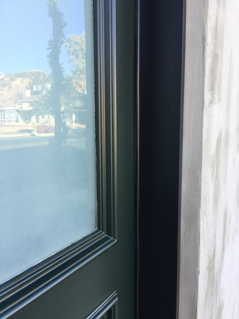
Here’s a side by side with Jasper and Tricorn Black

Before we go deeper into that let me tell you why I was so drawn to it. When we were touring the Merc for the first time I noticed these green boards stacked in a back room as well as spots of green hanging out other places (like the pass through window in the kitchen). When I asked about it, the previous owner told me the cutest historical story about Southern Utah. When the pioneers had finished building the temple they ordered paint to cover the red sandstone that it was built out of. White for the walls and green for the roof. When the paint arrived there was wayyyyy more green and not enough white, so the church passed it out to whomever wanted it to paint their gates/houses and ordered more white. I’m not sure if the green paint at the Merc is temple paint but isn’t that the most endearing story?! From that moment forward I knew if I was going to use color, it needed to be green, so it was constantly in the back of my mind.
Enter Jasper. When I saw this almost black inky green I knew it was meant for the Merc. We’re using it on our front doors and kitchen cabinets, and if we’re being totally honest I wanted to use it on all of the interior doors as well but decided against it because I didn’t want to overuse it. It feels like the cabs and front doors will be the perfect amount of green. And so far that’s it! Mandi White, Tricorn Black, and Jasper. I’m sure I’ll end up with other colors once we’re moved in and the decorating begins but for now I’m really digging the historic vibe this palette is throwing off.
Tomorrow we’re talking practical application. See you then!!
