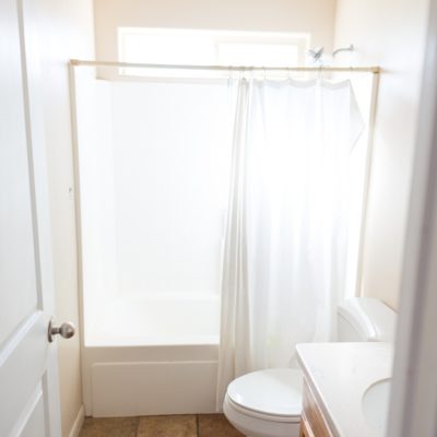
Hey!! If you’re just tuning in, you’re in for an adventure. We are completely overhauling our builder boring beige bathroom (say that 10x fast!) on a small budget using stuff that we already have. The Rock What Ya Got bathroom makeover! (Make sure to catch the past posts in this series at the end of this post!)
When it came time to really figure out what was happening in the bathroom design it was looking really white. I love white. But it was like white white. No contrast whatsoever. Which is a whole different kind of boring. Also, a reflector is a great way to visualize a mirror if you are in a bind.
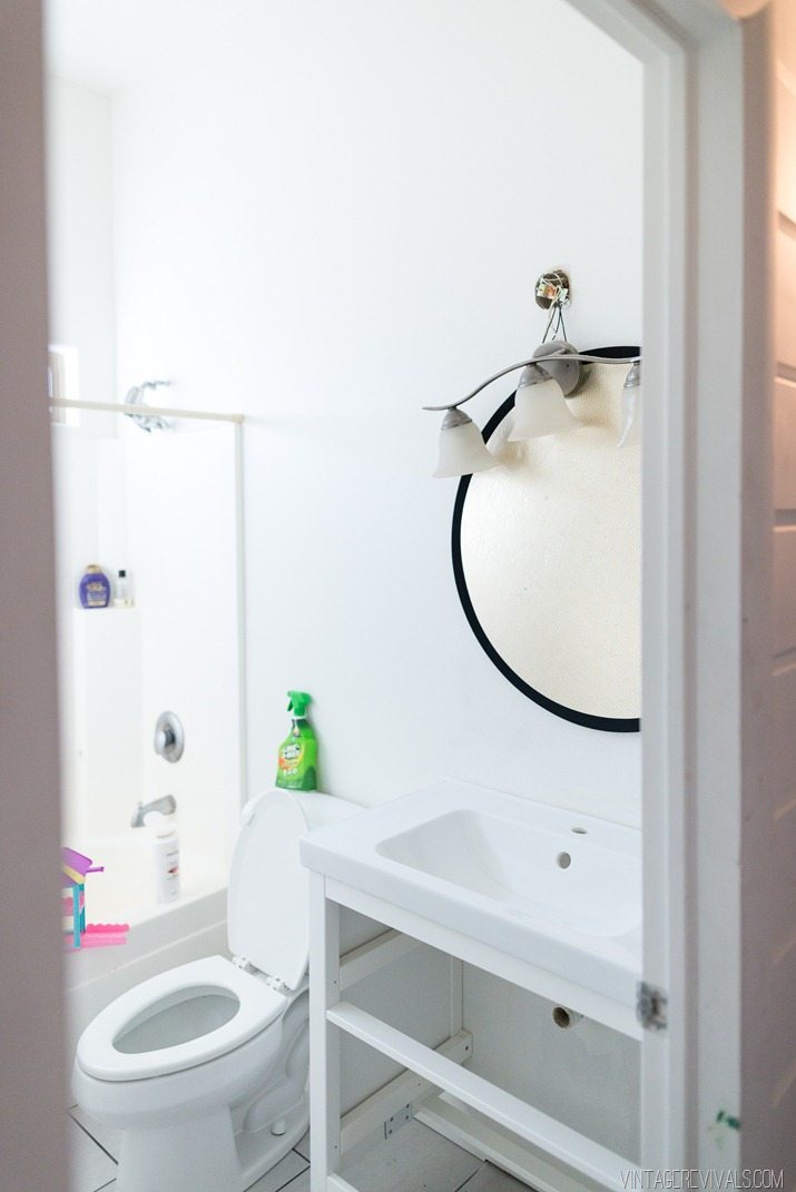
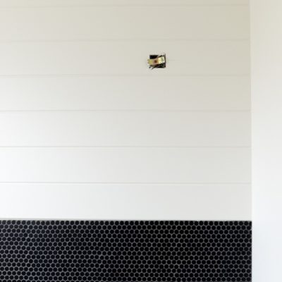
We had just enough of the black matte penny tile leftover from the Laundry Room Makeover to cover a section of the wall.
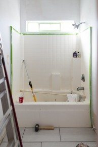
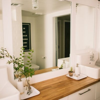
So out came the toilet…again. And the new cabinet (we’ll talk about that in a bit).
In went the penny tile. You can see my post all about tile here. Penny tile is tricky tricky, you’ve got to stagger it because it is very easy to see the seams.
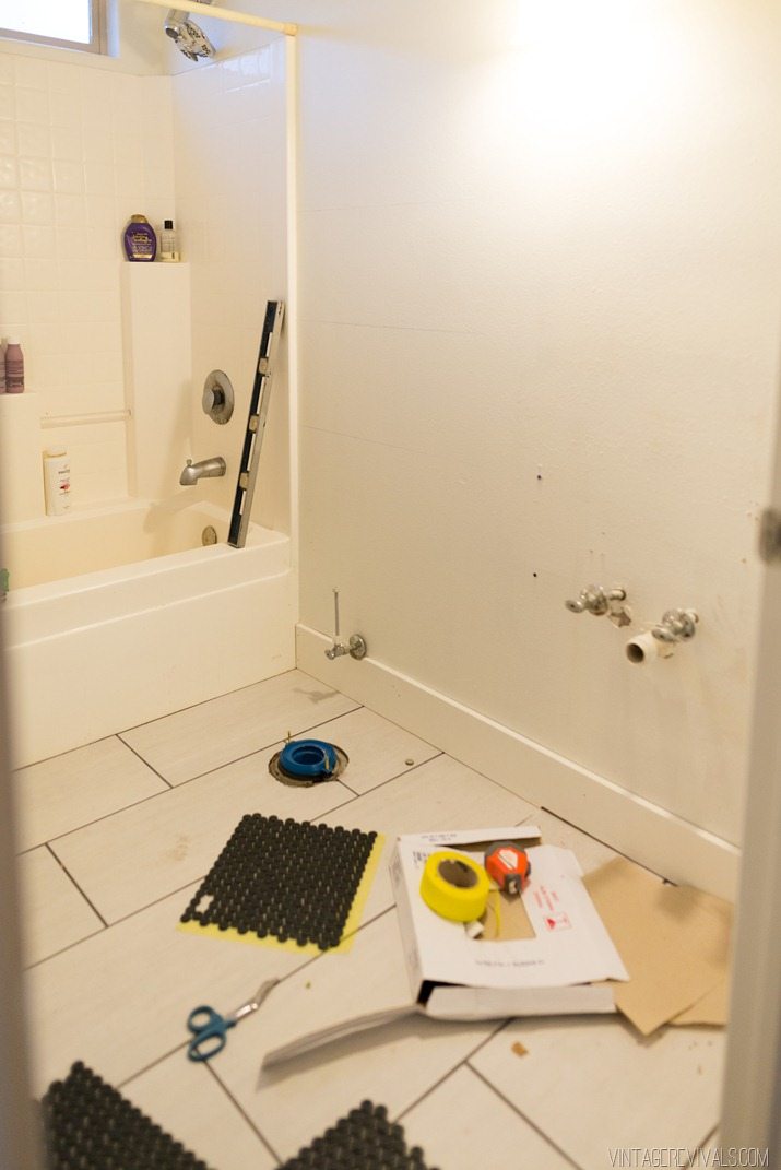
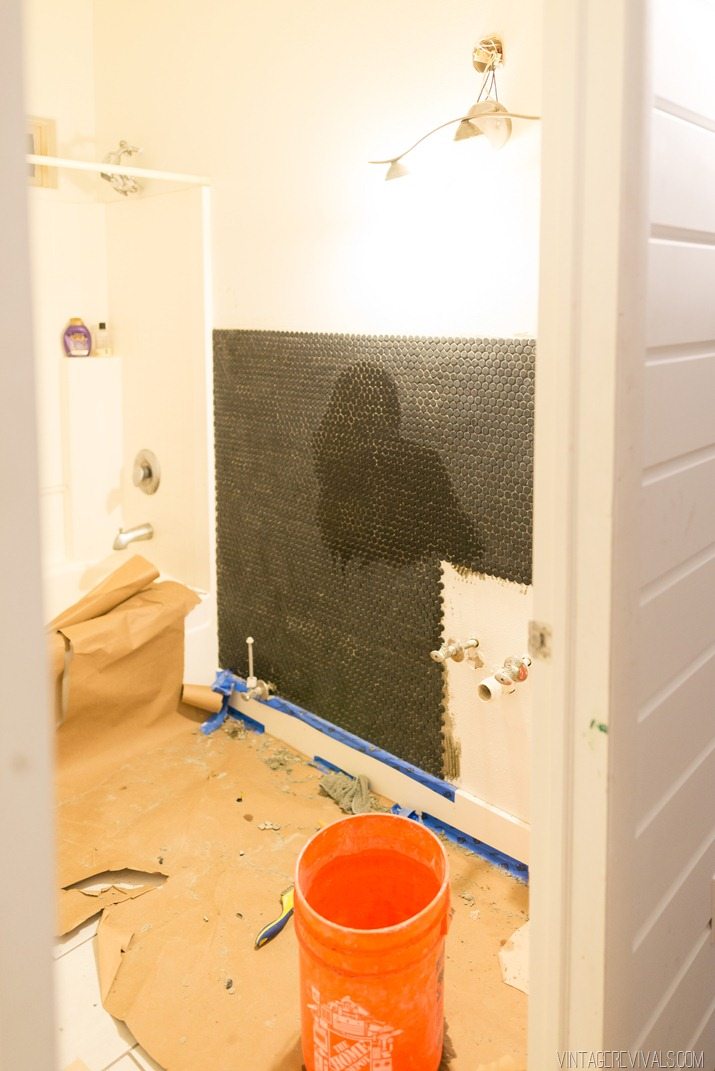
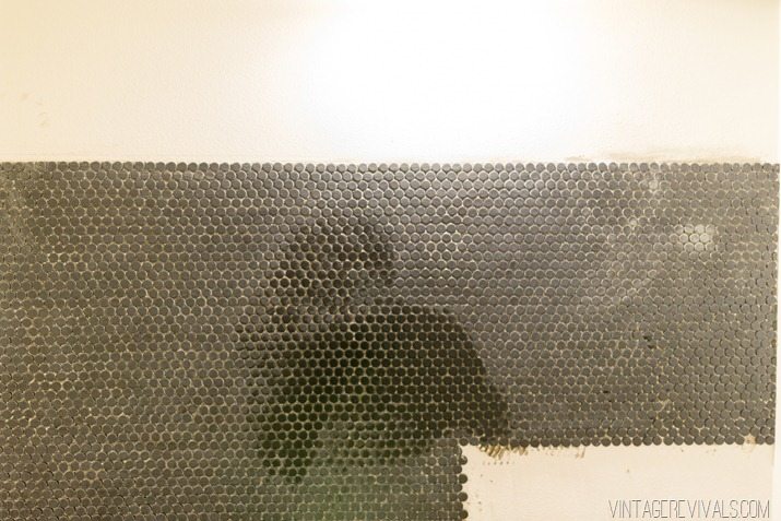
We didn’t have any Fusion Pro premixed grout left over from the Laundry Room, but we did have some grout left over from the kitchen tile. If you hear nothing else from this post today, hear this. Get the Fusion Pro. It is better in every imaginable way. The texture, the color, the wipe ability, the stain resistance, the color consistency. Every.living.thing.
I wasn’t sure about how I wanted to finish off the edge of the tile so we lived with it like that for a bit, I cant wait to show you what we did!! Stay tuned!

Looks amazing! And I can’t wait to hear more about the new cabinet!
(Side note: I love your site, but the ads and pop ups are really rough to manage. Like, out of control. Maybe it’s my browser? I always look forward to a new post of yours in Bloglovin, but I tense up a bit when I click knowing what’s coming. Anyway, I’ll keep coming back regardless – supporting you wherever I can. Just thought I’d let you know about my interactive experience on your blog.)
Hey Kari! Thanks for the feedback! We’ve scaled back quite a bit, can you let me know which ones are doing that and what browser you are using? I want to make sure that everyone’s experience is as pleasant as possible 😉
x
m
It would be cool to have the tiles make some sort of pattern at the top like staggering or something like that! Love how it’s coming so far!!
Love the absence of pattern at the top – it is a place for the eyes to rest. Look forward to seeing it all completed. It’s a great idea!
http://www.decoraid.com