I think I have gotten more emails about this tutorial (or lack thereof) than anything else lately.
I originally did this project when I was getting ready for The Nate Show but when I was putting it together I was on such a time constraint and my camera was dead that I didn’t have time to wait for the battery to charge.
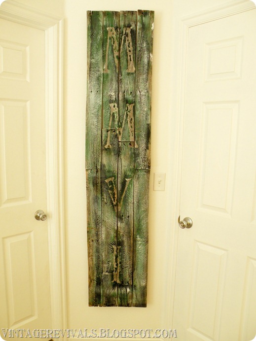
I knew immediately that I wanted to do this project for the Epic Makeover because there was such a small skinny wall between the 2 doors.
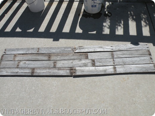
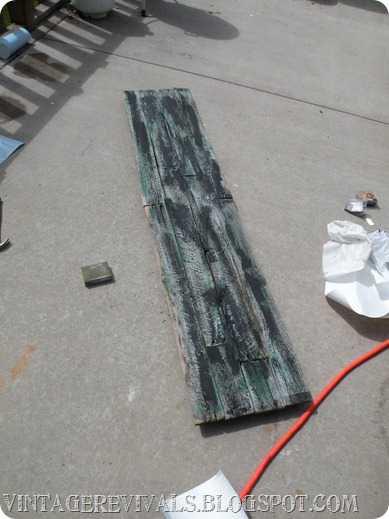
First what you need is wood. You can use new or old, whatever you prefer.
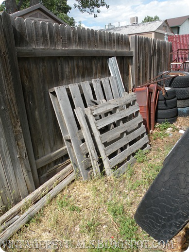
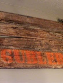
On mine I used newer wood that was already stained; on Jessica’s I used old pallet wood.
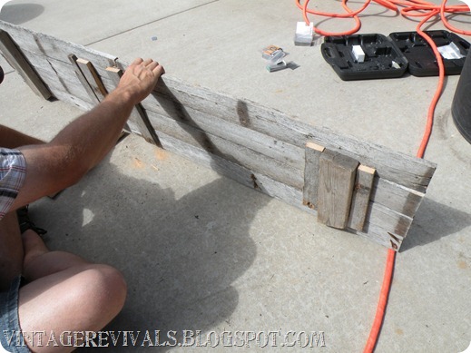
Secure your boards together with brace pieces.
I used a nail gun because I had one handy but you can use regular nails if you want.
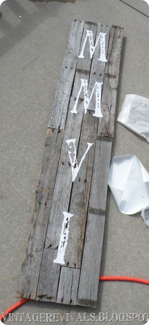
Once your pieces are secure bust out you vinyl. I used this roman numeral converter to figure out what the numbers were for 2006.
I used Madonna my Silhouette and the Artistamp Medium font that I love so much.
If you are doing this on reclaimed wood the vinyl wont really stick so just do the best that you can.
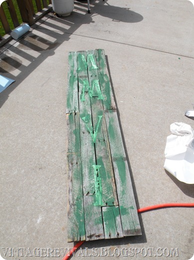
I used my 1.5 inch Purdy brush and all of these Decoart paints to make this sweet project a reality.
I watered down the first layer of all of these colors and randomly brushed it on. The reason is because I wanted it to look old and sometimes full strength paint looks too new. It’s a fun little trick, try it sometime!
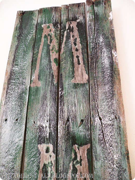
The color I used for the first layer is Americana’s Kelly Green, super bright and exactly the shade I was going for. The reason I did it first is because I wanted it to be seen but not be the MAIN color of the piece.
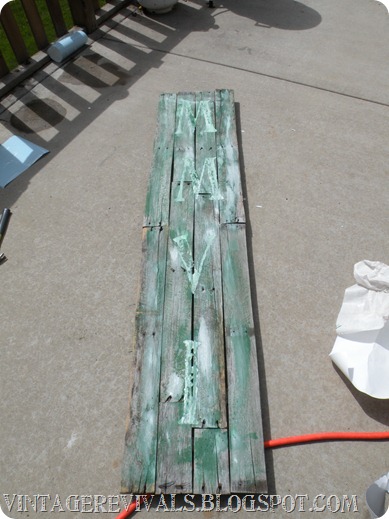
Then I did the same for the second color which was Americana’s White.
and for the third Americana’s Lamp Black.
Then peel of your vinyl
Once I got it hung in Jessica’s room it seemed too dark so I took more white and did not water it down this time.
I dry brushed it on and it lightened the sign up a ton and gave more contrast between the natural wood color and the paints
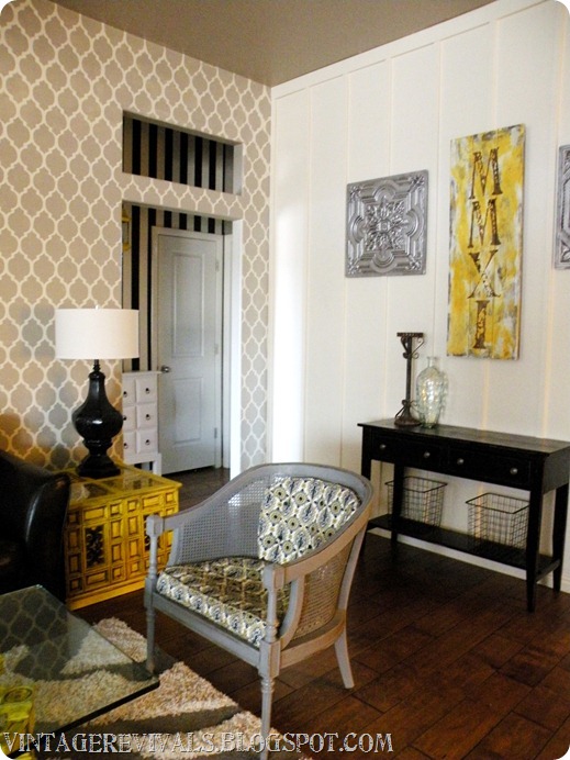
For mine I used the same technique but painted it heavier with Americana’s White and Bright Yellow.
I like different things about both of them. Which one is your fave and why?
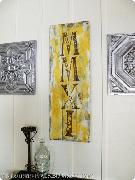





I am really into yellow at the moment so it would have to be that one! Also my house is tiny so I can imagine a smaller one like that in our home. Thanks for the tutorial. It makes me feel like I could do that now!
That is so creative and cool! Great job!!
Take Care,
Mandy
https://a37s42.blogspot.com/
It would be difficult to choose. Green is one of my favorite colors but I love the punch of color the yellow piece has (with the grey/brown tones) and it ties in with the rest of the space…amazing project and thx for sharing!
https://www.lminteriorsllc.blogspot.com
Thats a fantastic idea!
I love using palettes!
xoxo
Kerri at HollyMuffin
You wow me, girl! I love it.
Join us for our weekly Throwback Thursday link parties.
http://www.luxeboulevard.blogspot.com
Wow! I need to figure out how to do 2001 now! This so totally rocks! And ps. I dreamt that I got to hang out with you and swap design ideas. I was in st. George last weekend and wished I knew where you lived! I even went to DI in hopes of seeing you… that’s probably where the dream came from! Ha ha!
I like yours better because it has more contrast, but I like the length on the other. I have a feeling these are going to pop up everywhere. Love!
This is going to make a perfect anniversary gift for my parents at the end of August! I might reach out to you for help mid project! 🙂
I like yours best, because (like others have said) there is more of a contrast between the colors, and also I am lovin’ the yellow/brown combo. But I’m curious–I may have missed something along the way, but in the epic makeover you used 2006 because that was the year they were married… Why is yours 2011?
And to Heather, above, THANK YOU for the anniversary gift idea!!! DUH~but seriously I never would have thought of that myself! My parents are mid-Aug, so I’d better get to work…
You are amazing woman!
My husband and I are currently working on making the master of our first home “ours”. We knew we wanted to make the whole entire room just about us. No kids allowed style. We wanted some sort sign to hang from the ceiling in our bath. We really like graffiti and that is the sort of style in the space. We both have matching tattoos of our wedding date in roman numerals. I think this just might be the sign that goes in the bath! Thanks for the idea!
The Miller’s
Prezidential Life
i love the yellow! but like the length of the green sign! im lusting your living room!!! i cant wait for the bedroom reveal when you finish! you rock mandi! thanks for the fun you send into my days! much luv and squishy hugs! melanie C=
I like the green one because it’s *perfect* for that little skinny wall, but I love the yellow one because it’s more bold and stands out. Not to mentioned, when paired with the silver/greys… yummy yummy slurpitup.
“not to mentioned”
I’ve had a long day.
I like the yellow one! I like the contrast of the dark MMXI against the yellow. Besides, my favorite color is sunshine yellow. That might sway my decision just a tad!!!!! GORGEOUS!
my fave is the yellow, I love bright colors and it’s a stand out. Also, love just about anything Roman. 🙂 Great job!!!
I’m with you. I like them both for different reasons. They both look phenomenal in their own settings. You rock!
I love this idea, but….I did the roman numeral conversion thing, and it gave me this:
MCMLXXXVIII
Holy cow! I need a really tall wall!
OHHH I LOVE the yellow one in your house! I’m a sucker for yellow’s 🙂 Great Idea!
So I got all inspired and got supplies together and started along my way. I even downloaded that same font and everything. I just went to cut the phrase “FAMILY” on my silhouette in that font and it totally started to jam and get all screwed up!!! I’m so so sad. I will try again when I get brave. I just barely got the Silhouette and spent all day learning how to use it. Did everything go smoothly when you used your Silhouette cutting out the letters?
I love the yellow one – in fact, I’ve been waiting for a long time to see just how you did that! I wanted to ask how you get the blotchy-ness on the letters under the vinyl – does that happen during the part of the process before you put down the vinyl? Great stuff!
Both are very inspiring but the yellow one just pops out that bit more for me – love it!
Think this would look cool as a stand alone piece too, made from a heavier chunk of wood such as an old train track piece.