Hey guys!!
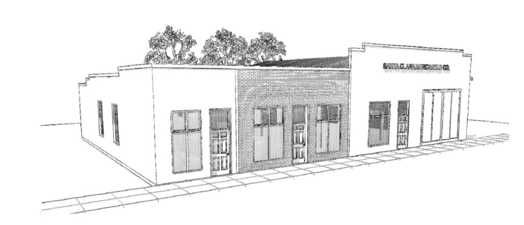
K, there is just so much to share with all of these plans that we have happening, I’ve got 5 different posts in various stages of explanation, but I think if we start with the exterior elevation that might be the easiest way to have reference points for the interior space.
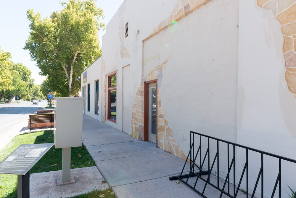
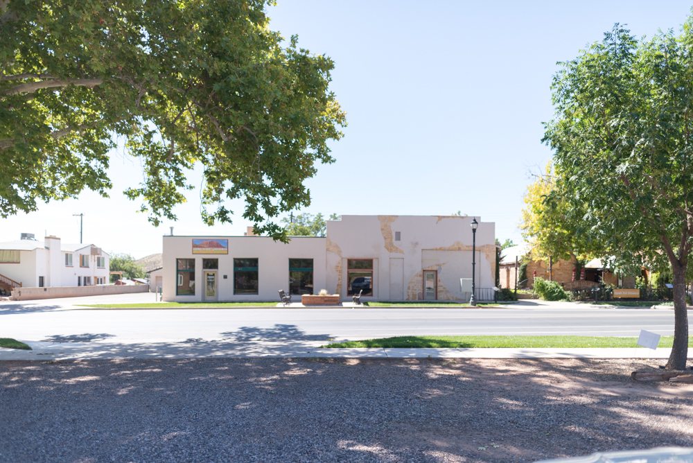
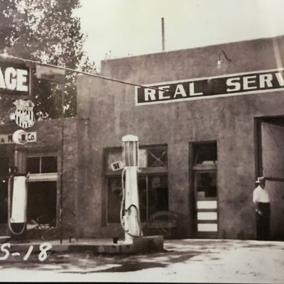
Right now the exterior can be described in 1 word- forgotten. If you didn’t know The Merc existed, you wouldn’t notice it driving down the road. Its just this giant beige nothingness. Except for the faux rock that is painted on the front. That’s the only memorable thing, cause its so bad.

We’ve definitely got our work cut out for us, but when we’re all done, its going to look a little something like this:
Here’s a really rough photoshopped version:
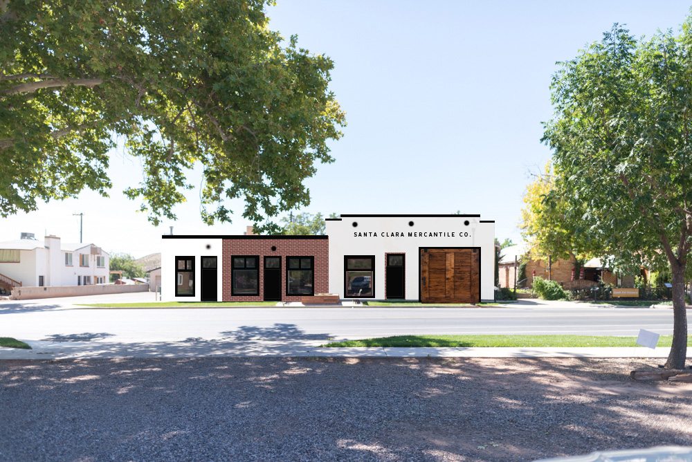
I’m going to keep plugging these images into the post so you don’t have to scroll up and down a million times, consider yourself warned!
Its REALLY important for me to bring back as much of the original style as possible.
The door that is currently living in the old garage door space will be taken out and in its place will be 2 giant faux doors based on pictures of the original ones.
See that old doorway outline that is between the garage door and the window? We are adding a faux door and a transom window to that spot. (On the other side of the wall is the kitchen, so we don’t want to use a real door.)
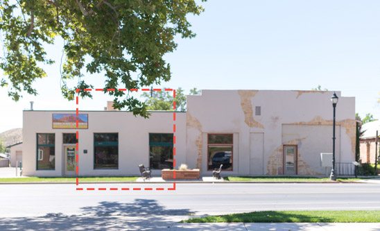
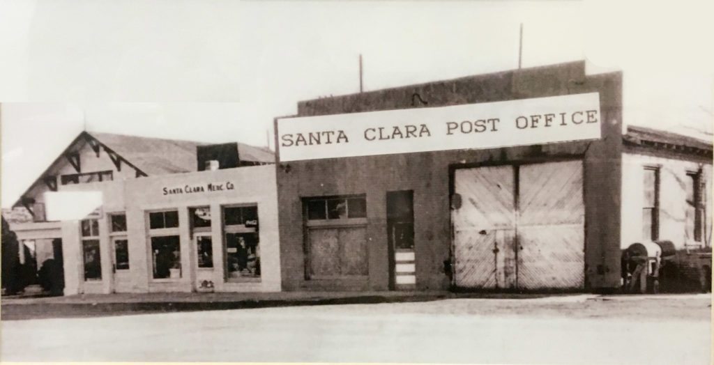
The original store entrance existed between these 2 windows. It has been boarded up (you can see it from the inside)
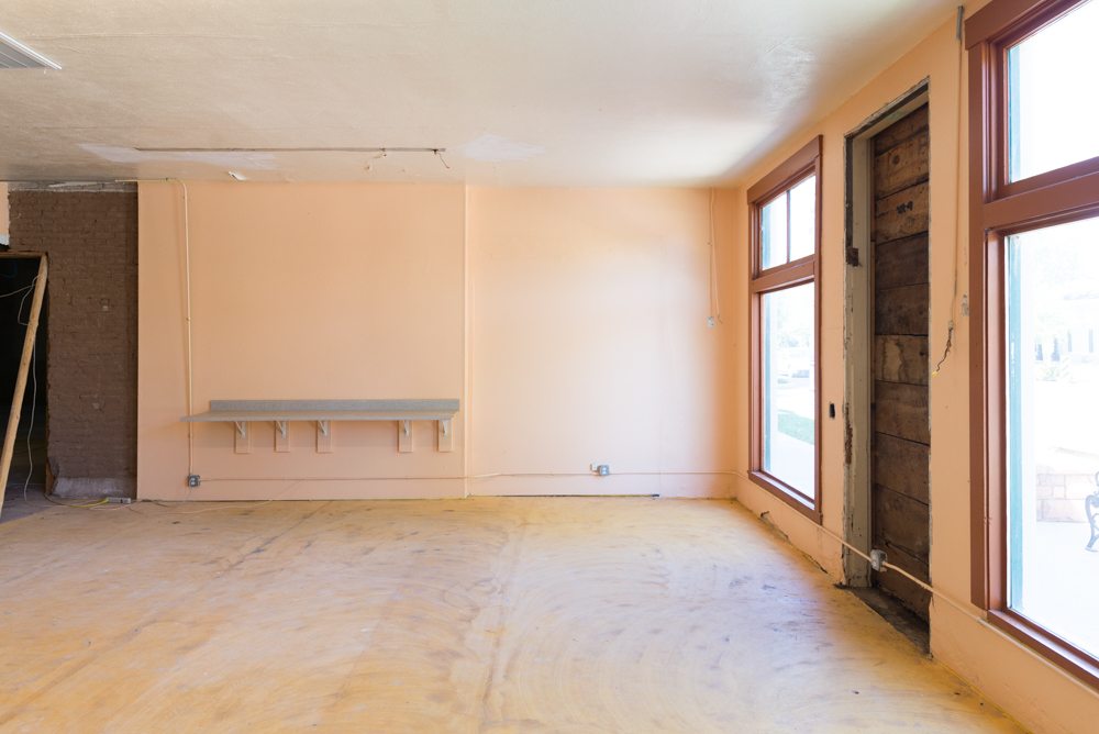
We are reopening this doorway and making it our official front door. This is also the only section in the front of the building with brick that can be exposed, so we will be taking off the plaster and restoring the original brick. I think it was painted some time in the 50’s but we won’t know until we get inside. In fact, we won’t know until we are into it neck deep if the brick is in ok condition, Hopefully it is salvageable!
In the renderings it is red, but after a little bit of research we realized that the exposed upper section of brick in this picture is the original exterior, so it will most likely be this mix of gray and yellow with light grout.
The window/door section at the far end doesn’t have brick underneath (this portion was built with concrete block) so it can’t be exposed.
We’ll be re-stuccoing all of the white portions and fixing the cracks, textures, and bad paint jobs.
This little section is going to be my office. I love that its divided visually from the house portion of The Merc and is so well defined.
I’m still not 100% decided on door and trim color. I love the black, but there is the coolest story about this specific shade of green paint in southern Utah (I’ll tell you all about it!) so I’m kind of debating back and forth about those 2 options.
What do you think? Do you have any great ideas we need to consider before we start doing everything?
Love hearing about this but I feel a bit lost- I’m pretty sure I’ve read all the posts but what are your plans for this space? You have mentioned that part of it has to be a commercial space- are you going to have a store? What part is your house and what part is the store? What kind of store? What did you decide to do about the easement or just no yard?
I like the look of the black doors and trim!
Your work is inspirational! I would have never thought to buy commercial space for residential use. Excited to see how it all unfolds!
You are the perfect person for this job! Love it!
Go with the green paint!! One of my favorite things about st george/santa clara is the tradition and history!
another vote for green – not to be a history nerd (tho i am) but the historical aspects are super cool to play around with.
also. easier to change from green to black than the other way around. (if you don’t like it)
Not sure if you know, but there is a way to stain the brick. If you don’t like the lighter brick and want to go more red, it can be done. It’s a bit tedious, but you don’t have an overwheing amount of brick outside. I’ve ordered the stain from England, a company called dyebrick. My house is a peachy blonde brick, and I have stained most of it gray/black to help modernize it. I still have a lot to do but love what I’ve done so far.
I think your space is going to be amazing. Good for you for saving a little piece of history in your area!
Just a thought you might want to consider, but the sheer number of doors is confusing to me. Even after reading your post, I’m not sure which door is the entrance. I think it’s the one surrounded by brick in the rendering? But the way the brick and doors divide up the building makes me think it’s three different businesses. If I had to guess which door would be the entrance to the store, I’d say the first door on the right.
It’s aesthetically very lovely and clean and I love that it’s based on historic photos, but it might drive away customers who can’t figure out exactly what’s going on with the place.
She hasn’t said she’s opening a store. Part of the space just has to be used commercially, so it’s possible her using part of it as her vintage revivals office will suffice. Of incourse, I would LOVE some kind of VR store, though!!
My main thought on doors is that I would always keep my home door locked if I lived there- since the building says it’s a mercantile it’s possible confused tourists could walk into their living room ?
I had EXACTLY the same thought. I’m envisioning my own awkward magnet self walking down the street amd seeing this EXTREMELY coo bding and seeing the words Mercantile thinking its an old fashioned store and just trying handles. Yeah that would be so awkward
The green is so cool and is a color associated with Santa Clara for some reason. Our fruitstand also had the greens tied to it. Can’t wait to hear your research on the green paint! It also gives it a nice softness and is inviting. Looking forward to seeing all the good you are doing!
Love your rendering! And so proud of you for taking on this project. Kudos!
Love the mix of materials, but for me it is a bit too high contrast. Maybe a warmer white with the green (or even a warm grey) trim (I am thinking along the lines of Patina Farm’s color pallete). I also really love the nod back to the history, but it seems a bit too literal … if there isn’t a need for the door, why not replace it with a window? There would still be an opening where there once was in the past, but would be more functional with the interior use changing. It is hard to understand the elevation without knowing the floor plan and function of the interior. This is such an exciting, fun and challenging project, and am looking forward to following your journey 🙂
I love it all! Keep going with what you have so far! I have never seen a project of yours that I haven’t liked! Go with your gut on colors and ideas… it’s your house so it should be whatever colors and designs make you the happiest! I can’t wait to see more! I am always telling my husband about you and saying “look what she did now!! Isn’t it so cool and creative?!!” You are one of my biggest interior design inspirations! Yay- keep it up!!! XOXO
I love your vision for the Merc! Love everything about the front elevation; the color and textures are fantastic! I drive by there a lot during the summer on my way over to Frei’s produce stand!
Have you onside red some type of porch for the house side? It would break from the original look, but not much, and add a little bit of hominess and shelter from rain. Maybe a wood porch to contrast from the brick and plaster.
Oops that first sentence should be “have you considered”
I think the front would look better with less doors. I can’t wait to see what you’ll do to make it homey.
I like it. And of course the true front door must be locked at all times. Also consider a tasteful brass plaque on or near the door bell stating it is a private residence. The Mercantile sign will be confusing to locals and non-locals, but I still like the idea. If it becomes too much of a problem you could always remove it.
This is a huge undertaking–best of luck. It will be fun to see it unfold. Are your girls excited? Mary Wilding
Pretty fabulous, as far as I’m concerned. If a vintage modern, prefab house existed, the mock-up is what it would look like.
I love that you are using an old building. I’m confused about you are doing it and how rigidly you are sticking to the original structure. The faux door under the words seems tricky. It’s asking for people to pop in. If i passed this on the street, I would think that someone had turned it into an updated, mini strip mall and that there were 3 stores to visit. I would feel like such an idiot when i realized that most the doors were fake and, oh, it’s private residence anyways. Are you going to have a sign saying that?
This doesn’t seem like a home at all – but a really cool storefront; I’m also wondering how this is going to be a good place for kids even if you do reclaim the backyard from the easement simply because it’s so close to the road. Don’t get my wrong, it’s going to look amazing. But just not amazing for a family to live there.
Since you have the easement and all…you should just make a rooftop yard! haha easy fix right? 😉
Love it Mandi! I’m a long time reader, and this home choice is so wonderfully YOU! I’m sure there will be stresses and unexpected hiccups, but I believe in your and Court’s problem solving abilities to find creative solutions along the way.
Home is where your people are, and this will be a lovely home because of the lovely family in it!
What about installing skylights as a source of natural light into the bathrooms? My parents have one in their spare bathroom and I think it’s a great feature.
You are my hero for doing this! It has been my goal for years to someday turn a cool, commercial space into a home! I’m so excited to see how this turns out! I do wonder though, if you put up the “Santa Clara Mercantile Co.” signage, do you worry people may think its a shop? I’d think it would be bothersome to have people pulling at the doors, trying to get in! Regardless, I think this is an amazing project!
So inspiring! Cannot wait to watch it unfold. I trust your talent and design process, but at first thought, I, too, am not so sure about the faux door under the Merc sign. A window seems to make more sense without disrupting the original vibe.
Love your fearlessness, Mandi! You are badass!
All the best!
Wendy