This is the best day of the whole summer, right here, right now.
2 months, 6 trips, and 100’s of life stories later, my girl Cara has a brand new makeup oasis. Today is the day that you FINALLY get to see it!
I love working with other people and their design parameters. In my house I can experiment to my hearts content, but when you are designing for someone else, they have all their own ideas that you get to work with (that is one reason that Dyl’s room turned out so fantastic!)
When I asked Cara what she wanted her room to feel she immediately answered with welcoming, calm, creative and glamorous. (she obvs thought about it long and hard.) Creating a space based on feelings is my favorite. Because so many of her readers come over for makeovers, Cara wanted the room to be a destination, somewhere totally special and beautiful.
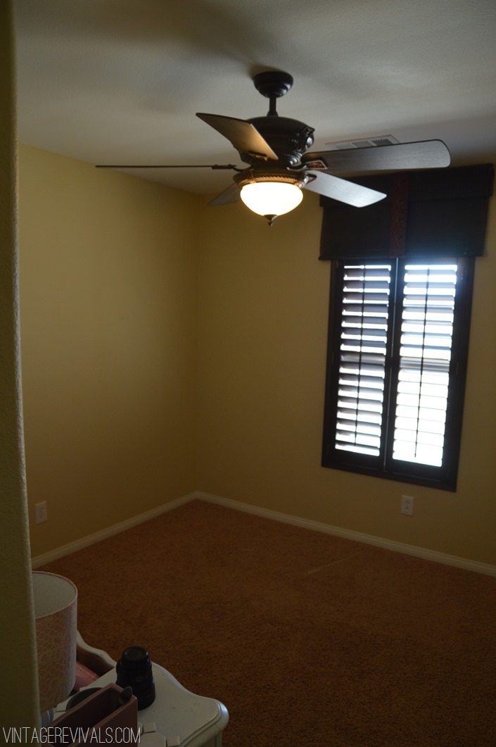
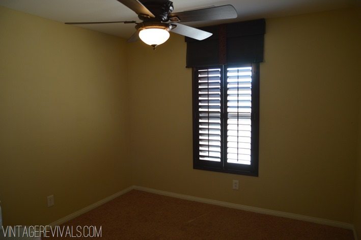
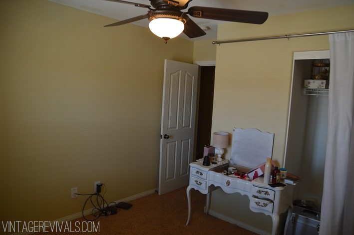
Here is what it looked like before. It was totally not functional for what Cara needed it for. Imagine trying to shoot beauty videos in a dark, mustard-y beige cavern. There is a fantastic chance that you will look like you are in liver failure.
Liver failure…that is what we started with.

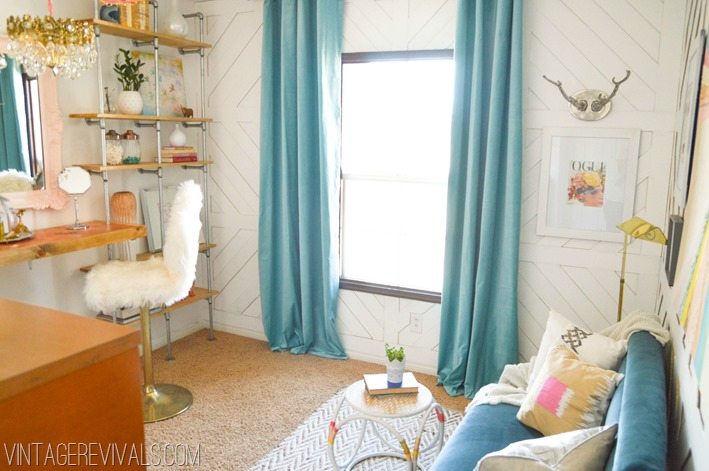
This is what I turned it into:
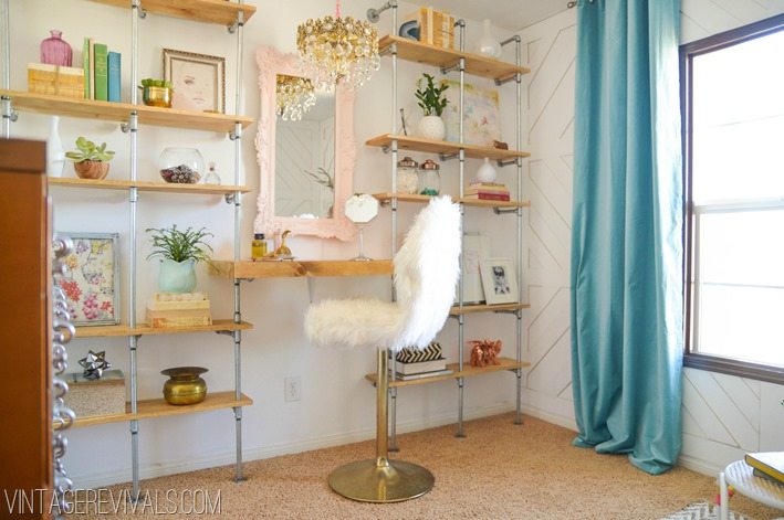
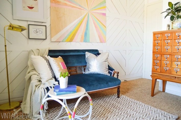
One of the big hurdles in this space is that Cara rents (as do so many of you). Now before you go all Hildy on a room make sure that your landlord is ok with it. Rental agreements are different everywhere. That being said. We all know what it feels like to not love a room. You know where you make excuses when people see it, or in Cara’s case, it is just not functional for what you need? Why not make it amazing and then when it comes time to move out, spend a few days putting it back the way you found it?
People are freaked out about patching small holes, when in all reality it is not a big deal at all. My advice when you are working in a rental is to make sure that everything you do is reversible. Take our wall treatment for example. It was painted beforehand and not caulked. Each board has 2 tiny finishing nails in it, and can be pulled off the wall without damage. Spend a few hours filling holes and its like it never happened.
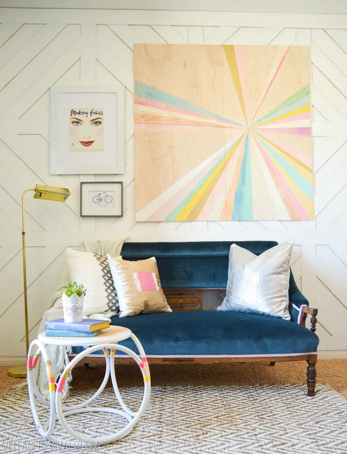
The art was inspired by a piece that I spotted in HGTV Magazine (they are my fave).
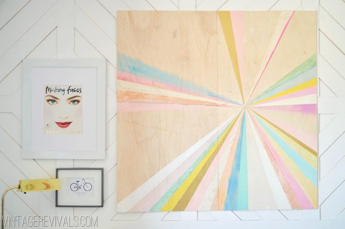
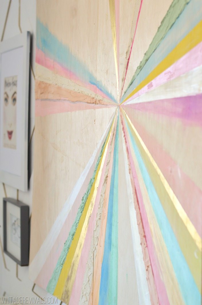
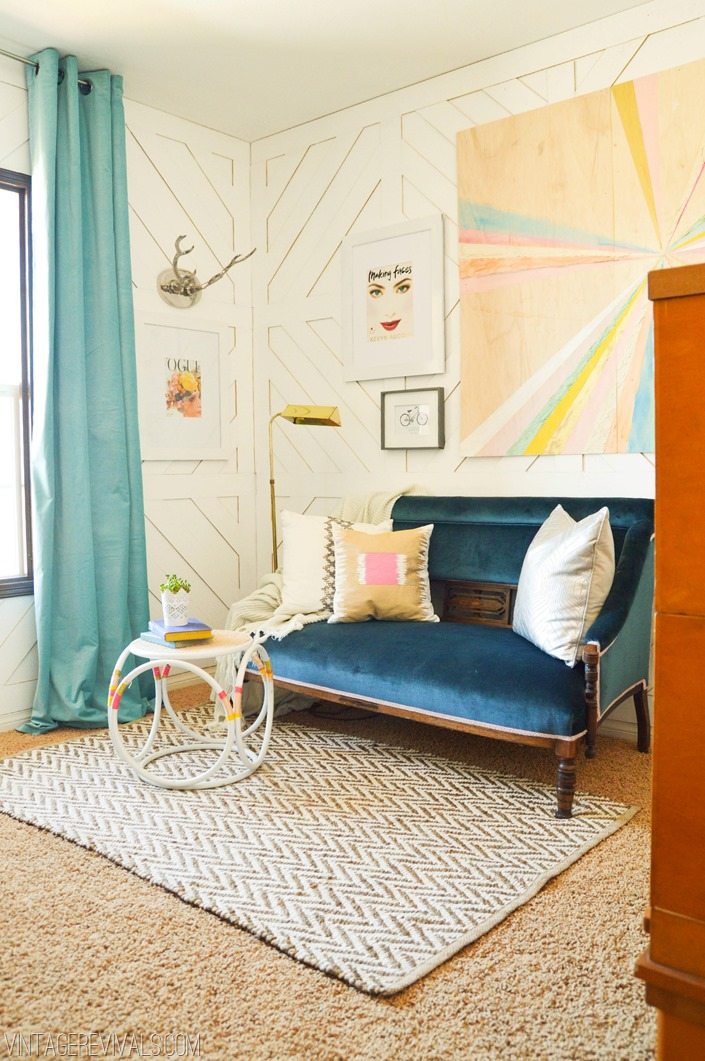
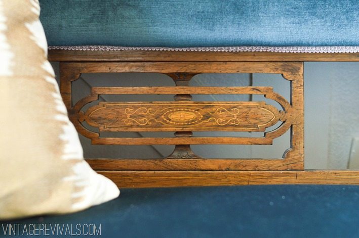
The amazing antique velvet settee is the stuff that dreams are made of. Literally. The blue velvet is in perfect condition, and it is trimmed out with pale lilac. Who does that? My guardian angel, that’s who.
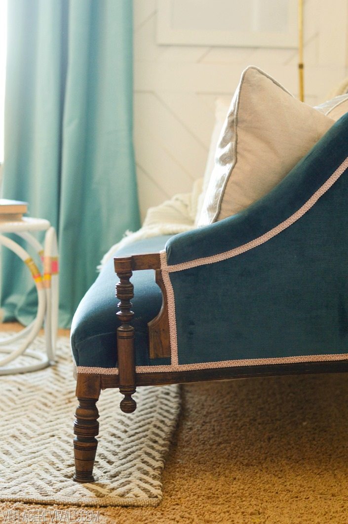
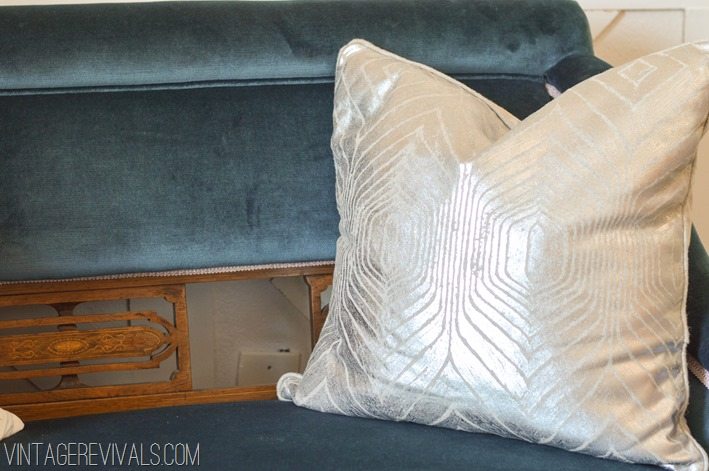
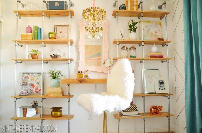
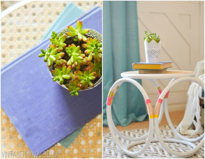
More than a beautiful room, Cara needed a space that was functional. I am talking major storage and somewhere that she could actually work her beauty making magic on. So transforming this idea I created a custom shelving unit that rocks the industrial glam hard. I cant wait to tell you all about the stool…his name is Miracle (for reals) and he has a little secret under his pretty white coat.

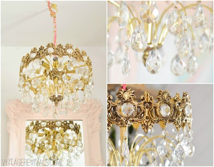
The ginormous ceiling fan HAD to go. In its place is an antique crystal art deco chandelier. Because the room is on the small side we were able to swag the light over the table and not worry too much about light displacement. That my friends is called a win win win. Also this is the part where I stop talking, because I know you just want to look at pretty pictures anyways…
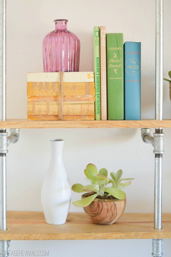
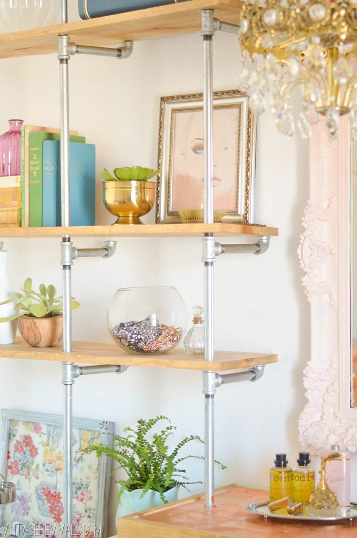
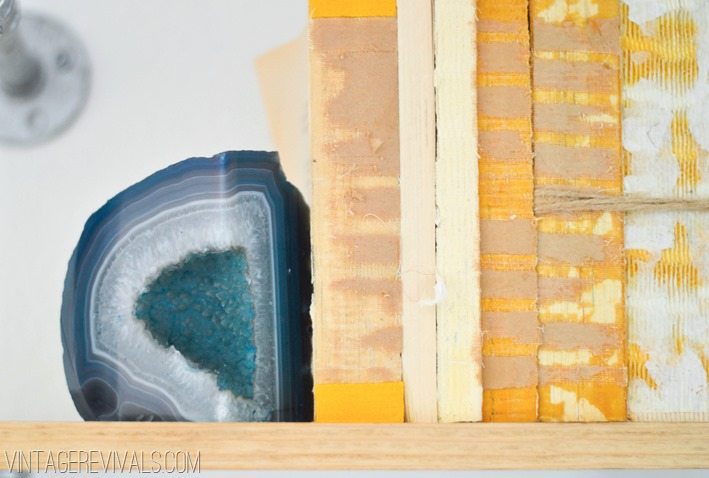
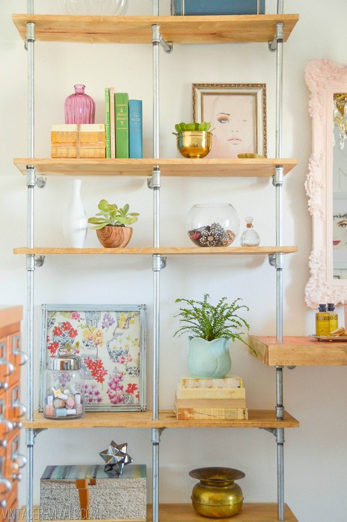
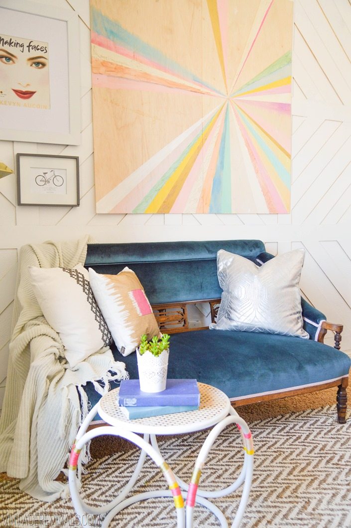
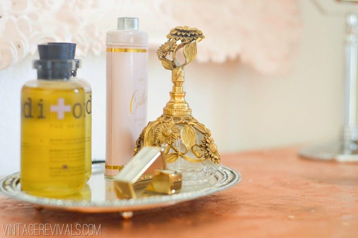


So good right?!
As amazing as this room is though, the best part was finding a bestie for life. Miss Cara I love you!
Next week begins the whirlwind of sources, step by step tutorials, and behind the scenes mishaps that went into creating this space from the ground up.
Ok now. Lets be honest. Dont you want to take a little bit of this room home?
EEEK! I want you to be able to take a little bit of this room home too!
I am doing something that I have never done before. I am giving away MaskCara’s Office in a Box to one lucky reader. It is a box chock full of treasures to create your own industrial glam oasis. Complete with pillows, rugs, art, and tchotchkes galore. I am going to be sneak previewing all of the goodies on Facebook and Instagram throughout the weekend, so make sure that you are following Vintage Revivals in both places! On Monday the giveaway post goes live! So make sure that you come back then!
And just for fun, lets look at the before and after again…

pssst newbies! Want to see more room reveals? Check them all out here.
And we are dying to know, what is your favorite part of Cara’s new room?

This is really a job well done Mandi! So feminine!
xo
Alison
Mandi, you are some kind of wonderful! Bright and feminine, this office makeover is insanely gorgeous.
This is freakin gorgeous!!! Are you for hire? Holy cow, love it!!!
My favorite part is Cara, of course! Can’t wait to see videos from her new glam surround!
Another genius makeover! Love the wall treatment.
Favorite – definitely the shelving!
Oh. My. Heavens. I want that trim in every room of my house! I am going to be re-doing my office after Christmas, and this post has got me all sorts of giddy about it! Can’t wait for the tutorials!
Before we get to my favorite part, you should know, since this is a photo heavy post, it was taking a while to load. With each pixel getting added, my mouth dropped lower and lower.
My favorite part?
It has to be the walls.
Or the shelves.
Or the objects on the shelves.
I would also take that beautiful piece of HGTV-inspired art.
You crushed this room. Crushed it.
Love, LOVE. I’m not a glam girl but love the room. Great job – you are incredible!
Your new site takes FOREVER to load. I didn’t know if you knew how slow it was. I don’t want you to lose followers or not get new ones 🙁 some of the pics still didn’t load after 5 minutes & I refreshed.
Mandi – you knocked this one out of park. For reals. It’s beyond gorgeous. And I am DYING over the wall treatment! Just gorgeous, gorgeous, gorgeous.
I not sure if there is one particular item I love most (even though the little side table is awesome), it is more the feel of the room. I love all the shiny elements!!!! I am happy the oil rubbed bronze is not the only option today ha ha. This room is beautiful and I need to go to Vegas for a makeover.
I love the way you re-did Cara’s makeup room. I am in love with the wall treatment and the industrial chic bookshelves. I can’t wait to see the tutes!
This room looks like a dream come true! I’m a new follower, but I was wondering, how do I become best friends with you and Cara???? 🙂
Absolutely fabulous!
LOVE LOVE LOVE the wall treatment. My favorite you have done so far! Also the settee and light fixture are amazing! Can’t wait to hear all the details. Also so glad I found Maskara’s site through yours.
This. Is. Amazing!!!!!!!! Seriously Mandi-SO awesome, everything about it is perfection, Cara must be over the moon! You can bet I’ll be back for that giveaway Monday!
Wow, I’m in awe of your talent. Seriously adore this room. THE wall treatment…I CAN”T GET OVER IT!! Can’t wait to see the tutorials. You rock!
What is there NOT to love about Cara’s room? Oh my goodness, it is gorge!!! Mandi, you have such a gift, for reals! I love coming to Vintage Revivals, and because of you, I also have been living Maskcara too for the past few months!! Very inspiring- love you girls! -Kristine
You are awesome-sauce!!!! Literally have new words for that wall…so freaking cool!!
omg I loveeeeeeeeeeee it. it’s so so perfect.
I started following Cara a few days ago…what a great surprise when I saw you had redone her office! This is my favorite redo of yours! Very feminine…LOVE IT!
Mandi – love love love the wall treatment and can’t wait to see the tutortial for that and the awesome shelving that I’d love to recreate for my son’s room so he can display his collection of garbage trucks!!
Oh I love this so much! My computer was totally flipping out while I was trying to see this post for what ever reason & I was dying of anticipation! Once I saw it was going to let me see it I went & made myself a cup of coffee to have while I read it & soaked it all in. I don’t have a beauty office but I have a sewing studio and I want to use so much of your ideas in this room. I could go on & on. I love the artwork and I will be doing it. Awesome room!
Mandi — Wild for the wall treatment! The room is inspiring.
Amazing job Mandi! I love the shelving, the chandelier, the wall covering, the artwork, the settee…um ok pretty much everything! 🙂 You are so talented!
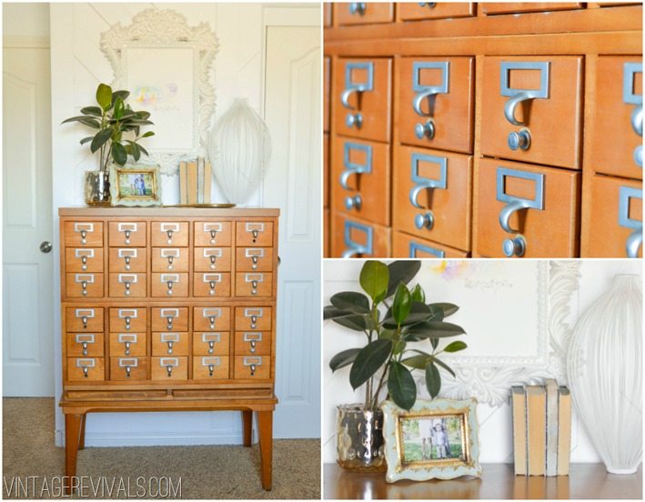
I love your transformation! OMG! I don’t know if i have ONE favorite because i love the dimension you gave to the items on the shelves, the texture that the tone on tone wall pattern showcases, and your vintage touch in the velvet settee, the chandelier, and parfume bottle, etc. Oh yeah, love the antique (so hesitant to use that work since I remember these in my library growing up) library card case too. 🙂
Looks amazing of course. Love you both!
Mandi this room is amazing! You definitely got the glamor aspect right. I am obsessed with that velvet settee! You did such a great job. This page did take forever to load, just thought you might want to know.
My favorite part is how you built all the shelving for her makeup but there’s no makeup on it.
Ha! That is what the card catalog and closet is for my dear!
xo
m
I’m one of Cara’s readers and I just became one of yours! Its so hard to pick a.favorite part but the nerd in me is dying to have that card catalog!
Oh. My. Gosh. That wall treatment is a-mazing! Great job (again), Mandi!!
This is incredible. I am in total awe. Great job.
I love it all! The devil’s in the details. Amazing work. So inspiring!
That art is so great!!! Please tell me that this is DIY and that this WILL be a future post…right! I would love your guts if that was the case’;)) And also, you have an amazing sense of wit and humor that really translates in your blog! Always makes me laugh out loud
Of course it is a DIY and the post will be up next week! Its the first tutorial coming out of the gate!
xo
m
Fuzzy chair! Instant relax for next makeover …. genius
!
Fuzzy chair! Instant relax for next makeover …. genius!
A-M-A-Z-I-N-G!!! I absolutely LOVE it! You’re awesome!!!
Mandi,
I love what you did. Industrial Glam isn’t exactly my taste, but that room makeover is amazing. The white paint really helped brighten up that space…and I luuuuuurrrve that Velvet Seatee! beautiful. I was wondering, as a fellow renter, any thoughts or recomendations (for or against) temporary wallpaper. I was looking at maybe adding faux beadboard wainscotting to our “dining room” with it. Any thoughts, ideas? Thanks, can’t wait to check out all the other before and afters on your blog!
Sara I have a post coming about this exact thing!! Stay tuned!
xo
m
This came out AMAZING! I can’t WAIT to see how you did that wall with the wood pieces, I’m so curious how thick the wood is. I really love it!
Wow…this is amazing. My favorite part is definitely the wall treatment, although the card catalog is close second. You did a fantastic job!
Amazing! What a fun work space!
You are seriously ridiculously talented.
You are a genius woman!! My favorite thing in this room is the wall treatment, show stopper!
This is gorgeous!!! Could you give more details about constructing the wall treatment? I love it!
I think I want to cry–hands flapping at my face and everything. This is amazing!!!
are you serious?? This is epic. Will you move in with me?
My office Next Mandi, it’s just as boring (albeit much more crowded) and needs a mandilicious touch. I want to rip up the carpet, stain and stencil the cement floor, add some glitter, paneling, a great light and of course paint and art…
You are so talented!! I love everything about this room!
The room is just amazing – love all the vintage finds and how all the colors go together. I would love to just hang in this room!
This is AMAZING!! I don’t even know where to being to say what is my favorite because it is ALL my favorite! You continue to amaze me with your decorating skills and DIY skills. I need you to come decorate my entire house!
You are just beyond talented, my friend!! I want you to go on Design Star. Really. And maybe come and help me. 🙂
that wall is amazing! can’t wait to see the tutorial!
GAAAAAAHHHH!!!!! It’s insanely, fabulously wonderful in every way!
Cindy
Blown away again! Girl, you never disappoint! This is one of my faces! Love the girly glam style mixed with the industrial!
Love it!! The paneled wall is amazing, and I am in love with those curtains!! The colors are so fresh and feminine and totally transformed the room. Great job, Cara is a lucky girl!
Darn auto correct! My face is not in that picture. But I wish it was. A Mandi makeover and a Cara makeover = ever girls dream come true! I meant to say that this is one of my favorites!
love the shelves
that settee made my heart stop.
WOW! You are amazing! This is incredible.
the wall treatment is ahhmazing!!
I love you Mandi! Such a great design lady!!
xo-Kristin
When I scrolled down to see the first ‘after’ photo, I literally said out loud, Holy Shit. That is all kinds of awesomeness.
I LOVE this! my favorite part is definitely the pale mirror/furry chair/desk area. I want that for my house!
Super, amazing, fabulous. And Miss Cara totally is deserving!
Holy crud. Just…wow.
But I don’t need a whole office in a box; I’ll be happy when you get to the art tutorial. And mah butts NEEDS to chat with Miracle. And also I need that chandelier’s twin sister… *sigh* Yep. I need the box.
PS, I totally just added “go all Hildy on it” to my word arsenal.
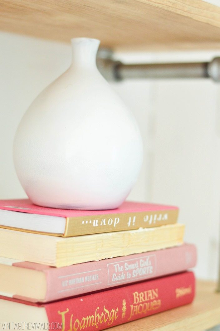
Absolutely beautiful! You did such a smashing job on that room. That settee is to-die-for (and to even have something that can be legitimately called a settee is glamorous on its own!) and the shelving is wonderful! I love how you have books where the spine covers have come off. I have a bunch of those too because I love how they look even without the spines. It’s good to know I’m not strange for doing that. 😉
Seriously amazing! This is so chic! Can’t wait for the tutorials!!
Yupp. You’ve done it again! LOVE LOVE LOVE.
The molding is absolutely amazing! Great job!!!
My favorite part is the card catalog… I have a bit of an obsession. I have been wanting to get my hands on one for years, but can’t talk myself into making the plunge. All the ones I find are all sorts of expensive! Great job!
LOVE THE ROOM. YOU ARE DEFINITELY LOVING A “LOOK” LATELY BUT IT REALLY WORKS HERE. WISH I COULD SEE THAT ARTWORK UP CLOSE- I SEE THE TEXTURE AND METALLIC AND THEY NEVER PHOTOGRAPH AS WELL AS I KNOW THEY MUST LOOK IN PERSON.
Absolutely awesome! Love it. Wish I could have make up room of my own 🙂
Great job! It doesn’t even look like the same space. I can’t wait to find out about the walls, I have ugly orange peel walls and I am dying to find an easy solution for them!!!
I am in.LOVE.with.this.room!!!! It’s funky fresh and retro glamorous. Love it! And you killed me with “before you go all Hildy on me” lol! Didn’t she want to make you throw something at the Tv?!? She was creative sure but all I wanted to see was good design, not a room full of sand. Anywho Laurie was my fav. Great job as always Mandi, you are fabulous!!! 🙂
WOW! Love this! The room looks amazing. I know Cara and her readers will thoroughly enjoy the new space!
I’ve followed you for a long time now, but never commented until now. This room is flippin fantastic!! Girl, you are pure genius! Thank you for sharing your gift with us!
I follow both you and Cara and I love you both to pieces! This is the best collaboration between my 2 fav bloggers! I especially love the wall and art pieces around the room! I can’t wait for the giveaway!
Congrats Mandi! & I’m congratulating you on your success. Because if you haven’t been discovered by some massive celebrity/ connection (such as someone like Nate, but bigger) YOURE ABOUT TO BE!!! Someone’s about to make your massive dreams come true…. Your STUPID (that’s a total compliment) talented!
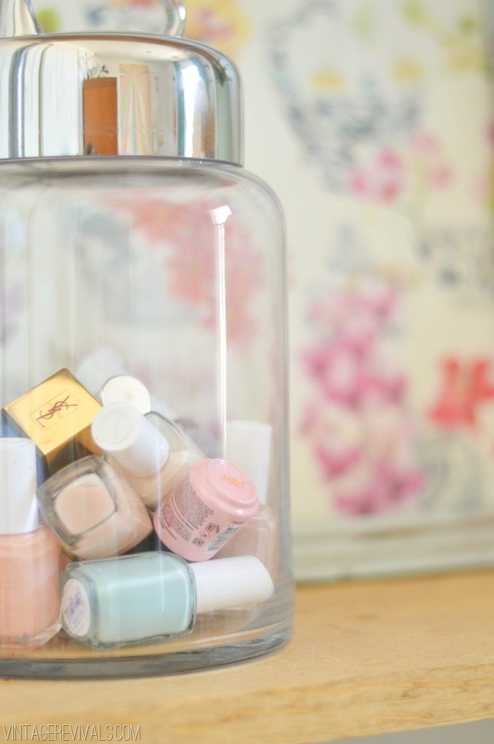
Wow! I love the effortless mix of vintage and modern. It’s good to see some brass make a comeback. I’m using the idea of the jewelry in a bowl and the nail polish–I need to go get some pretty pastel colors, just ’cause! You did a wonderful job–I’m looking forward to the “makeover in a box”. I’m glad Cara has the beautiful place she deserves–so long ‘liver problems…’ Hugs, Kim
I am dying over this room. I want that card catalog.
You never disappoint!! I was dying over your ombre honeycomb wall and now this one is just as a-mazing!! I love the industrial shelving in such a girly space–great contrast. I love the little table too and the pop-of-color string you wrapped around the circle legs for detail.
this is WOW!
I love your mix of styles that all seamlessly flow in this room. But what I LOVE the most – that settee. I’ve been scouring the internet for a settee just like that for part of the seating for my kitchen table. I need it!!!!
Can’t wait for the wall tutorial. Also hurry with the secret to Miracle! Curious – why rip binders off the books? Don’t mind the texture of the spines, but love my books with their own personal binders.
yes sirree! stunningly gorgeous! the wall art is jumping out at me but it’s all AHHH-mazing!
MANDI!! I just gasped out loud and my hand flew to my heart like a movie! This is the most stunning thing I have ever seen!! What a transformation!!!!!! WOW!!!!! I am beyond obsessed with that wall! And THAT CHANDELIER! Perfection! The whole thing is unreal. Pretty please go be on Design Star, dear. I need to watch you in action every day on HGTV! WELL DONE! Cara is so lucky to have you as her bestie!!
ONE WORD- {GORGEOUS!}
the couch and card catalogue are lovely
PLEASE PLEASE PLEASE PLEASE PLEASE PLEASE (must I keep going?) PLEASE do a tutorial on how to do those amazing walls!
Love it! the Shelving and chandelier are my favorite I think – love the pink chord – just makes me happy. The entire room is inspiring. And since I’ve read some comments above about how long it took to load, I just thought I would mention that it didn’t take long at all for my computer to load. It was all up quick. So I am not sure what the difference is, but wanted to let you know that we are not experiencing the slow loading.
I hearby name you the Queen of Amazing Wall Transformations! Seriously digging this. Everything about is awesome. GREAT JOB!!
Okay, I have to admit, I was getting a little impatient. But, OH MY HEART!!!! This reveal was so worth waiting for! Can’t wait for your giveaway. Would love to have some Mandiliciousness for my house.
Hi Mandi,
I LOVE this room. I love how you incorporated so many different elements into it: hardware with the plumbing shelves, earth with rocks on the shelving, chic with the settee, unconventional with the card catalog. And I love how bright and chic it all is. Great job!!!
I’ve been a huge fan since I saw you and your home featured on Nate – gosh, how I miss his show. If I remember, you did an acid-type wash on mirrors so that you could put lace or something behind it. Was that you? If it was, how did you do that?
Keep up the great work and keep on designing! You really have a flair for the process and for understanding a person’s needs.
Best,
Michelle Ziemba
Hey Michelle!
Those were the good ol days right? Here is the tutorial for an acid washed mirrors https://vintagerevivals.com/2010/11/anthropologie-acid-mirror.html
xo
m
Amazeballs. Absolutely amazeballs. Love every single thing about this room. You are amazing! I think my fave is the blue sofa (gorg!) and the white wicker ottoman. Genius!
Holy amazing! I can’t believe it’s the same room, great job! Also, it was so fun to see you guys together. You have such similar stories that it just made sense in my mind that you guys are friends.
Holy WOW! You 2 amaze me! You have NO idea how much I would love to be able to fly YOU & CARA here to change ME & my home! If I win the lottery I’ll be sending both of you tickets…ever been to Chicago?!
Wow, wow, and wow! It is stunning and I have to admit the wall is my favorite! But the art is super cool, and the settee, and the chandelier, and the shelving….aghhh! You totally rock!
MANDI. mandi mandi mandi MANDI!!!! You are out of control amazing, seriously!! I can’t even deal with how much I LOVE your rooms. Most bloggers/designers, I can pick apart the space, see how they got there, picture myself arriving at a lot of the same solutions, which is not a bad thing, just a little predictable. You, on the other hand, you take trends and make them seem crazy fresh and out of the box! Your rooms just have this thing, I can’t put my finger on it, they are just stellar! Places I could live in forever and ever and never feel like I’m missing out on any design trend. Bravo girl, you get it!!!!
Wow, OMG. I was left speechless when I witness the make over of Cara’s room. What a great job. I agree with one person before me who stated that you incorporated so many meaningful pieces into the room. The plants give life and better oxygen to the room, I adore the card catalogue, I also adore the chandelier with the white furry chair. This reminds me of my favorite hair guy who creates miracles with his hands and eyes. He is a Master Stylist. And for the past two months that I’ve been following Cara, I know she is a Master Make up Artist. Now with this wonderful room, the best is coming. You are a great friend/person.
OMG! Mandi! You have outdone yourself! I gasped when I saw what you did with Cara’s little room. I looks AMAZING! Completely transformed! Get it girl!
Uhhhhh….. errrrthing? Well, I guess if I have to pick it would be the chandelier and the art work layout.
“Now before you go all Hildy on a room…” – literally the funniest thing I’ve read on a design blog. Love the transformation!
This is out of control amazeballs! Aaahhh! I love the wall treatment. I mean, I’m pretty creative, but I never would have thought of that bad ass wall treatment. Killer!
Wow! Huge transformation! You created such an amazing space.
It looks amazing!! Favorite though is for sure the DIY art you did!! In love.
Holy smokes! I love it! I can’t believe how much you lightened up the space. It’s beautiful!
Wow wow wow wow wow. Wow.
HANDS DOWN you ARE one of the most talented and inspiring gals I know!
Amazing Job!!
Love the room! The spittoon seems an odd choice for a makeup room however. https://en.wikipedia.org/wiki/Spittoon
WOW this is amazing. you are super talented!
I love it all but especially the big beautiful art you made. I just made your string art (a heart but changed love to LET IT BE and used grey string). Now I must make this one. Where to hang to huge peices like that in my tiny house ? haha.
EEEKKKK!!!!! i love it!!! so bright and clean and vibrant ! i think the sheves are my fav!
I adore that wall. Can’t wait for the tutorial…. it may be recreated up here in Toronto in my boudoir.
This is amazing Mandi!! Love what you did here 🙂 xo Kristin
Really lovely! I think the walls are definitely the biggest transformation. I’m sure it’s important for it to be light and bright for Cara, and you definitely accomplished that! Great job!
I don’t usually comment, but this room is just stunning. Also, just wanted to say thank you soo much for introducing me to Cara’s blog. She has completely changed my “beauty life”. A sweet little space for such a seemingly sweet person. Perfect.
There are literally no words…absolutely none:)
I absolutely LOVE this room. Seriously one of my favorites from you. Love, Love, Love!!
I am in love with the Chandelier! I will have one like that one day!
I love love love this!! I especially love the shelves and am going to copy them for my office. I love your taste you always provide me with inspiration.
PS My daughter Anna is in Dylan’s preschool class, I’m the one who told everyone you were famous at the open house and was completely nerdy. That’s me, just so you can picture who I am:)
Talk tol me about the silver looking antler on the wall….and that velvet sofa……SWOON!!!
AWESOME! LOVE the colors, love the shelving…love it all! Recently found your blog and I find it so inspiring. Keep up the amazing Make-overs!! 🙂
Girl, WHAT?????!!!!!! You are a miracle worker! That room is so amazing. I wish I could have you come to my place and work some magic!
-Becca
Ladyface Blog
It is like, disgusting, how talented you are.
I am in love with this room; I want to marry it and have a family with it! Cannot wait to see all of the details, tutorials, etc. because I am definitely taking this inspiration home with me!
Wow. Just wow. This is the most beautiful room ever. I want to do this to my sewing room! Did you make the shelves from scratch or from a kit? I NEED them in my sewing room. NEED!
So AweSOME!
The nailpolish in the jar is my favorite!!
What an amazing transformation! You are so talented! I wish I had a friend like you!!! xox
Lou from http://www.littlewinglou.com
GET. OUT. !!!!! Shut the front door, this is AMAZING. I cannot begin to believe your talent here, girl! I mean, c’mon….where in the heck do these ideas of your come from?? I do not have that talent…..if I happen to come across a picture of something I like, I copy the ENTIRE thing….no, I do NOT just get one or two ideas from said picture, and “run with the rest….”, I must copy the entire thing, because I am THAT unskilled. You killed it, Mandi…..F’real. 🙂
Wow!!!!! It is all so stunning. I could never pick just one favorite!!! I follow her on youtube so I was so excited to see that you guys teamed up!!! Love the space! xx Liz Marie
I love everything! Coming back to see how you did it all. Just amazing!
I’m I obsessed and so proud I get to call you family. Holy mother Hannah you are talented and funny and gorgeous and talented. Your mind is out of control creative and I just want you to decorate my whole house when I have one. Love your guts my cousin and I miss you and wish you lived closer!
That is really a huge turnover, it looks million times better after. And I just loved the shelves gonna copy them..
You did good my friend! And, yes, that settee is FABULOUS!
I am soooooo using that shelving idea around my tv!
This office is AMAZING. I feel like it was meant for me! But it’s not for me, so that’s sad. But congratulations on being so incredible!
I am officially lost in the rabbit hole of vintage revivals now. I recently moved to alaska, rent, and have been looking for some awesome statement pieces to try to decorate around, but people in alaska have mostly functional furniture, and everything has to be done from scratch.
I would LOVE to find a card catalog like the one above, but alas, I think not.
Thanks for the awesome room reveal, I definitely am inspired!
Love the Wall treatment, curtains, and shelving! The poofy chair and chandy are THE perfect touches. Amazing before/after shock!
Omg this is the most amazing thing ever! I am completely in love with this room!! And I can not believe how amazing this giveaway is! <3
I absolutely love this Mandi! What great work! I think it would be cool if you could give a project financial breakdown if possible. I have been planning our own pipe shelving, and I’d love to know how much that cost for you to do!
What made the room for me is that you had Brian Jacques on the book shelf! Good choice. Love the book shelves, the plywood art, the rug… isn’t there anything you can’t do?! Thanks for inspiring us all to find the awesome decorators we can be.
Hi mandi. This room is amazing! I recently saw an entry way table made the same way you did the shelves… Wood boards & pipe. I LOVE the industrial look & have been dying to give my home office a pick me up. A new desk & bookcases are exactly what I need & have been planning to make a desk this way… And now I wanna do the shelves too! Can you give me any info on how you did this… Like how many pipes? Did they come those lengths or did you cut them? How did you cut them? Etc… It seems fairly simple, but I’m sure there are a few tricks you may have picked up that you might be able share. Thx!!!
I am DYING over those walls! Holy cow, how did you DO that!!!
Oh my goodness!! This is one of the most beautiful and original rooms I have seen in a very long while! I love the colors in your artwork and how they play with the sofa. I have a selfish question, where did you get that fabric? I am looking for upholstery fabric and so far all the places I’ve looked on/in have been futile, either too expensive or no luck with the quality of the fabric when I did find color. Continued success in all you as I really enjoy looking at them.
This was one of my favorite parts of this past week! So beautiful, it made my September Make/Read/Got/Loved/Ate round-up 🙂 https://paintingsunny.com/2013/09/30/made-read-got-loved-ate-in-september/
Shut up and step back a few.
I’m percolating an office redo and want those walls. Or something like it. I’m putting my thinking cap on and am going to try not to hurt my brain too much.
Loves, baby. True Loves.
Where did you find the chandelier? I am looking for one similar in style and I am running into issues because of budget. Can you share some of your chandelier finding tips? Beautiful before/after!
Would love to know where that rug is from?! Gorgeous room as always!!
Oh my gosh – I love this room! I’m a new fan to you, but have been a fan of hers for a while, and kept wondering if you two were related. You are both amazing – and beautiful to boot!
Lovely! Where is the rug from? Thx!
Homegoods! xo
Quick Q about the curvy little cutey on the floor there next to the loveseat: Looks like a piece I’ve seen on one of those “why am I looking at this catalogue while my bank account laughs at me?” websites, but is it DIY? …buhcuz the cerebral gears be starting to whir and chug at how I can do this on the fuhreal discount…
Wow Mandi, so glad I found your page. I checked out the Home Depot site and they are featuring THREE of your projects on the front page! Can’t wait to attempt some of your hacks in my new apt. Thanks so much for sharing your great ideas!!
I love your style and have been trying to achieve a similar style in my own (very tiny) Brooklyn apartment. The biggest issue I’ve had is designing around a tv. It’s been hard to balance utility (needing the space for storage & display) and aesthetics (not wanting to overcrowd the largest wall in the living room). All the posts on other blogs I’ve seen about designing in “small” spaces are by no means New York small. You made great use of a truly small space here and was wondering i you could give advice about deciding how to make the most of tiny, but multi-purpose rooms. Thanks!
I know this is an old post but just wondering what material you used to do the wall treatment / fretwork boards idea. I am trying to do something similar on a mirrored wall with closet doors that would be glued on – basically I want a super-thin molding effect – like a DIY version of O’verlays https://www.myoverlays.com/