This post is sponsored by Sherwin-Williams®.
It’s the best time of the year!! No it’s not Christmas, its Sherwin-Williams eighth annual National Painting Week!! For the last 6 years we’ve celebrated with everything from Dylan’s viral Hexagon Room to adorable playhouses for Utah Foster Care.
This year’s deserving nonprofit is one that is making a huge difference in the lives of teenagers in Southern Utah. Youth Futures is a homeless shelter just for teenagers ages 12 to 17. They offer everything from a place to live, to drop in services like laundry, and provide food and clothing. They recently acquired an old dentist office next to the house for intake, counseling, and admin offices and that is where we worked the Vintage Revivals magic!!
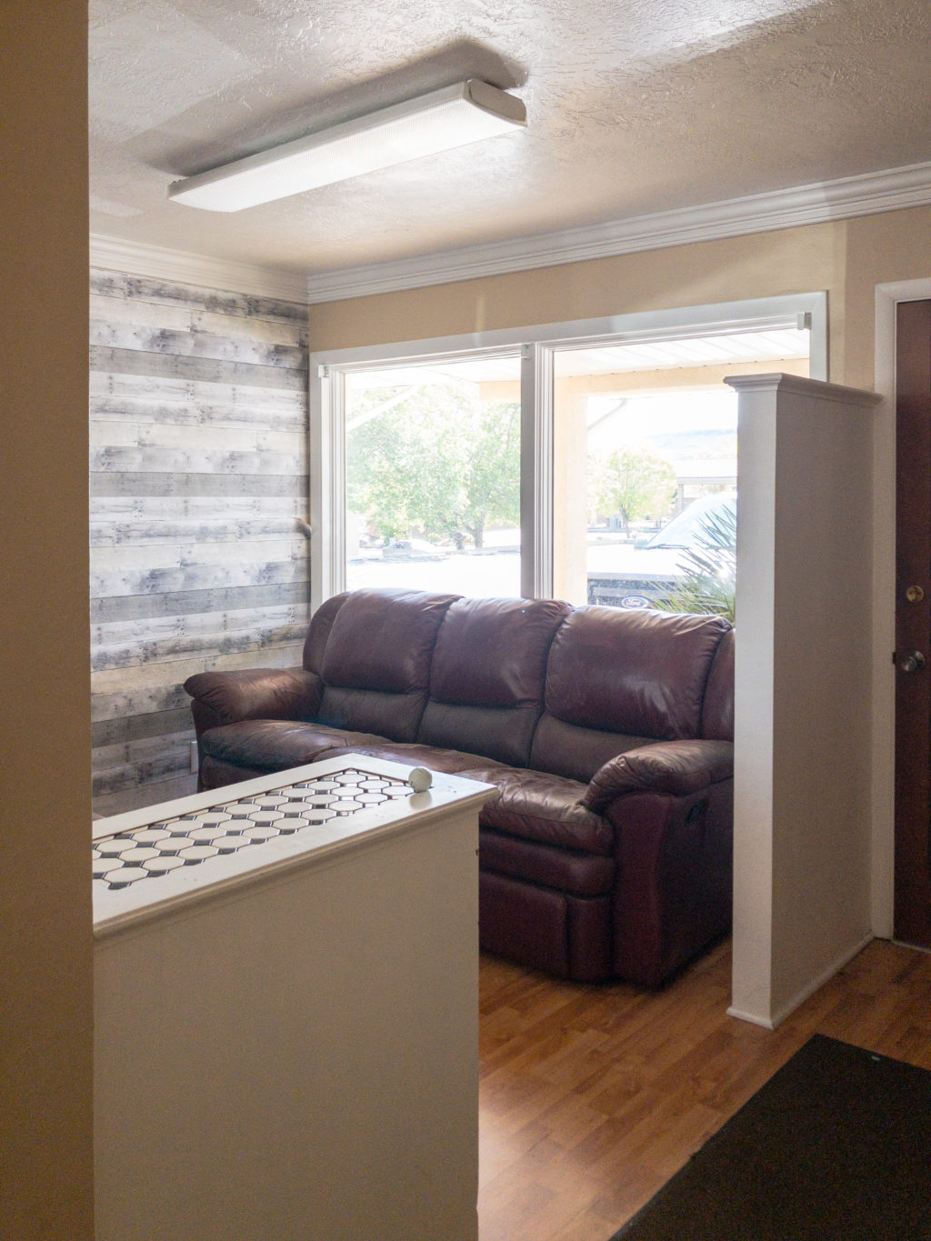
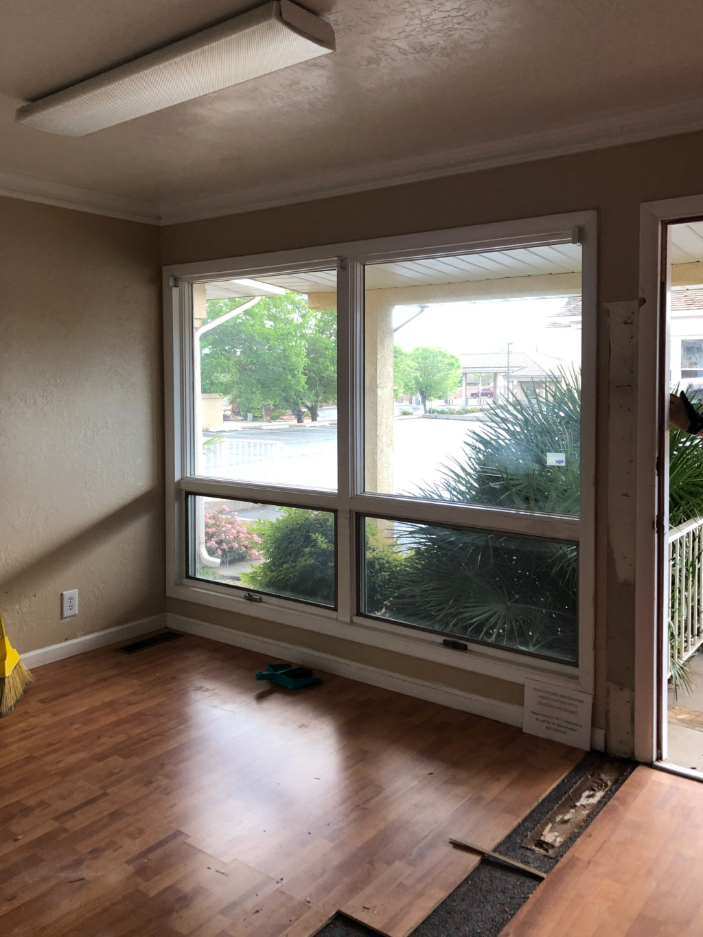
When we started, the reception area was not great. It’s a pretty old building and things were just added throughout its life. Including giant reclinable couches – which are never a great idea but especially in a tiny room where reclining would be weird.
The first thing we did was clear off the walls, which meant down came the mirror and temporary wallpaper. We also demoed the pony walls. The space was already pretty small, and that broke it up and made it even smaller.
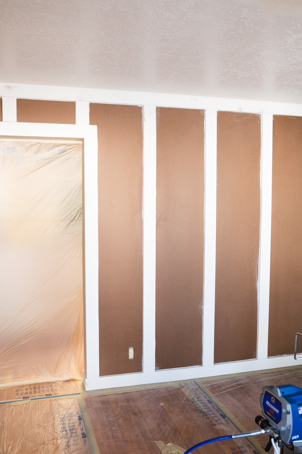
Sometimes when you’re working on a project like this you’ve got to just roll with the punches and have a loose plan. Each layer of stuff removed reveals more info, like an onion. Once we took the mirror and crown molding off we learned that the wall texture was added after those had already been installed. Matching wall texture is an art form, and that was a big project and also not a super stylish one. So the solution that we came up with was to cover all of the walls with hardboard to give us an even (and very elevated – you know how I feel about smooth walls) wall texture.
To cover the seams we used battens, or vertical boards.
Once everything was installed, puttied, caulked, and cleaned, it was time to paint!!
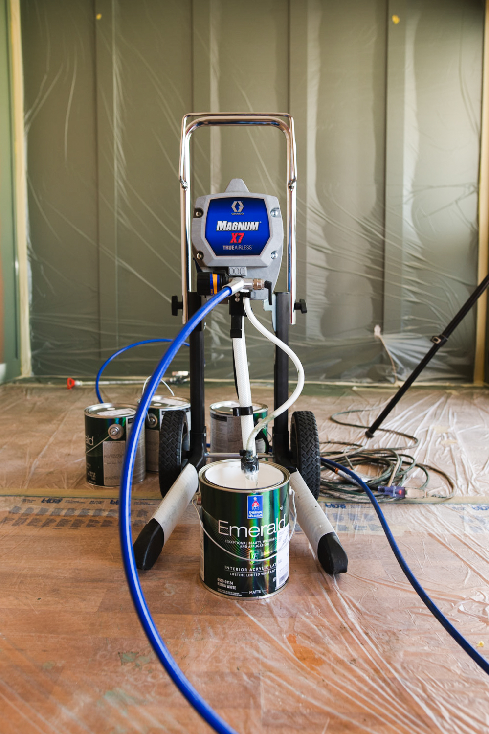
For this space we used our Graco GX7 paint sprayer and MAN do I love that thing. When you use a paint sprayer you’ve got a ton of prep, but the finish is incredible and it’s so satisfying!
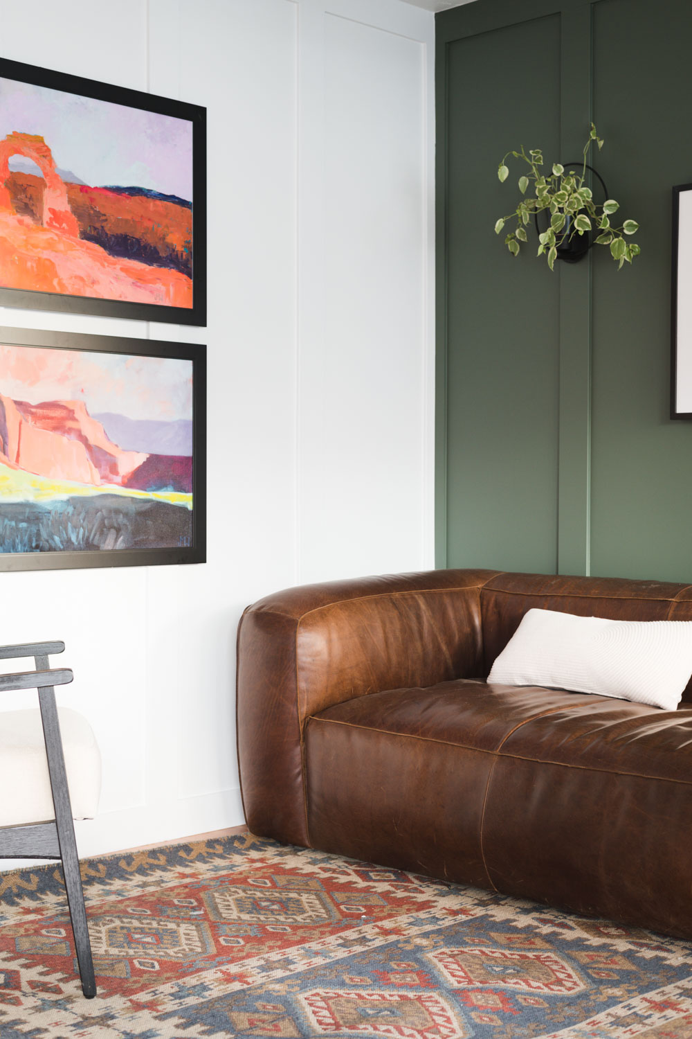
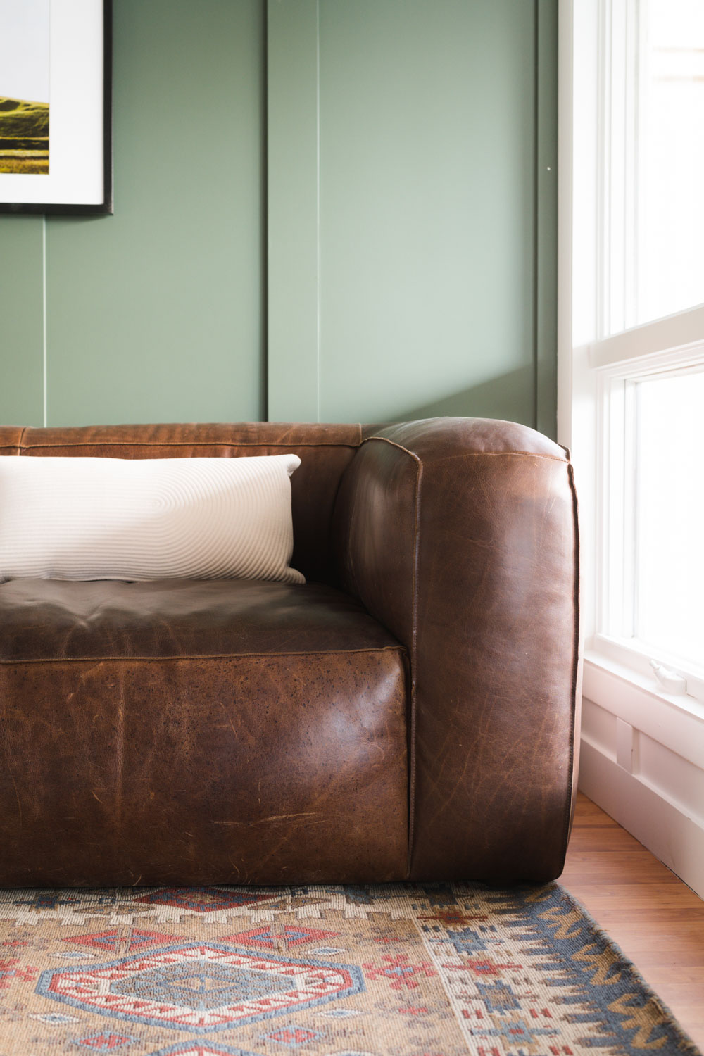
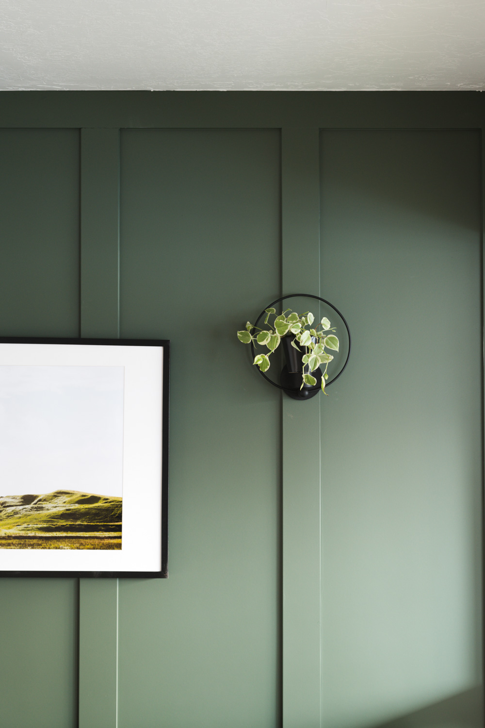
The color that I chose for the accent wall is called Rosemary SW 6187– it is the perfect dusty deep green. I’m going to use it in one of the bathrooms at the Merc because I am SO obsessed with it!! If you are looking for a great green, look no further!!
If you are painting an accent color in your space (and using a sprayer) paint the accent wall first and once it’s dry, tape it off and paint the rest of the room. It’s way easier to tape off one wall than 2 walls and a ceiling- which is what I’d have to do if I painted the white color first. The white I used is my secret formula for THE BEST WHITE PAINT IN THE WHOLE WORLD. You can find the recipe here! For this room we used Sherwin-Williams Emerald® Interiorin a Matte finish. It’s really important to make sure you’re using the right kind of paint for the job you’re doing!!
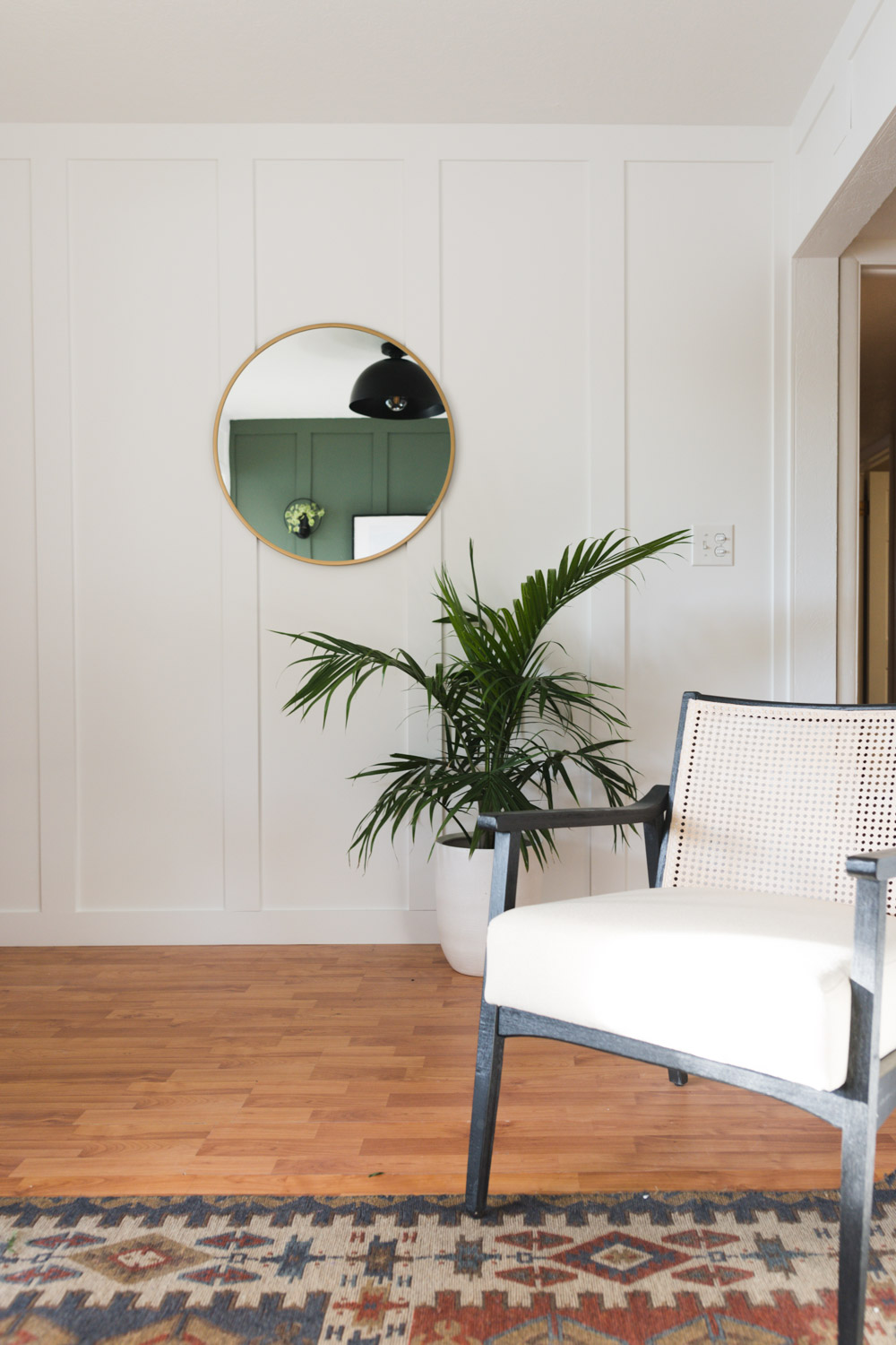
And this is what the space looks like now!!
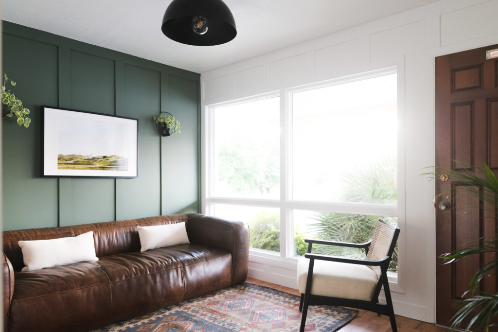
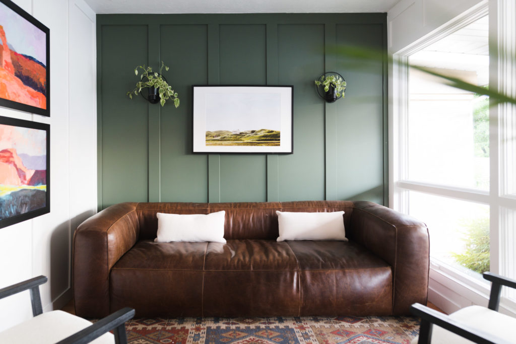
Could you die!?!
I mean, it could be a living room! The couch is from Article, the chairs are from Target (painted black with Sherwin-Williams Emerald Urethane Trim Enamel in Tricorn Black SW 6258. You can read a step by step guide on how to paint furniture here!) and the art is from Juniper Print Shop.
It doesn’t even look like the same space!! My favorite kind of transformation!!
I just want to give Sherwin-Williams a huge thank you for partnering with me on this series every year. It is just the best to give back to my local community and I’m grateful for their hand in helping countless people!! Xo



Holy WOW! I would happily live in that room. Amazing.
Amazing! Can you come to Canada and do a room in my house, any room really, lol! But seriously this room looks amazing and it looks so much more inviting and calm which is just what you want for intake. A clinical room will just elevate anxiety in a teen, especially a teen in distress. But I have to know, where did you get the wall planter?
Mandi, That looks amazing! I hope you get to help with the rest of the office. Your vision and touch is impeccable. Thank you!
This is beautiful!
WOW! That looks… amazing! Using a green colour on walls is probably the trickiest, I don’t know how you kepp nailing it every time. Great cause, you’ve made a real difference.
Wonderful job!
I hate to be this person, but resource for the chairs? I think I am in love with them.
Amber – I found on Target web site but it looks they might be discontinuing soon. Most stores in my area don’t stock it. Check it out the name is Chelmsford Cane Lounge Chair. Maybe you’ll be lucky.
OMG!!!! That is by far one of the best transformations I’ve ever seen! You are right, I could totally live in there. This is how my livingroom should look like. Everything looks really well put together. Your best work, Mandi!
Greetings from Germany.
Looks great! How did you patch the floors?
I am wondering the same thing! Looks wonderful!
This looks fantastic! I love the simple yet so beautiful decor. A few simple pieces in complementary colors and it is heavenly.
This turned out gorgeous! Where is the light fixture from?
You rock with your writing!! Spectacular one for sure.