You guys! I’m so excited to share this fun dining room makeover with you!! Before you keep scrolling I want you to close your eyes (I mean, not really ‘cause you have to read, but pretend to close your eyes.)
Picture Home Depot (just go with me on this). Picture all of the things that Home Depot is known for. Now buckle your seatbelt ‘cause you’re about to be blown away.
I’ve had the pleasure of teaming up with Youtube darling Aspyn Ovard for a complete overhaul of her house.
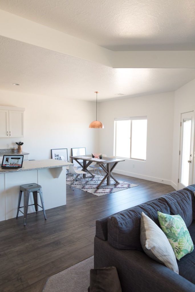
When we started out with not a lot. If you remember, her house is a new build and you could tell. In other words it was very basic and very empty. Her style is young, fresh, and a little mixed bohemian. I wanted the space to feel clean, eclectic, nothing super structured, formal, or traditional. Full of life, yet still calm. Tall order? Maybe.
Are you ready to see it now? EEEEE! This is my favorite part!!
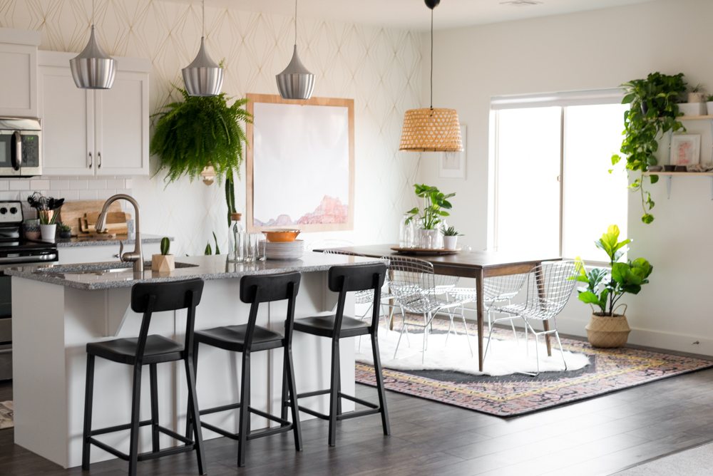
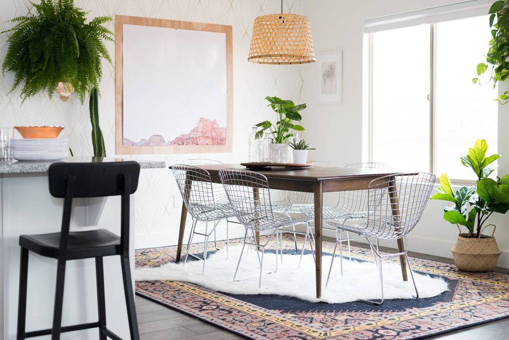
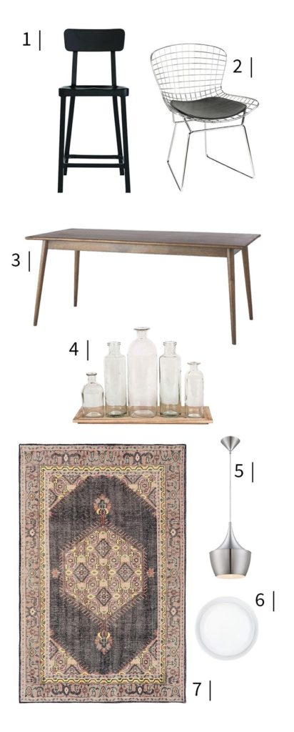
Have you ever dug into the furniture that Home Depot has on their site? YOU. GUYS. They have an entire sister company called Home Decorators Collection and it is SO good!! In fact, everything in this room makeover is from Home Depot!! I know what you’re thinking. The Midcentury table? YES! The Modern Wire chairs? YES! That KILLER rug?!?!! YESSSSSS!!! (Don’t worry, I’ll link everything below!)
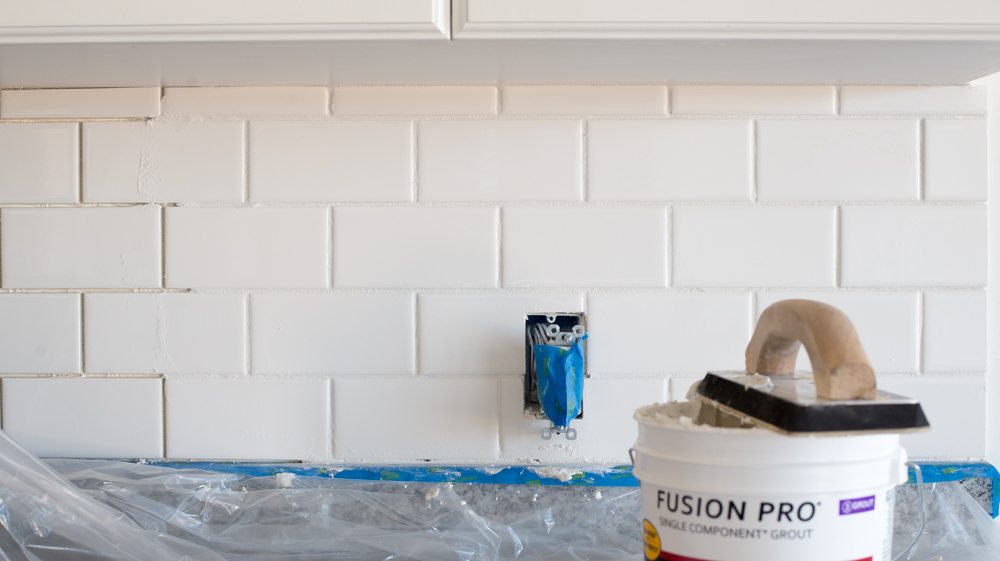
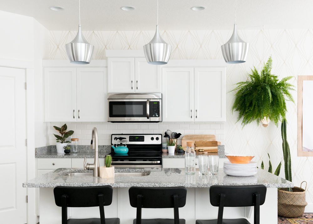
We took a few hours at the beginning and tiled the backsplash with basic white subway tile that your local Home Depot will have in stock (remember how I’m currently obsessed with that?) It immediately took the builder basic feel away. This is a great post all about choosing the right grout color for your project!
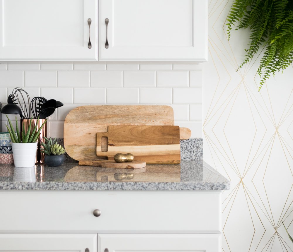
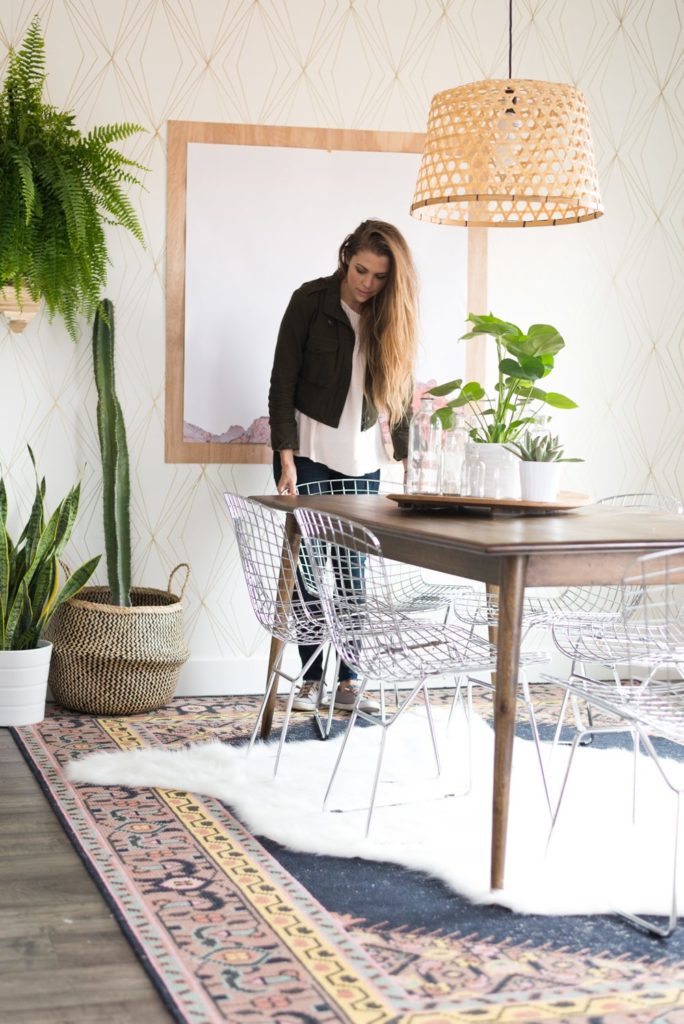
The next project of the space was the Sharpie wall. Who doesn’t love a project that looks like custom wallpaper but only cost $8.00?
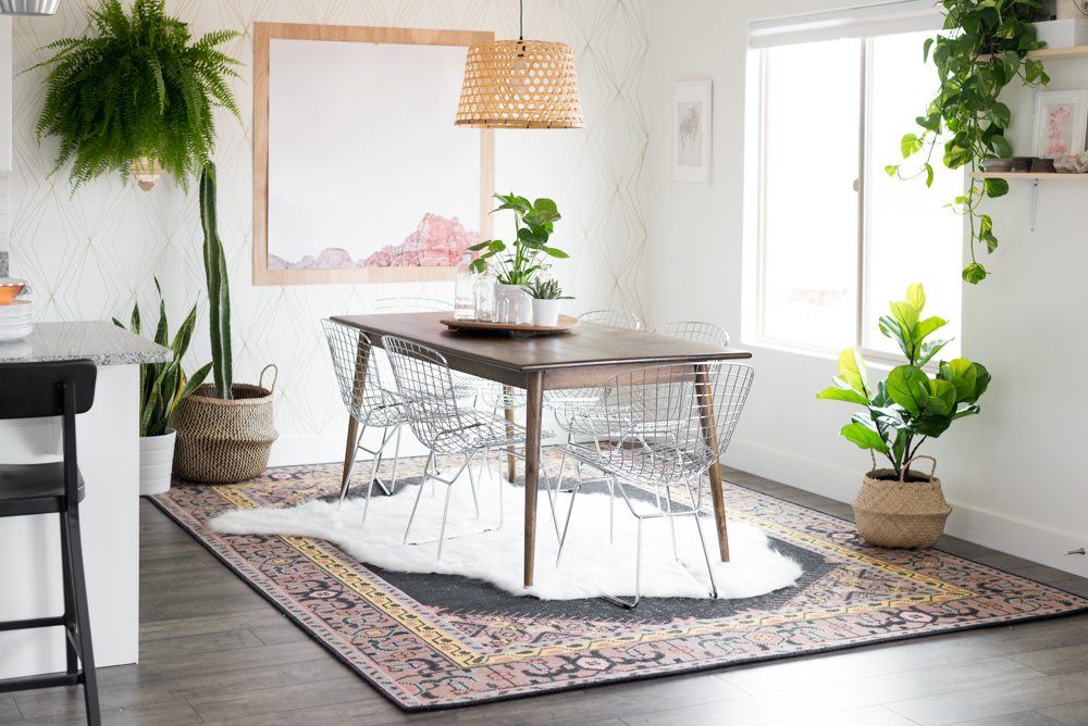
Then it was time to decorate. Aspyn’s house is like so many others. It’s got an open floorplan and the dining room is part of the kitchen so I feel like loads of you can take this makeover and plop it right into your own home. It can be little overwhelming to decorate a space especially if you are a first time homeowner like Aspyn, I mean where do you even start?!
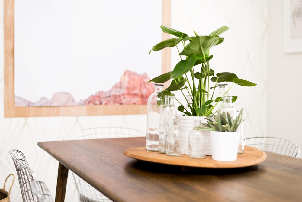
Their original table was cute and simple but a little small for the space and the wood tone was too similar to the flooring. I swapped it out with the Conrad dining room table from Home Depot. I love the midcentury modern style and that the finish is a little warmer than the previous table but still staying on the slightly desaturated side with the antique natural mango wood finish. (Oh yes, and this heirloom piece is currently on sale for $399!!)
Because I upped the table size, it now comfortable fits 6 instead of closely sitting 4 which is perfect for entertaining!
The chairs are killer! I love brass, but I’m kind of really digging chrome lately and these pushed me over the edge!
Let’s just have a heart to heart about this rug. Guys. It’s amazing, right? One of the easiest mistakes to make when you’re decorating a dining room is the rug size. Large rugs are more expensive, but if a huge kilim is out of your budget try to layer a large and inexpensive one underneath it (sisal works great for this!) I really wanted a large sheepskin but wasn’t able to track one down (like that’s ever stopped me) so I ordered this flokati off of Home Decorators Collection and made my own by cutting the shape out.
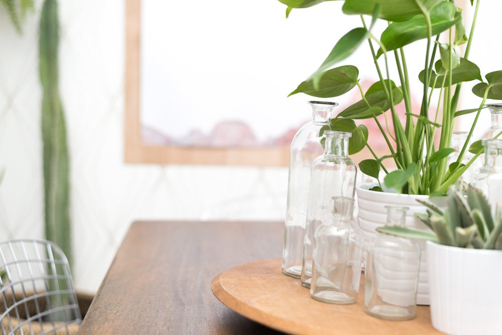
I wanted the table decor to be something that was pretty and collected and easy to move so I put these bottles on a vintage wooden platter.
Aspyn previously had some stools at the island, but they sort of just blended in with the cabinets and countertop situation so I swapped them out for these stackable aluminum stools.
Speaking of aluminum, I added these spun aluminum lights above the island. I’m really loving the juxtaposition that’s happening in this space with the uber modern shapes and finishes and the relaxed slouchy style of others.
The back wall needed something large and simple to break up the wall pattern and finish everything off. I waited and hunted for weeks and just couldn’t find anything that was right so at the last minute (‘cause that’s how we roll) I called my friend Tyler and asked him if he had a picture of the tips of the mountains in St. George. I had it blown up and then mounted it on a simple 4×4 sheet of plywood from The Home Depot. It’s pretty perfect right!? Just the right amount of white space. You can snag it in the Vintage Revivals Shop here!
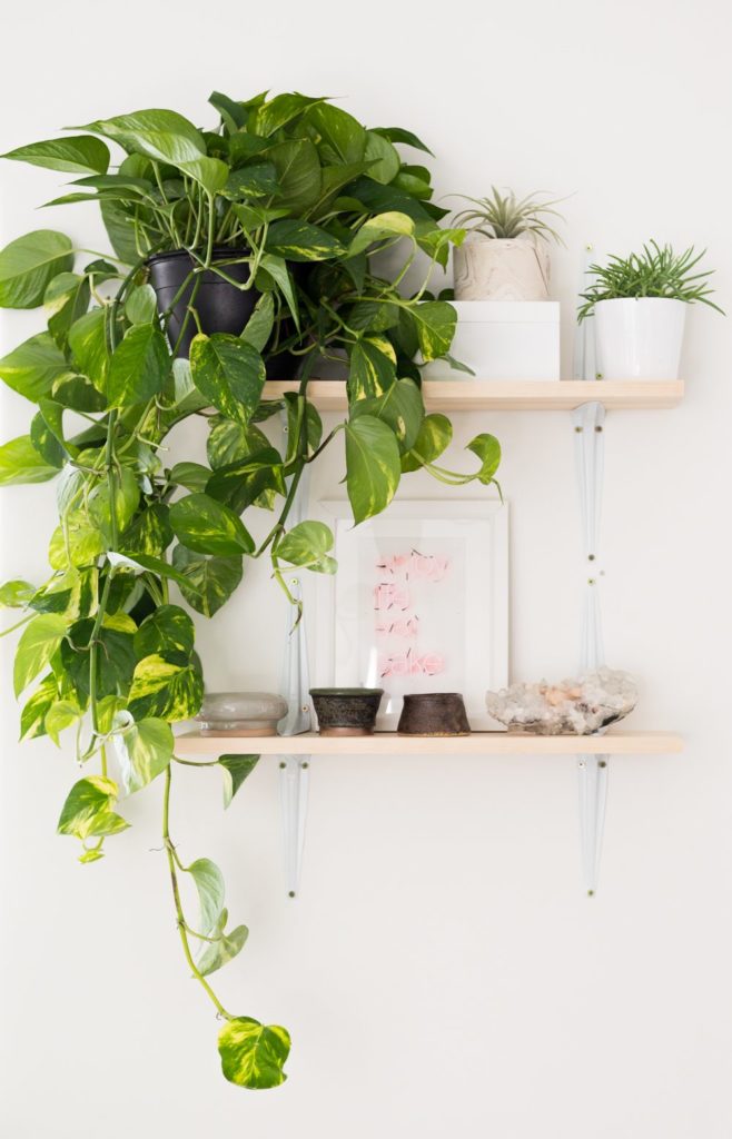
The last thing that the space needed was some plant love. If your house is lacking something and you can’t put your finger on it, chances are you need a plant friend or 2. Home Depot is the best place to buy plants, especially if you have a black thumb because they will return them for a year!! Granted it’s a little shameful to take in a pot of dirt but I promise they don’t get judgy about it.
Here’s a quick guide to all things dining room:
1| 2| 3| 4| rel=”nofollow”5| 6| 7|
So tell me, were you surprised that everything came from Home Depot?!

This looks awesome! Great job!
The whole space looks wonderful, but I LOVE that Sharpie wall the best!
I am surprised, but not at that sharpie killer wall. You are so talented! I love the changes and am now off to check out more of this Home Depot collection.
Looks nice, but that window still looks basic and cheap with the builder blinds. Maybe a roller shade with fabric? A matchstick wood blind? Leave bare but add custom trim around it?
I agree, I think it needs some type of window treatment.
Everything looks soooo cute and cozy. 🙂
Gorgeous, as always. Will you provide a tutorial for that Sharpie wall? I would love to do that in my bathroom.
Regarding the rugs – they look fantastic, but don’t stacked rugs annoy you in real life? It seems like they would constantly get caught on the chair legs. Does that make you nuts?
Yes, I so agree! Tutorial please on this design/sharpie wall.
So great! But I already know they have amazing stuff 🙂
THAT SHARPIE WALL!!! (yes, it’s worth yelling about). what size is the dining space? We are moving into our first open concept layout home (a new build versus our go to fixer upper) i’m struggling to decide on what size table is appropriate for the space.
I love the mountain tips photo (great idea!) and the Sharpie wall. Really looks excellent. Nice work!
Mandi I absolutely love what you did in this space! I had no idea Home Depot had a sister furniture company!! Beautiful furniture!!! I just revealed my dining room makeover on my blog, check it out! Similar mid century vibes:) Also I love meeting you at pinners conference, you are so sweet and real.
https://www.kemleydesign.com/mid-century-modern-dining-area-reveal/
Your room reveals are so great because there’s always some simple, yet astoundingly creative little touch that I never would have thought of. I love the shape you created by flipping those shelf brackets! The whole space looks amazing!
I love the big rug, chair, and sharpie wall. Those plants definitely have a nice and welcoming feel! I have the same metal grid chairs too, but for some reason, I feel like the they are uncomfortable without a seat cushion. Overall, I’m in love with this makeover! 🙂
Beautiful space!! I love that sharpie wall.
The picture on the sharpie wall looks unfinished…shouldn’t it be in a frame?
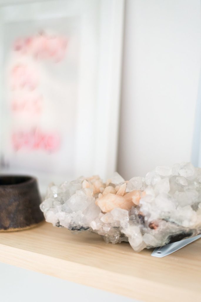
In St. Louis, I lived a block away from a Home Decorators Collection store and worked a half block from their outlet so I am well acquainted with HDC. They have everything! The room looks great, I think the unframed mountain photo gives it that slouchy, modern bohemian vibe you were talking about. Love the crystal geode and the plants– wondering how is that lovely fern mounted to the wall?
Loving the basket light over the table – is that HD too?
I’m obsessed. I love it all. In love with that table and I can’t believe it’s Home Depot. I would also like to know about the basket light!
That sharpie wall is to die for! Please tell me you’re going to do a tutorial…
Absolutely love this!! It looks so stunning :))
itscamicreative.blogspot.dk
-Cami
Beautiful! That Sharpie wall is absolutely amazing! Please post a tutorial!
“Granted, it’s a little shameful to take in a pot of dirt….” Lol! ALL of mine. I got succulents in hope but even they are dying one by one. My kids uprooting and overwatering them (“they need water to live!”) may have contributed.
Really great makeover! I love the simplicity of the print on top of the wood. How did you mount it to the wall?
Also I love the Sharpie wall and hope a new post is coming about that 🙂
And, yes, I am definitely pleasantly surprised about the Home Depot offerings. I never would’ve considered them for lighting (I thought it was only boring boob lights and tuscan chandeliers there) and especially rugs. Thanks for bringing this to our attention!
Your style has evolved and matured so beautifully; I want to hang out with you in real life because you feel like my spirit animal. Thank you for talking through your whole process: the tricky areas, the decisions options, the desired feel and how you achieved it. I take so much more inspiration from a thoughtfully composed blog post like this than from a room that I love for reasons I can’t name. Aspyn is one lucky lady!
If/when you do the sharpie wall tutorial, can you talk about how to deal with wall texture? My walls have thick spray-smear texture and I’ve had trouble with getting the lines to behave.
Where is that mountain picture from in her dining room!? It’s beautiful
WOW! So great. The chairs, table, lighting-and the pic of the St. George mountains-so gorgeous Mandy. Really impressive how the room was so quiet before but now seems to be having a party all by itself:))
Very nice!! Where is the gold peanut on the kitchen counter from?
That is a lovely dining room, and yes I was surprised that these are all from Home Depot. I must say those spun aluminum lights are awesome. Great selection Mandi!
Amazing! Pleeeeease do a sharpie wall tutorial for that specific design! I saw your older tutorial but I would like to do this specific design in my home and no idea where to begin lol.
Did you get all the plants from Home Depot? Even the larger Cacti? I’m looking for a few for my apartment.
Thanks!