Hey guys! Man this week has flew by! We had the timing stars align for a project and have been hitting it full force (think staying up until 3 am every night). Some of you may know that Court’s family owns an awesome restaurant in St. George called Durango’s. It has become really successful over the last almost 14 years (because it is so good!!) so we thought it was about time to step the decor up to match the food.
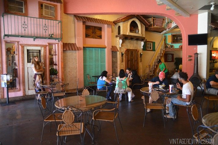
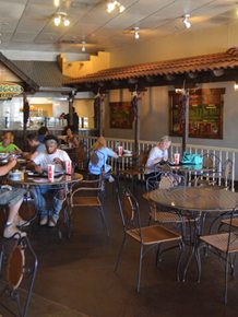
This is what we’ve been working with. The building facades are very quintessential Durango’s, but also a little outdated and sort of impossible to replicate exactly in other restaurants for future franchising options.
So to fix all of it, we are completely updating every single nook and cranny of this place, and the first step is the facade wall.
I turned to my favorite graphic designer/assistant/dance partner Jamie to replicate the facade into simple 1 dimensional line art.
She took this:
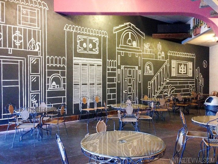
And turned it into this:
So cool right?!
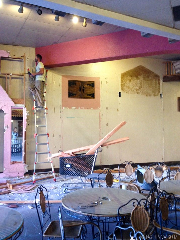
Demo took just a few hours and was relatively painless.
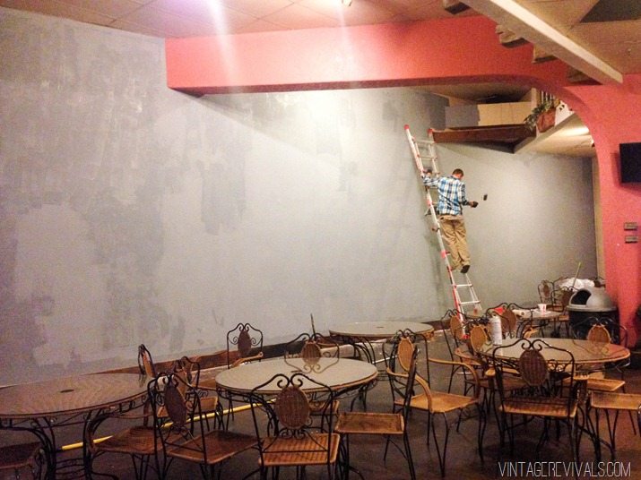
After the holes were patched and everything was cleaned up, it was time to prime. I had my guys at Sherwin-Williams tint the primer as dark as they could to minimize the painting as much as possible. When you paint with paint, the color dries darker than it goes on, well primer is the opposite, it dries lighter. Just a little piece of random info that no one will ever need. You’re welcome.
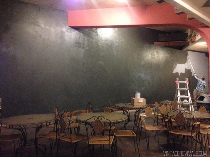
I sort of over compensated the size of the wall when I was buying paint. It only took 2 gallons to paint the monster (I bought 4) We used Sherwin-Williams Emerald in Iron Ore (just like here and here!) The reason that I love Emerald (and why I pay the $65 /per gallon price tag) is because it.is.the.best. The coverage is awesome (1 coat with a few touch ups on the heavily textured areas) and the durability is amazing.
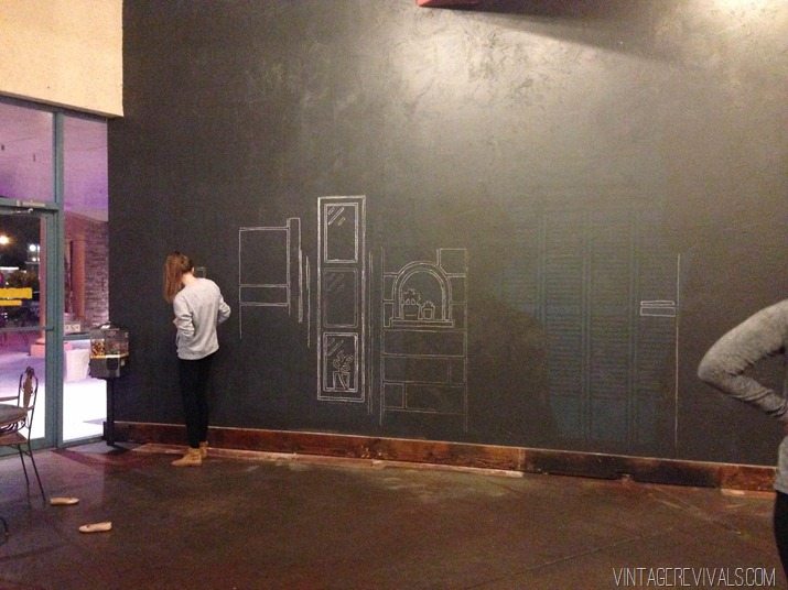
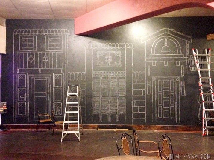
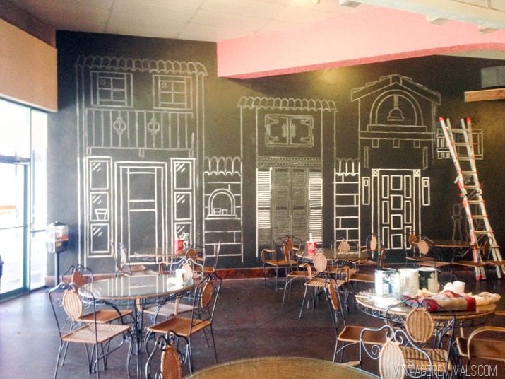
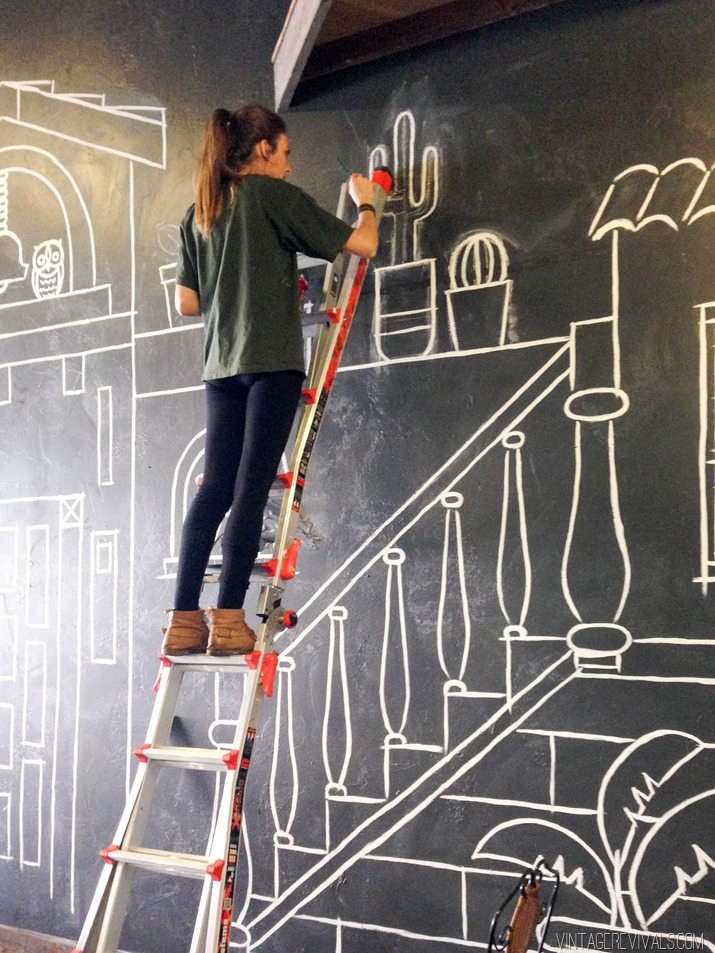
Then we spent the next 3 days chalking and painting.
We wanted it to look a little sketchy and imperfect, so we exaggerated points where 2 lines met by dragging them out, or stopping it short.
I LOVE how it turned out (totally worth the 4 hours of sleep a night) and we are officially 7% done with the renovation! Hooray!!

Really cool….love what you’ve done! 😉
https://vodkaandarose.blogspot.co.uk
This is completely awesome. I totally love it!! Such a smart re-fresh!!
I love it! that looks so, so much better
Looks great Mandi. I like how you kept the feel of the restaurant style, but totally modernized it too. Looking’ good. Can’t wait to see the rest.
-Mon
This is awesome!!! Can’t wait to see what happens next!
Very modern! Very cute! Franchised Durangos? Can you put Hampton, VA on the list of future sites, puh-lease?
wow that is incredible! i for reals thought this was just chalk when i saw the preview on IG and was kind of nervous for a 2 year old like mine smearing and ruining your masterpiece haha. this is so amazing though!! i can’t believe you guys free-handed the drawing/painting. amazing!!!
Amazing job. You guys work so great together.
This looks so good! Are you going to add any 3-d effects to it? I think this would look so good in a classroom.
So, so cute! I love the chalkboard paint idea! A much more modern but still very timeless look! Can’t wait to see the rest of the project!
Love this! Is there going to be a tutorial for this? (even in a much, much smaller scale?
I am in love with this!
Oh Mandi that looks FAB!! Can’t wait to see the rest of the 93% XOXO
I would also love to see a tutorial for this! It would look great in my kids shared room! It looks awesome! Did you just paint over the chalk drawing that you drew?