A huge eye-opening lesson that I’ve learned with the Merc, is just how much planning ahead of time has to go into building or renovating. I’m admittedly a fly by the seat of my pants kind of girl. Its who I’ve always been but I can’t really do that with a renovation like this. Man its a good thing I have an awesome contractor to keep me on task! So while we are still a few months away from kitchen installation, and the walls are currently 2×4’s the kitchen planning is in full swing.
A few years ago I met Shawn from Aspen Mills, he is the most wicked talented cabinet maker that I’ve ever seen. He’s also a nice guy with an adorable wife that I want to be best friends with. NBD.
For years Shawn and I have had these “when I have a house…” talks. We even made it as far as designing the layout for the kitchen in the new construction house that wasn’t. I did a little digging and came cross the first time I mentioned him on the blog. September 2012. WUT. He helped me by cutting out these wooden circles. What a guy. Well I’m happy to report that after 5 years of waiting we are FINALLY taking our cabinet making relationship to the next level!!
Obviously the Merc is special and the kitchen at the Merc is SUPER special, being the heart of the home and all. So lets dive into the design, and then we can talk layout.
I’m trying really hard to keep the design of the Merc as period friendly as possible, looking through tons of images on the internet I came across a common theme. Cabinets. (I know you’re thinking duh) but in the 1930’s pantries didn’t really exist. There were just loads and loads of cabinets. So that’s what we’re doing!
Typical cabinets have at least a 2″ trim piece around the edge of the doors so that you can mount the hinges easily. (This is why Shaker style cabinetry is so popular!) but the style for the Merc is going to be a little different.
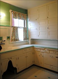
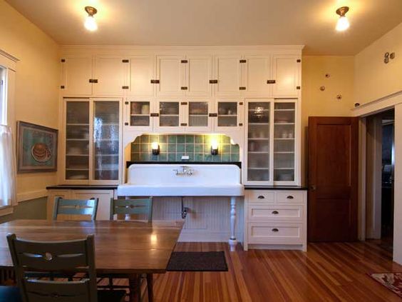
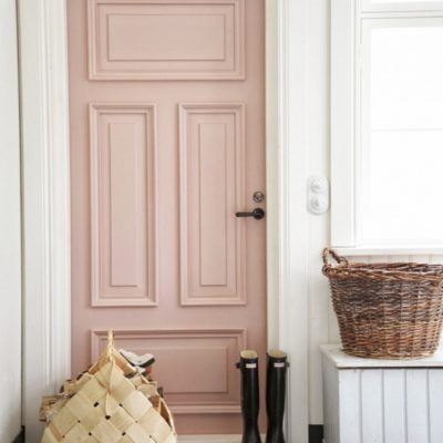
We’re doing inset slab doors. Inset means they sit inside the base frame, and slab means that they are just a flat front. Similar to these guys.
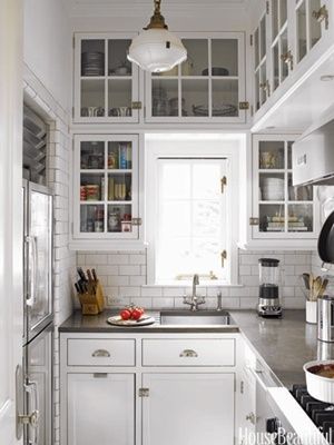
I’ve gone back and forth on wood vs. color vs. wood vs. color. Here’s my thoughts. Wood cabinets are great. They are classic. They also all look relatively the same. I mean sure, there are different finishes etc. but how often do you really see stand out wood cabinets that stand out because of the detailing? The grain is always the star.
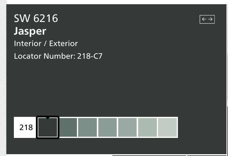
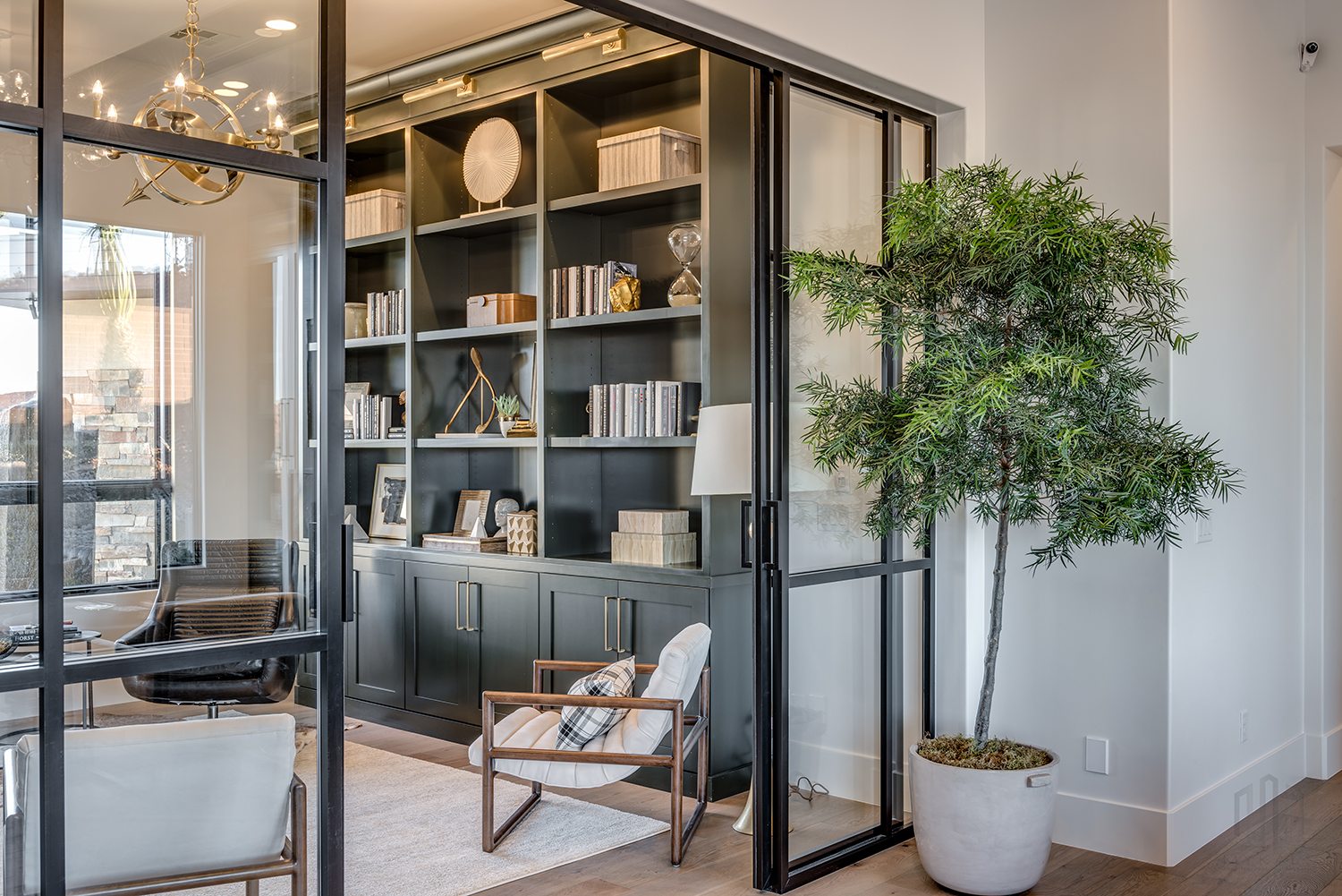
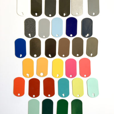
You are way more inclined to see detailing on painted cabinets because the color is usually one uniform shade so variation in the design stands out. I’ve also gone back and forth on the color. I LOVE the idea of doing a really dark (almost black) green (like SW Jasper) but I’m feeling a little hesitant because its having a moment right now and I want to Merc to feel a little more traditional and a little less trendy.
Shawn used a similar color in a Parade home this year and it was SO pretty.
In order for the space to feel balanced we need some wood. so on our island and shelving we’re using bleached walnut.
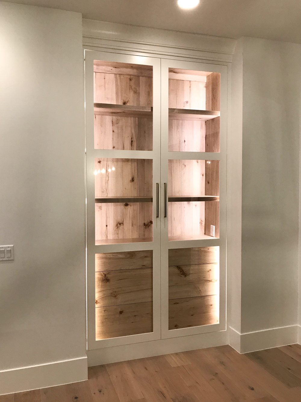
Ok so lets dive into the layout and then I’ll hit on a few more design elements that I am SO excited about!
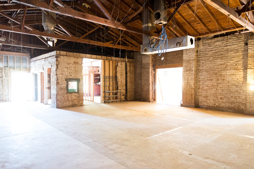
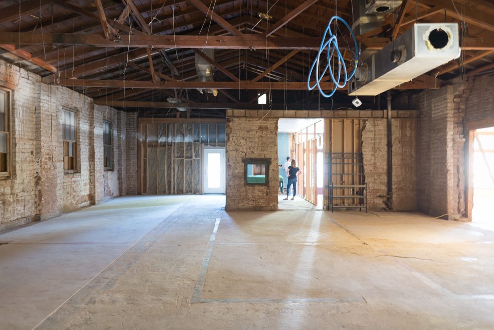
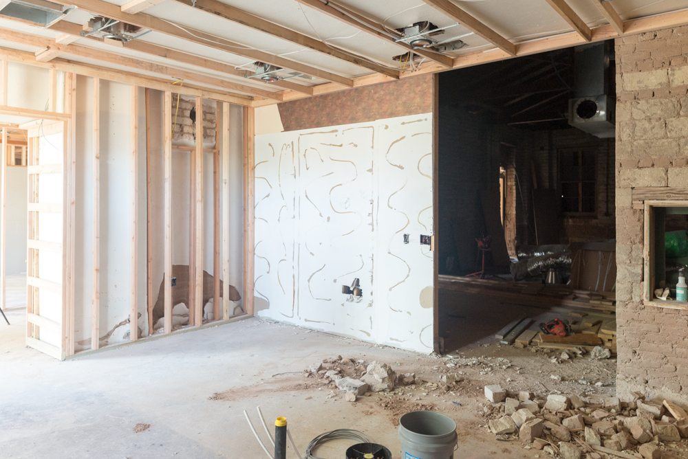
For context, the kitchen is this little room inside the big room.
It looks little compared to the size of the rest of the space, but its actually pretty huge. There are just a few #mercperks we have to work around. For now, to get our certificate of occupancy from the city (the approval that we can move in) we have to put a temporary wall in the space that opens up into the living room. Another fun thing that we’re doing in phase 2 is putting in a giant divided light window between the opening and the brick (see where all of the sheetrock is? Behind that rack? That is where the window will be.
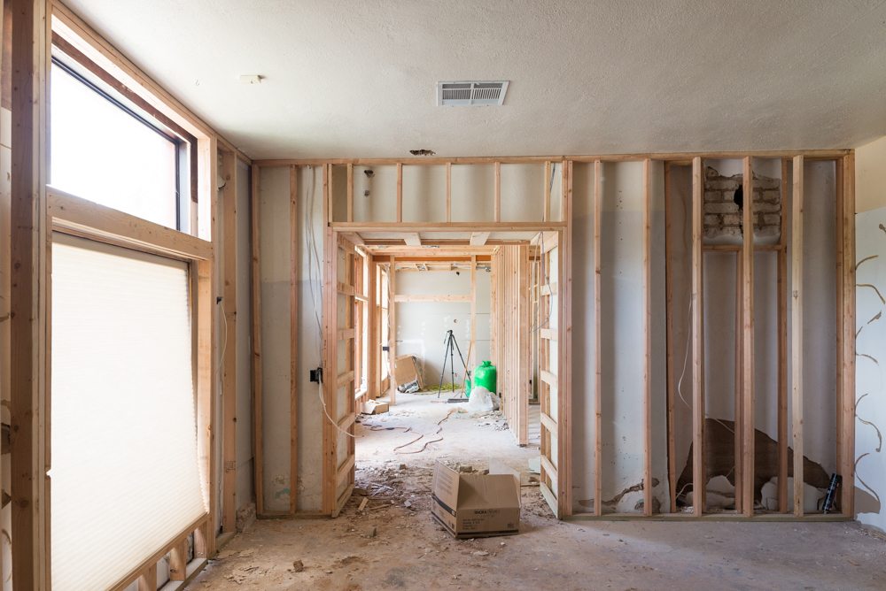
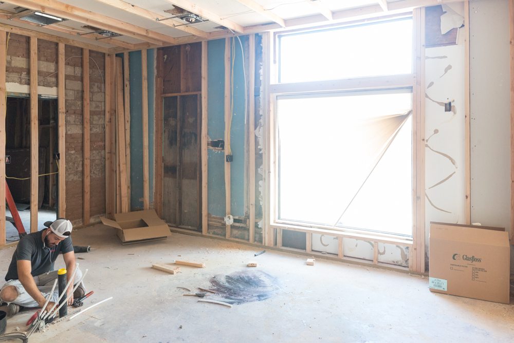
We’ve also go a massive window that we have to work around and the opening that goes into the entryway.
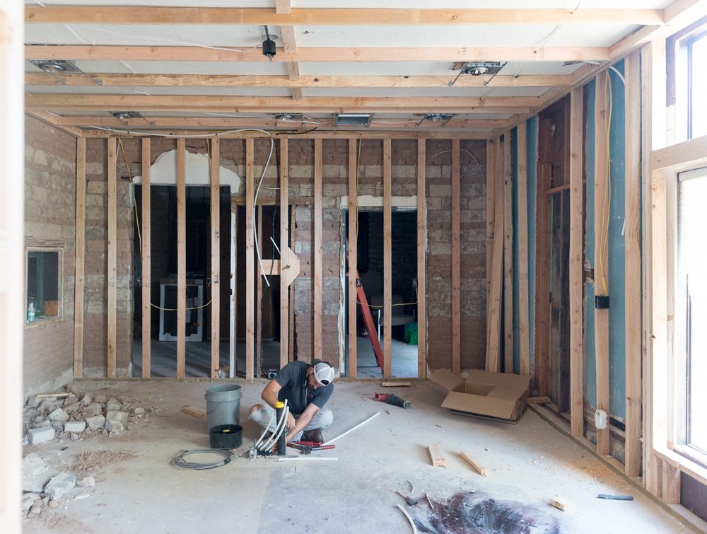
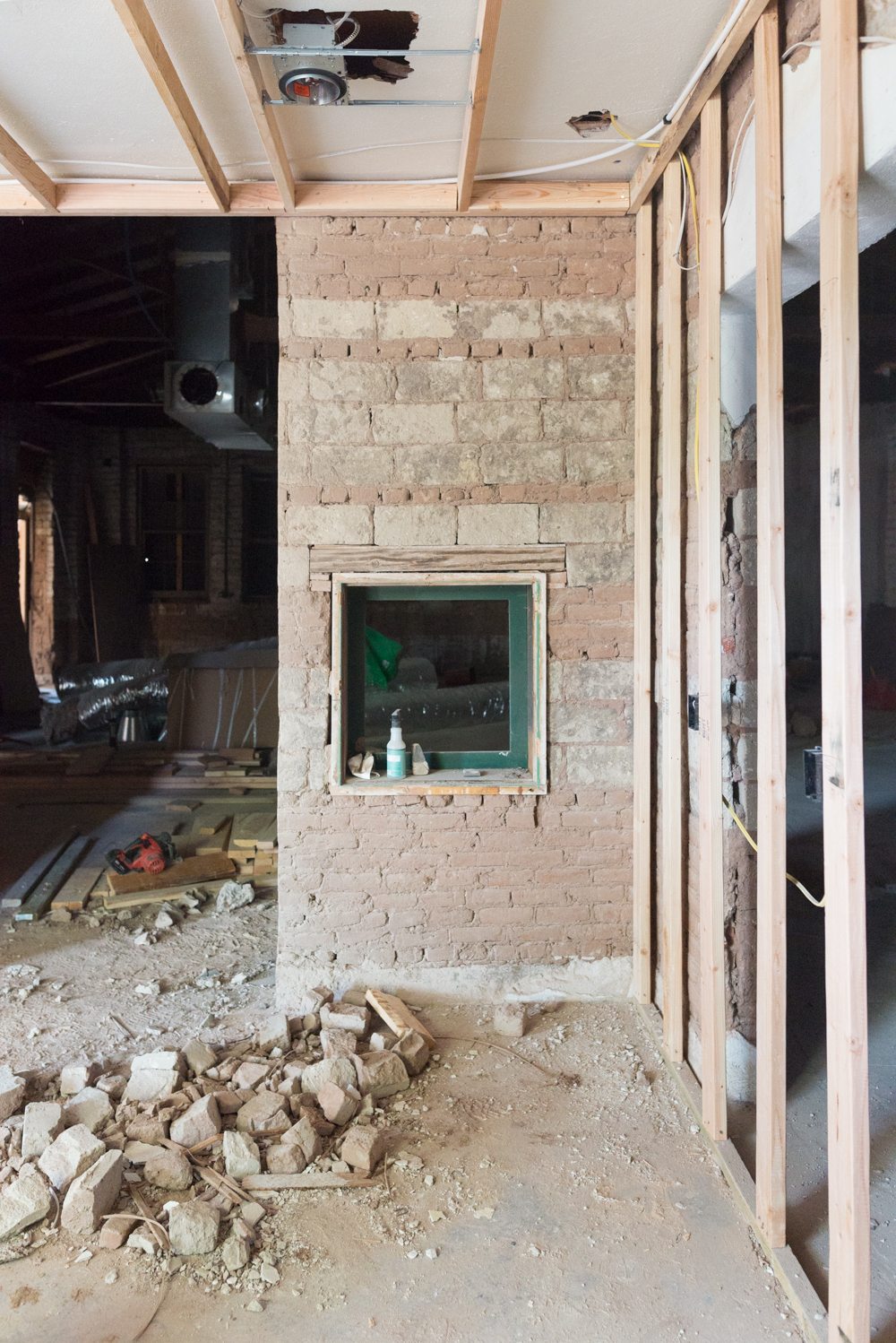
AND if that isn’t enough excitement, we’re keeping the brick wall with the little window.
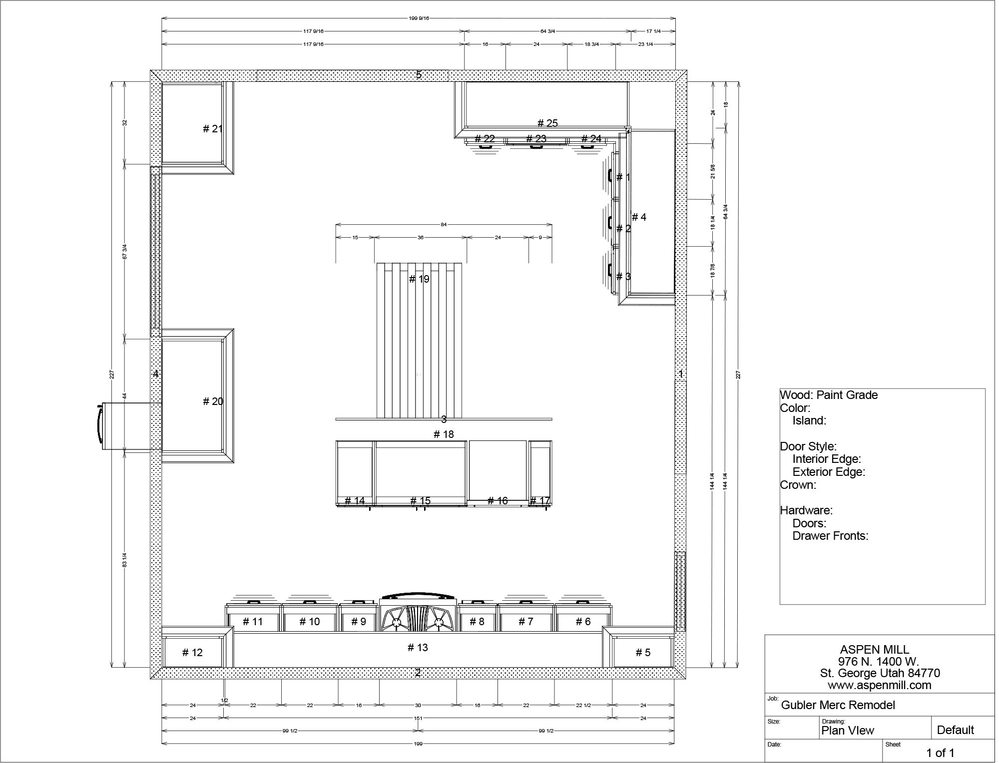
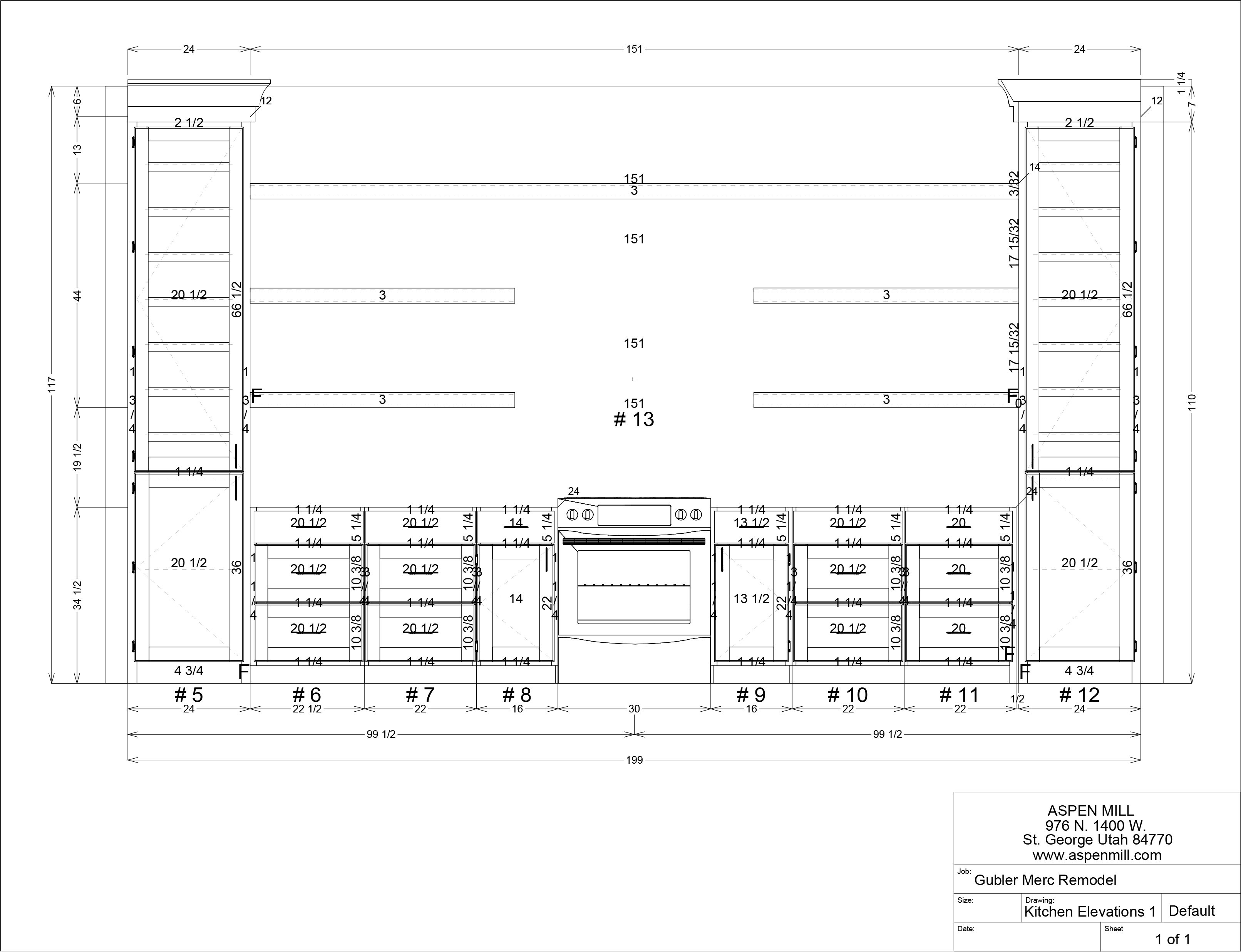
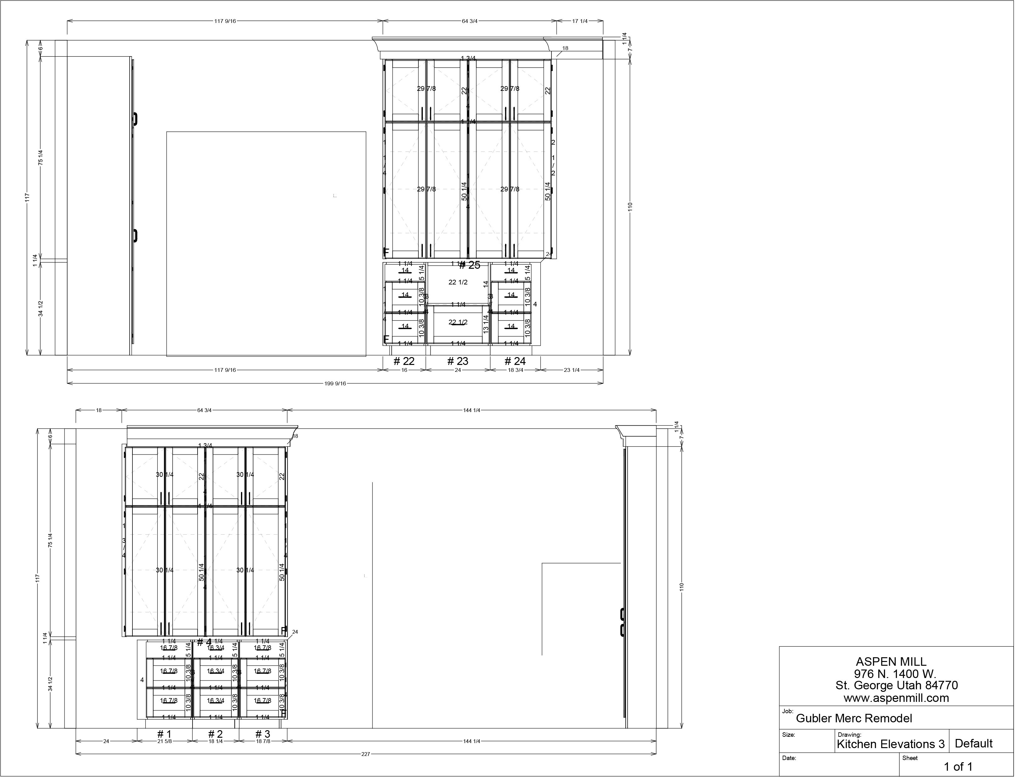
So this is what we came up with. The top of the image is the opening that goes into the main entryway.
The only full wall is getting cabinetry and shelving galore! This is where the range is going to be. And if you’re wondering, no we’re not putting in a range hood. Which I feel totally fine about because my cooking skills are limited to eggs over easy and chocolate chip cookies. Do you think we’re crazy?
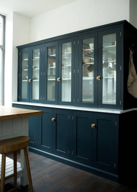
The tall cabinets on the sides are my favorite. We needed to come up with something creative because I’m keeping the brick and little window. The window sits quite a bit lower than the countertops which meant that they couldn’t go all the way to the wall and we needed something that wasn’t as deep as the standard base cabinets.
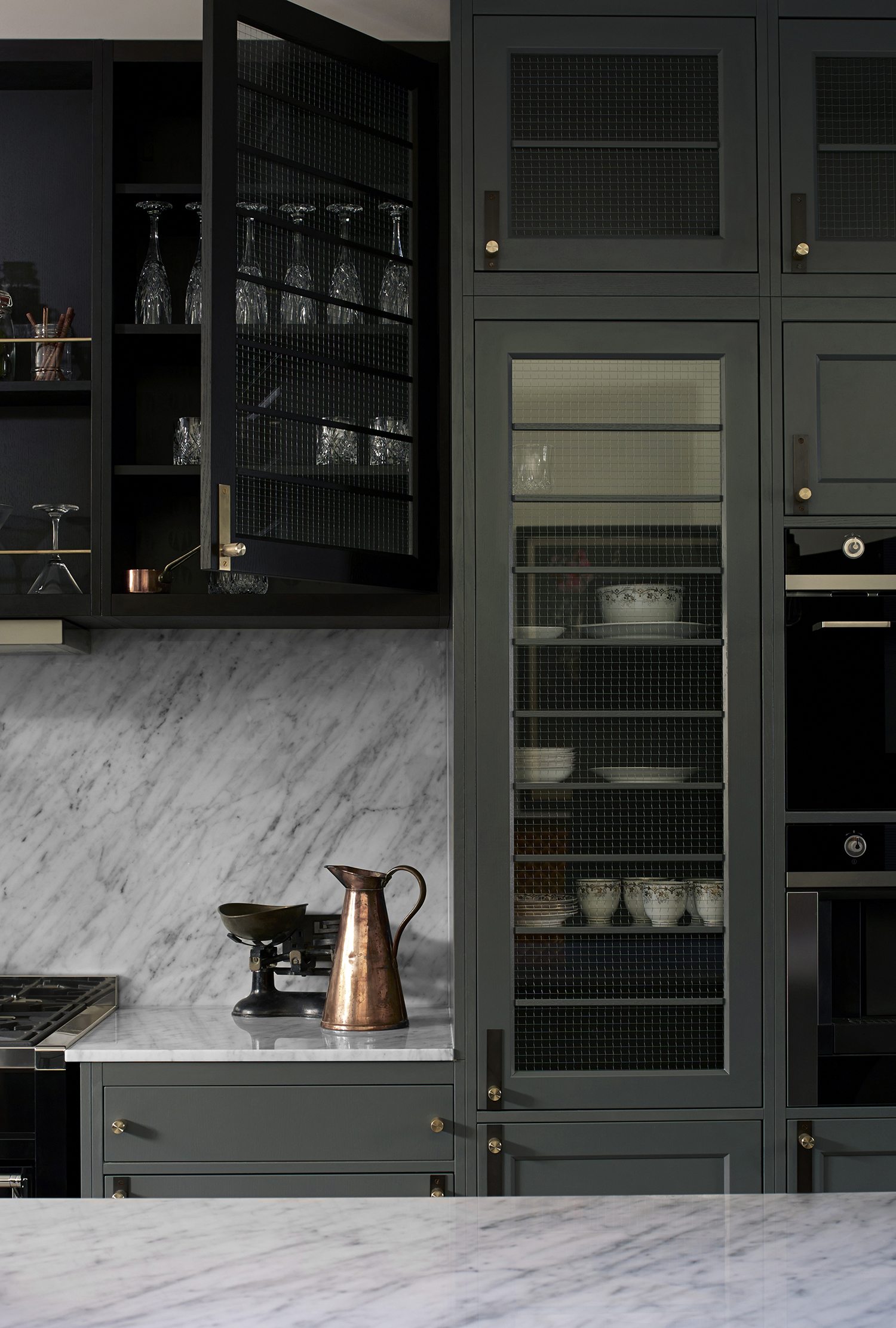
I’m straight up unapologetically copying this design from Buster and Punch. I LOVE IT. The horizontal dividers and wired glass. Freaking AMAZING.
The shelves aren’t going to be normal shelves. They’re going to be off the wall suspended shelves. These ones from are ohfarmhouse EVERYTHING.
Imagine something similar but covering the entire wall!
These suspended shelves are also solving our giant window problem.
We’ve got a massive storefront window in this space. With the ones in the entryway I feel like we were able to work the space in a way that we still had some privacy. To get more privacy than just having a window straight into the kitchen, we are putting the same style suspended shelves in front of it! That way if people walk by and glance inside they’ll have to actively look around things to see inside.
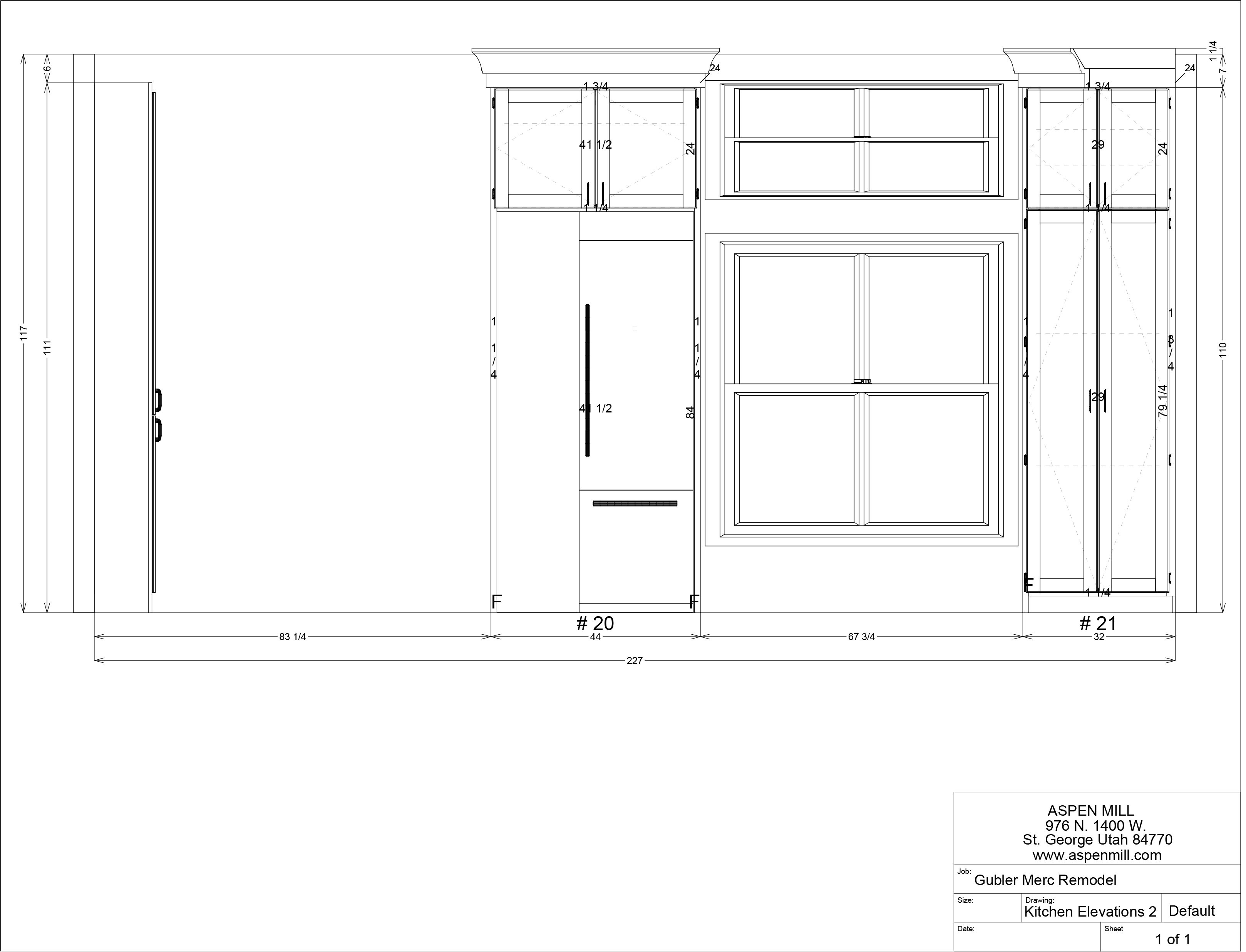
We’re putting our fridge on the left of the window and a tall broom cabinet on the right.
Most of our storage is going to be on this wall with floor to ceiling cabinets covering this entire corner.
The microwave will be in one of the lower drawer spots. The top rendering is the wall that leads into the entryway, the second one is where the window/entry into the living room will be.
The island is going to be in the center with the sink close to the stove. Shooting off from the center of it is a waterfall table made out of bleached walnut that has oversized dovetails on the edge.
I am SO excited about the plan that we’ve come up with! What do you think? Anything you’re particularly loving or hating?




It’s going to be gorgeously amazeballs!!!! I can’t wait! I am concerned about no hood vent though – I really think you should reconsider.
Love the design! Can’t wait to see it come together. That waterfall table sounds so pretty! I would definitely put in some sort of ventilation, though. Just because you don’t cook much now doesn’t mean you won’t at some point. It would suck to have to add ventilation later or deal with a smoky house. Better to have it and not need it very often than not have it and need it more than you think. Just my two cents.
Looking good.. I have a down draft range. An idea about your window privacy. I saw on Fixer Upper that they flipped a switch like a light switch and the glass was fogged up that would be perfect for your huge window.
It was on a door with glass.
It seems a little weird to have your microwave across the room from your other cooking appliances. Have you thought of putting it in your island? Check out Young House Love’s island and their microwave placement.
My exact thoughts! That’s where I’m putting mine in my new house–just seems to make sense!
My old house I just bought a year ago didn’t have a hood vent either and since I don’t do a lot of cooking ( aka spaghetti and grilled cheese) I didn’t think it would be a big deal. What I found out was hood vents are super helpful for keeping a kitchen clean. Even with open windows near the stove I struggle with the fine layer of grease/dust that settles on my entire kitchen because I don’t have a hood vent that helps pull it out of the air. My fridge, counter, cabinets and stove need to be wiped down 10x more often than when I lived in an apartment or house with a hood vent. Just some food for thought. It would be easier to install it now than in the future.
I think this is a really great plan! I love the wired glass cabinets with the horizontal trim. Those are going to be beautiful. The one thing that I am a little hesitant about is the location of the fridge. It feels odd floating in the middle of the wall like that. Those units are pretty deep, and you’ll have to work extra hard to make it feel like it belongs. I would almost extend the cabinets into the corner to the left, but then you would lose your beautiful symmetry around the stove. It’s a tough space!
Love the designs! Can’t want to see it IRL. I too have the no ventilation concern – if no hood maybe an industrial ceiling fan?
We have a cooktop that ventilates down. Vent pipe connects under cabinet and then vents outside. I love not having a range hood while still having great ventilation.
You totally don’t need a range hood. Our home inspector told us it’s ok to not have one as long as your kitchen area is basically open concept and has plenty of airflow. We don’t miss having one at ALL!
Curious. How far will you have to walk from the dishwasher to put all your dishes away? And have you figured out where to put your trash and recycling?
I am loving following your adventure I’m getting ideas for our upcoming renovation. My question is do you guys have an architect draw up your plans or do you use software and do it yourself?
Looks fantastic! I love how you’ve really worked in a period appropriate design, and paint will be so nice!
I’d check with your building inspector about the hood, where we live you have to install ventilation legally. I know they show it in pictures all the time from Europe etc, but it might not be allowed. Also, without ventilation the cabinets get a film on them in any crevices ( like your door detailing), very hard to clean up once it sets on for a bit.
I used to be solely a kitchen designer before moving into interior design, so I’m coming from some experience.
Can’t wait to see what you do and how things progress!!!
http://www.tinyhousegiantlife.com
Wow mandie! I can tell I’m going to love your kitchen ?.. when we built our house 5 years ago we opted for no range hood as well. I have a lot of open shelves and find myself cleaning a thin film off of my dishes on a regular basis.. if you don’t mind washing all your “shelf” dishes frequently.. it’s not a big deal. Some days I’m ready to install some sort of vent though! Good luck on the renovation!! I love all of your ideas ?
Wow, this is going to be stunning! I love the design and material choices. I really think going without a range hood is a mistake. Even with minor cooking its most valuable functions are keeping grease, toxins, and carbon monoxide from filling the air of your home and your lungs. Your kitchen will be cleaner and safer.
About the range hood, we don’t have one in our kitchen but have a ventilation fan in the ceiling that vents to the outside. It works great for us an I have never missed a vent hood.? By the way I’m Jessica’s MIL
Love everything about your design except for the lack of a range hood. I would have gone with a down draft style if I didn’t want the hood. I prefer the hood to vent outside, but some hoods just filter the air indoors. I wonder if there are down draft styles that don’t have to be vented outside so you wouldn’t have to mess with the concrete again.
Why not get a piece of frosted glass vinyl to cover the window with? That it a pattern cut with, let’s say, a bunch of tiny stars to help detract the view further.
DO NOT NOT put in a vent. Big, big mistake. I’m telling you, you need it.
I also don’t have a hood and it’s not a critical element. We live in a small place and there never seems to be a problem with ventilation. I like the hanging shelves in theory but I think they won’t be practical in the long run. Having to keep the shelves always in order and also the cleaning factor makes it a real problem for me. Even in my cabinet where I store all my dishes it’s never quite as orderly as I would like. But, again, that’s a personal choice. It’s going to be beautiful.
I love almost everything and I can’t wait to see how it turns out! I’m also concerned about not having a range hood or some kind of ventilation. Also it seems very strange to have the microwave on the other side of the kitchen. Could you put it in the cabinets on then wall with the range? I know it would mess up the symmetry but I think trekking across the kitchen to get to the microwave is going to get old! Personally I’d want more privacy in that window than just some shelves, especially at night. Will there be any sort of shade or curtain at all?
For all of the great reasons readers have given you in the above replies, get either a good down-draft or traditional exhaust system in your kitchen. Don’t make the same mistake I did in believing a ceiling exhaust fan would be sufficient!
Maybe a window with privacy glass. Does your family need to see out or could you handle just letting the light in? If you’re building shelves in front of it anyway, you might not need to see out. I think I’d do a window with a glaze that is opaque so you let light in but have privacy.
We did a ventless rangehood in our last remodel. It’s in our plans on our current remodel as well. They have filters you change out every so often. No need to run the exhaust outside.
Love the layout you’ve designed. The table will be so cool! Excited to follow along with your progress!
LOVE your kitchen plan! I can’t wait to see it finished. I am concerned about the no vent hood though. A ventless would work but I’m afraid you will regret it at some point if you don’t do it? Looking forward to seeing your progress!
The design is BEAUTIFUL, but as someone who moved into a home without a range hood, I would recommend you reconsider. The cabinets and wall above our stove get dirty and grimy. Any steam sticks to the wall, from normal cooking, which attracts any and all dirt and grease. You’d think we’re a family who fries food all the time, which I do not. My parents put a ventless system that is amazing if you don’t like the aesthetic look of the hood. Your cabinets sound fabulous, and I’m so excited you’re not going white, which I’m so tired of seeing in every kitchen lately, lol. I can’t wait for the next update! As one who lives here in Houston, it’s good to see normal activities are still going on.
I’m so sorry, but I actually DO think that it is crazy not to put in a vent hood ? We had to close our vent off to the outside when we remodeled the exterior and have a few more months until we start our kitchen remodel and it’s been awful not having one! I would never buy a home that didn’t have one. I’m so sorry, but I think you should reconsider.
To put all of that work, love, detail in and not put in a hood, seems really off. Even the design images are screaming- this blank spot is where a hood should be. You can make it really beautiful, or even minimal, I just feel like you should reconsider. Even pasta needs a vent.
gorgeous choices. gorgeous. love the cabinet glass and open shelves.
three things based on above comments.
1. I am a bad cook at best and I use my vent hood often. I would find some way to ventilate.
2. the microwave across the kitchen is fine if you don’t use it often. mine is on the other side of my kitchen and seeing as I rarely use it – it doesn’t matter at all to me.
3. love the idea of adding some type of textured glass to the big window to allow for a bit more privacy.
best to you in your continued efforts and planning. so fun to watch it all come together!
I love the design, especially the incorporated wire in the doors. I too have to vote for some sort of range hood. I am assuming you don’t want it because it will be too hard to vent to the outside? My husband does lots of handyman work and sees lots of damage from moisture when things aren’t vented. You might want to boil, like spaghetti, and it creates a lot of steam. Maybe you can just throw open the windows? Even just cooking hamburger makes a lot of grease you don’t see until you are trying to clean. It all looks so great. Can’t wait to see the end result.
I think the kitchen is going to be gorgeous! I love the horizontal dividers with the wire glass and I think you should go with whatever paint colour you love. Anything that you love now you should hopefully love later on so don’t be dissuaded just because it’s currently popular.
I am also in the group who thinks you should add a hood vent. We have a recirculating vent right now and I loathe how much grease is all over the hood and the cabinets close by. We don’t do a lot of cooking either and I’m surprised how much has built up since we replaced the old circulating vent with a newer one. If you don’t like the look of the vent above go with a down vent behind the stove but I personally would go with a bleached rectangular walnut hood all the way to the ceiling. It would tie the wood in to the table and the shelves and really be a nice contrast to whatever paint colour you choose.
As someone else mentioned, the microwave does seem like it’s in an inconvenient spot compared to the other appliances, plus it would be useful to have somewhere you can put the plate/bowl down after it comes out of the microwave blazing hot.
I’m living without a hood vent and my entire house is constantly being covered in a disgusting layer of grease. Please reconsider!
I totally agree with every single comment (yes, I read them ALL) recommending ventilation of some sort. Our house doesn’t and it drives me crazy!! Think of it as kind of an unmanned vacuum cleaner that instead of sucking stuff off the floor, it’s sucking stuff out of the air. Sticky stuff. Dirty stuff. Gross stuff. I don’t know about you, but sign me up for anything that cleans by itself!
Also, I think the #mercperks that are harder to find the amazingness of should be called #mercquirks. 😀
Looking forward to seeing all this unfold!!!!!!
Love the layout, I would def put a vent in even if you don’t cook as much. it def completes the wall aesthetically as well as for ventilation, one of my friends had no range hood for a while & her house just always smelled like food. It was a weird smell, it would be weeks & you could still smell the food.
I love the design, but I’m with the venthood crowd. I’m not a big cook and only cook for myself usually, and only have a filtering one and couldn’t vent to outside (I rent). But that already made a noticeable difference from before in terms of a grease film covering things, and with how long smells linger.
And you know when I’m most thankful that I have it? When I cook eggs. The egg smell seems to linger most and is far less pleasant than, say, garlic.
If you want to stick with going without for now, I’d at least prepare the necessary vents now so that you’d have an easier time putting one in later and wouldn’t have to have actual construction done again should you reconsider.
I have seen a microwave mounted down on drawer level. Then I got down on my knees and looked at the inside top of the micrawave…..disgusting…. nobody could see it so nobody cleaned it. Think about cleaning the microwave, if you have to get down on your hands and knees to clean it, are you going to want to do it very often?
It’s going to be so gorgeous!!!
1. If do something cool above the store if you don’t have a hood, it looks empty
2. I think the plans said a 30″ stove? I think for the size of that wall that’s a really small stove, the scale seems off, a 36″ might feel not to tiny.
And no vintage stove?!?!? ?????
Wow, based on these comments I see people reeeeally love their vent hoods. Who knew.
I happen to hate the look, noise, and price of vent hoods and when we eventually build our home I will not be installing one. We have one currently that I very, very rarely turn on (& I have just the regular amount of grease and grime buildup, but I don’t have any open shelving so maybe I just don’t notice it).
I used to work in a fabulous mansion out at Entrada and the main kitchen didn’t have a vent hood. Instead, you pushed a button and a vent would raise up at the back of the stove. When you we’re done, push the button again and it lowered back down flush with the countertop.
I feel like you are going for that first impression of symmetry, but I fear that the fridge protrudes so far in the room that you can’t even see the cabinet on the right. Altogether I feel like every wall is a separate story and that they don’t connect with each other. But I love the cabinets and the table, can’t wait!
Hi!what is a waterfall table? Just curious! So excited to see the kitchen done! Looks like it will be amazing! By the way Im neutral on a vent! Haha!
I love your design. I also love following you! I currently have what is a hood w/light and a fan that only blows out the top of it back into the room. Sometimes I DO cook alot…but most of the time I do not. Yet, even when I only cook my over easy eggs for breakfast during the summer the heat is there. I find also that when I cook Mexican food the fine layer of oil is everywhere. The stupid fake fan doesn’t really stop it. Seriously, Mandi, think about a fan. They come in handy during the summer to get heat out of the house without turning on the A/C and if someone else comes and cooks in your beautiful kitchen…you might me grateful in the long run you put a fan in.
My ten cents…..
I’m usually a painted cabinet girl myself, but these wood ones have had me inspired for a while!
https://www.pinterest.com/pin/122441683590100002/
https://www.pinterest.com/pin/122441683593498622/
https://www.pinterest.com/pin/122441683599595839/
Can’t wait to see how it all turns out!
I’m pro-vent too. We have an overhead hood right now that just circulates the air back into the kitchen and it sucks. Like everyone else has said, a thin layer of grease everywhere. Especially on our hanging glass pendants and if you’re doing glass in your cabinets I think you will have a similar issue. Think of the glass Mandi!
So so many great things in this kitchen!!! I can’t wait to see it all come together. And Im totallly intrigued by the oversized dovetails in the waterfall table! Live how you always have something unexpected in your designs!
Girl you neeeed a vent hood or stove hat has a small pop up vent or something!!! We are renovating and have no good. We literally have three giant windows within three feet of the stove and the smoke alarm still goes off all the damn time.
I. Love. It. I see lots of suggestions for the window, so I hope you don’t mind one more. What is you put mirrored film on the window. So it makes it like a two-way mirror. That way you can see out, but if they try to look in they just see their own reflection. It would still maintain the look from the front, but allow you some privacy.
I’m nervous about the lack of hood. I don’t have one and I feel like the drywall on the ceiling above the range is getting weird. And that is with two huge windows in the kitchen that are almost always open while cooking
It sounds amazing! I came across this picture of a kitchen today and the cabinet face trim reminded me a little of what you were describing. It’s not exactly the same, but it is definitely different than the current shaker style trim.
https://www.oldhouseonline.com/.amp/articles/designing-edwardian-style-kitchen
Loving all of the elements you’re adding and I can’t wait to see what it looks like put together. I love how you make bold choices, but it never looks crazy when its all finished.
Where can I find the rest of the merc kitchen posts?