Dudes! We’re renovating our dream house, an old mercantile store build in 1928! Follow along from the beginning here!
One of the biggest and most obvious dilemmas that we faced off the bat with the floor plan for the Merc was how to get as much natural light into the center of the space as we could. Having it all on one level is great so so many reasons but the downside is the rooms in the center of the house will have no access to natural light. Of course there is always the option of sky lights or solar tubes but the roof in phase 1 is in good condition (unlike the roof in phase 2 that needs to be totally replaced) so cutting a hole in it was not a can of worms that I was willing to open (at least not right now, who knows what will happen in the future!)
That lead me to transoms. For those that are unfamiliar, a transom is a window that sits above a door.
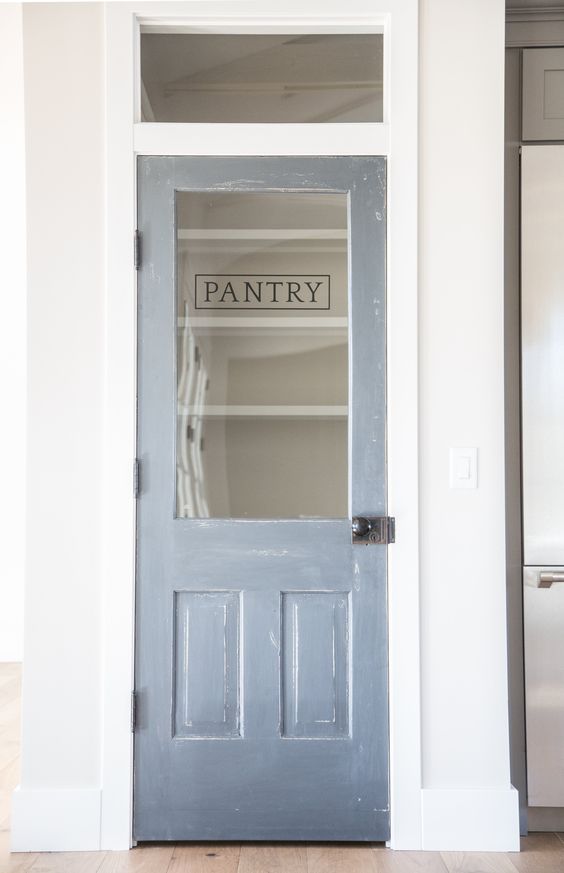
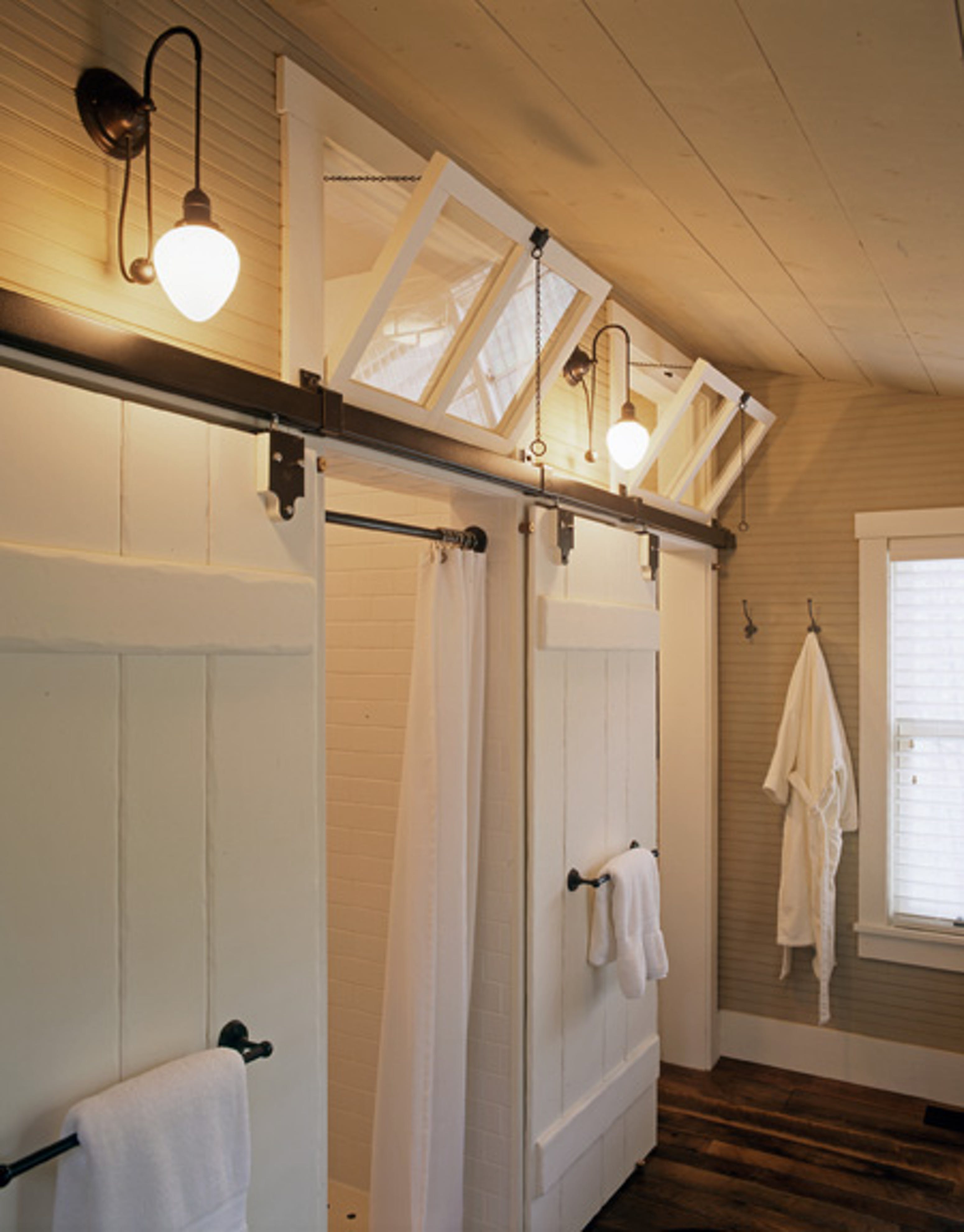
They have a few different kind. Functional transoms actually open the way a window would to help with ventilation and air flow.
They also have fixed transoms, that is what we’re doing. Basically its just a sheet of glass that lets light through
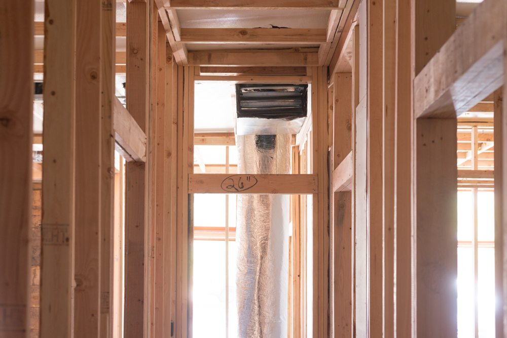
Transoms come in all shapes and sizes, are typically rectangular. This is where the transoms for the Merc come in.
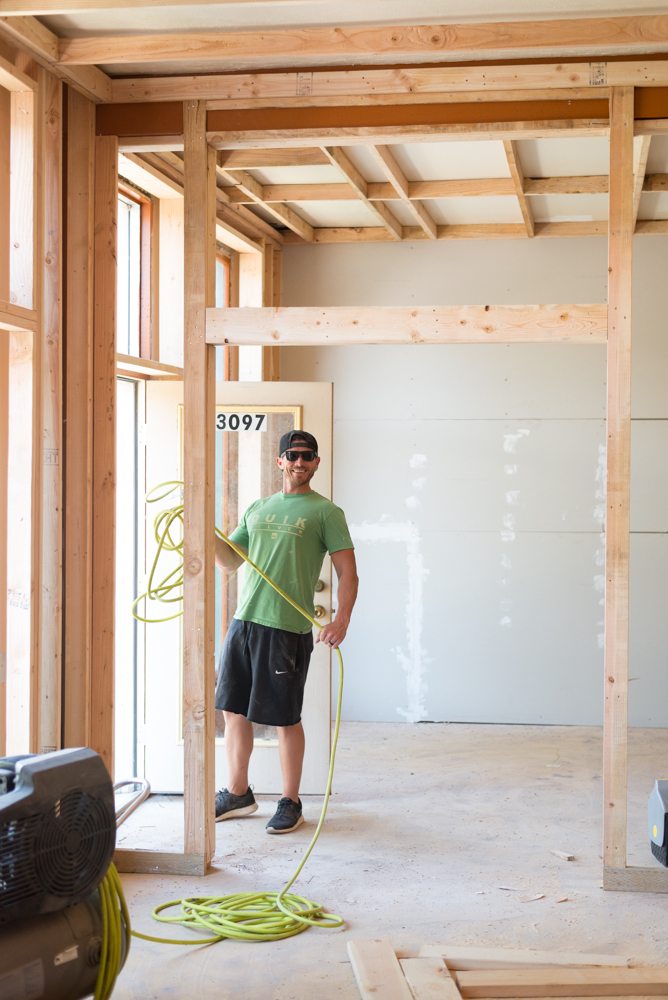
My plan is to replicate the original front doors and the transoms are extremely tall and almost square, so that is what I’ve been planning for the exterior and interior doors.
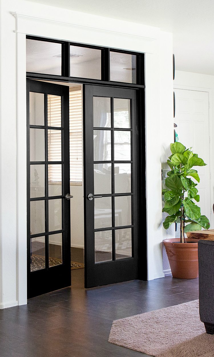
The transom over the french doors is long and rectangular,
But the windows over the single doors are definitely taller than typical transoms.
So the question is, what do you think? Are you digging the original style that we’re replicating or do you think we should make them a little shorter and more rectangular?Speak now or forever hold your peace.


I’m digging the different shape! The house is going to be unique so embrace it!
Did I miss something?!? I’m not getting emails anymore with your new blog content?
I vote for unique Merc style, Rather than the typical short rectangular ones.
Go big! Let there be light.
Oh my gosh, I love this idea! Square, rectangle, it will look amazing either way. As long as some aspect of it makes them uniform, it will just flow.
It’s hip to be square and this is no exception! I love the square!
I have transoms over our bedroom doors and love them! I don’t think you’ll regret going with the larger size…it fits with the scale of your house. Loving every minute of your journey…thanks for sharing it with us!
Bigger = more light. That’s my vote.
I would embrace my inner 90’s girl and say, “Go big or go home!” (Pun only sort of intended, because you’re already home.)
Big and square–unique and let more light into the interior. Love your adventure!
I love that you are incorporating the old merc into the new merc. Being able to keep the historical factors is very close to my heart. Keep up with the good work!
love the tile! Love the transom ideas. We have one over our front door now but it is fixed. I really wish we could open it so the heat would go out
I like them as tall as possible but do leave enough space for trim if you are doing big trim! My OCD would need some space between the top of the trim above the transoms and the ceiling. Excited to see it all come together!
Leave ’em big! It speaks to me–lighter and brighter and it feels like a modern interpretation of a traditional style. Love!
I like the idea of square but even in the photo you showed of the framing, that tall of a transom has you focusing on the ceiling of the next room, which is not what I think you want to be focusing on. So maybe shorten then a bit to draw the eye more to the trim and door detail, not the drywall ceiling beyond.
I would say original style, big and square for more light. Stained glass in the bedrooms would be lovely and unique.
Hey Mandy, just a different European perspective here 🙂 My family lives in an old town house from 1908 that we restored last year. In this type of house the ceilings are quite high (over 10 ft) and the original transoms from 1908 are just the shape you’re envisioning 🙂 They are actually quite the norm here ? So I totally vote high transoms! They are great at letting light in and not at all weird shaped (over here that is ;)).. Let me know if you’d like me to send you a quick pic how it looks with trimming over here (we had the original doors and trimming restored so it would all be authentic :))
The way you are doing it is perfect!!
Nice observation. I agree since the next room ceiling is all I see now.
Nice observation. I agree since the next room ceiling is all I see now.
Tall and square all the way!!
Large and square all the way. Might as well maximize your ceiling height. It will look amazing! I imagine you can save a little on the interior transomes and just use single-pane windows?
I would divide and conquer 😉 I think it would add architectural detail if you divide the square into two rectangles – in other words, stack two rectangular transoms on top of each other. But whatever you do, I’m sure it will look great!
I am totally digging this! What a perfect solution for the problem plus it looks really neat and you might not have to do such huge doors that would look like dwarves in that space. You’re so smart
I don’t like them. It throws off the balance of the door and the whole hallway for me. Almost like you bought doors that were too short and had to muddle through. Similar to kitchen cabinets set low with nothing above if that makes sense?
I love the idea of the light but could you get some of that with opaque glazed panels in some of the doors and a smaller transom?
I think once they’re trimmed out with (I’m assuming) matching trim to the door frames it will look more cohesive and intentional.
Totally digging the original style! I really enjoy following you on this journey, much because you are staying true to the original design and the history of the space. Staying tuned!
Big squares! Yes! Maximize light and stick with what’s original!
I like them big- more light is always a plus imo. But do leave room for chunky trim as another commenter posted……
I don’t know squat about transoms but I think this whole renovation project is off the charts awesome!
I am a big fan of staying as close to the original unless there is a functionality issue. If you wanted rectangular transom like everyone else you would have bought a trac home like everyone else. Embrace all of those original funky details! ❤️❤️❤️
I like the idea of big and square however, like others have said it does draw your eye to the ceiling in the next room, soooo maybe frost the transoms so you still get the light coming thru but aren’t distracted by being able to look into the next room and seeing the ceiling.l
While I get the idea of replicating the original transom shape, the problem I see is that the original style includes some wall above the transom. The way you have it framed out, there will be transom all the way up to the ceiling, right? I think it needs a bit of wall to tie in with the original look. it can still be taller than a traditional rectangular transom, but have some wall. I also agree with the previous commenter that the focus shouldn’t be on the ceiling in the next room (unless there’s a mural on it or something, haha)
If you want chunkier moulding above the transom (like in your 3rd image) that would bring the scale down a tiny bit so it isn’t so square. Plus, it will cap it off nicely!
Yes! For sure tall and different!
Go big or go home, er merc?
This is not a comment on size, but something you may not know about, or may have even already considered. There’s a gorgeous historic neighborhood in my city and many of the front doors have transoms. A lot of the houses put their address on the transoms like so (https://s-media-cache-ak0.pinimg.com/736x/19/bb/12/19bb1291bf3a152f9dd6bc6470085ba5–door-numbers-address-numbers.jpg). This could be super fun to do for your kids’ rooms inside!
I would go as big as you can (while still fitting trim). Above the double-doors, I would add a vertical mullion centered on the doors, to keep the proportion the same. I do like the idea above about making the interior transoms frosted, since they are there for the light, not the view. Frosted glass also throws a more diffused/ even light.
I used to live in a house that had one above the bedroom door. They streatched it the length of the wall and installed a stained glass of roses. It was so beautiful and unique. It also Ave very dreamily hallway lighting during the day.