Dudes! We are overhauling a 1972 Bell Travel Trailer! Follow the entire series from the beginning here! Huge thanks to 3M DIY for teaming up with us on this project!
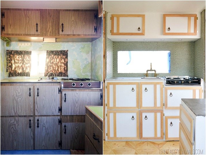
Oh cabinets. You tricky little suckers, you. The original cabinets in The Nugget were simple. Some sort of bullet proof laminated particle board (no joke, this stuff is tough!) with black hammered outside hinges and a black hammered handle.

In order to keep costs down we decided that reusing them would be the best option.
After removing them from the trailer and removing the hardware, I used 3M™ Patch plus primer to fill the holes. This stuff is my fave!
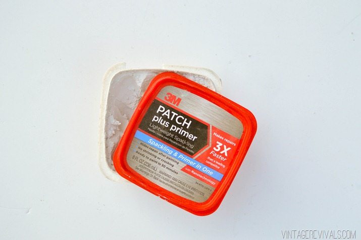
When it was completely dry I sanded the front and backs of the doors. When you are painting over laminate using a 150 grit sandpaper like 3M™ Advanced Abrasives is an absolute necessity. I needed to give the paint something to stick to.
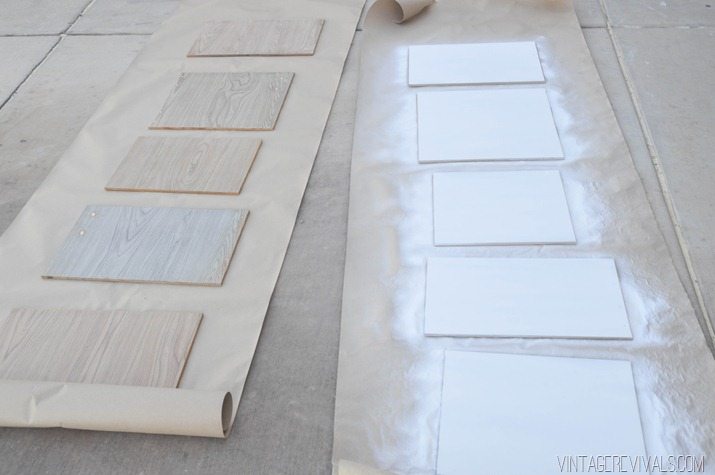
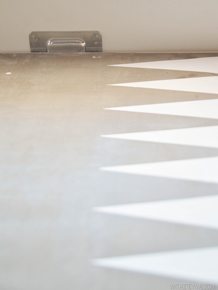
So go with me on this, sometimes we like to overcomplicate things, right!? When I was trying to decide the best painting route I had all of these paint options and techniques and it was just turning into such a process. What it finally boiled down to was durability and the finish. Guess what? Spray paint is AWESOME for both. No paint lines, no major clean up, and when you let if cure for the proper time period it is totally durable. I used Rust-O-leum 2x in White Satin and it matched my wall paint perfectly. (When does that ever happen? It was meant to be!!)
Please note the color difference between the backs of the cabinets, and the front (the 4th one down on the left) There was some major sun fading happening.
Trimming out the doors with wood proved to be a little more complicated. Finding wood that is 1/2” thick at a low price is pretty impossible, so we bought 1×2”s and ripped them in half on the table saw.
Then we measured and mitered the corners. Just a tip, when you are measuring for a 45 degree angle remember that you are measuring for the longest edge!
We attached the wood to the cabinet fronts with a staple gun, and then patched and sanded the holes again. Instead of spray painting the entire back side, I used a little spray paint touch up trick. Spray a good-ish amount of paint into a disposable container. Then use a synthetic brush to touch up your spots.
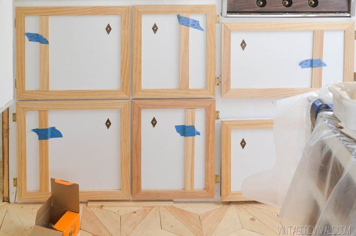
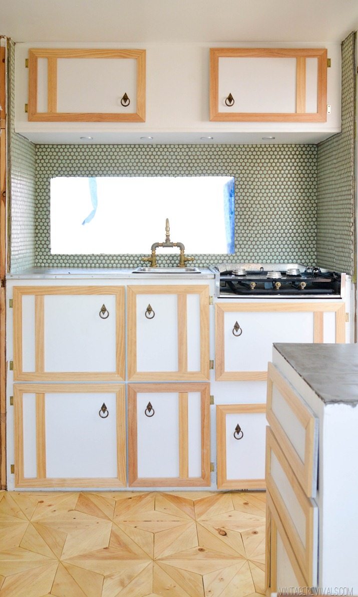
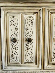
It was at this point that I was having stress that everything was so blah. After playing around with a few ideas we finally decided that an off set vertical piece was just the detail that the cabinets needed.
I attached these pieces with glue and used ScotchBlue™ Painter’s Tape to hold it on for the recommended cure time.
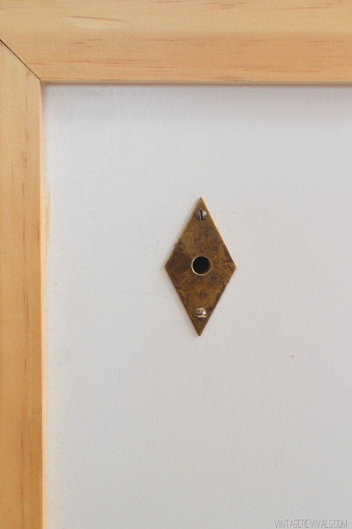
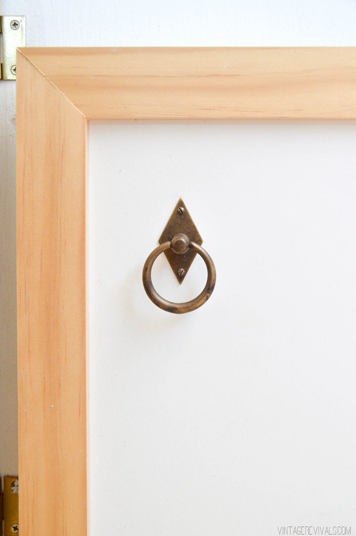
While they were curing I put on the freaking amazing hardware.
I am proud to be a 3M- sponsored blogger, and, as part of my responsibilities, I get the opportunity to evaluate products from 3M DIY. Opinions are my own and additional product used in the project were selected by me.

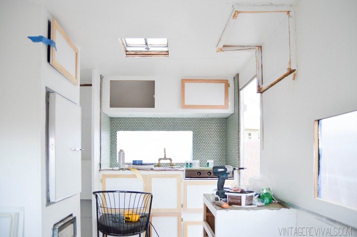


hmm interesting. I understand why you left the trim unpainted. but i almost feel like it doesn’t quite work….but that’s my opinion!
I love how inspiring is this series! Personally, I don’t like the extra vertical piece, I feel like there is too much going on… I prefer the pictures without it, but it’s only my opinion 🙂 can’t wait to see how it turns out when the project is finished 🙂
Unfortunately I agree with Erin – I feel like there’s so much going on with the cabinets that it takes away from the stars of the show: the amazing backsplash and even MORE amazing floor! But I’ve been thoroughly enjoying this series and can’t wait to see how you finish it out. I’m always flabbergasted by how good you can make things look 😉
I want a post on your powder-coated stove top! There are so many adorable trailers out there with the original brown or orange stove top that, while fab in their own way, aren’t quite right for the color scheme I hope to eventually use in my own little camper! I know spraypainting is not at all safe if you want to still use your stove, but I’d love more details on powdercoating.
Like Erin and Kaylee, I’m a little on the fence with the unpainted cabinet trim. I think I see what you’re going for, and you’ve definitely proven me wrong before when I questioned your design choices that ultimately turned out amazing (hence why you’re the design blogger and I am not, haha!), so I’m curious to see how these will turn out once you’ve got everything all pulled together.
Also, as everyone has said, that floor is everything.
Hmm. I unfortunately agree with the others. I’ve been crazy about all your finishing choices for the Nugget so far, but this one leave me feeling under whelmed. I was thinking you were going to paint the trim initially, but the added vertical piece is feeling cluttered and the wood/ white mix isn’t doing it for me.
To each their own for sure, but this one left me puzzled.
J 🙂
After looking at it again, I think the biggest reason why I’m not into it, is because it seems from the photo that the cupboards aren’t straight, and it’s only made more visible with unpainted wood trim. Feeling like a lot of white too. Maybe paint the bottoms a darker color and leave the top how it is?
I also wondered if it was crooked or just my eyes?
LOVE IT!!!! I can’t wait to hear about the faucet, it looks amazing.
What about a gray for the trim to tie in the countertops and grout on that lovely backsplash. I think the unfinished wood is competing with your floor, which is a real star. That said, I totally understand the Nugget is still a work in progress, and you are doing a wonderful job!
This is totally different – it turned out great! Xo, Sarah
Is it weird that I want my real kitchen to look like that? I’ve never said that about a camp trailer before.
While I love the trim, it feels like it is competing with the floor in it’s current state. I’m sure you have a plan in place that will make it blend together a little more, so I’m looking forward to seeing what you do.
I love the offset trim and how unexpected it is.
I guess I’m in the minority here because I think it looks fab and doesn’t compete with or take away from the floor at all!
I think it looks fantastic. In no way do I feel like the cabinets compete with the floor. I love the raw wood on top of the painted white. The hardware compliments the floor amazingly! Your talent makes me wish we were best friends.
I actually really like the look! It feels really light and fresh. That hardware is just awesome. Such a great touch.
Oh Mandi, I absolutely love everything you do. But I do have to agree with the others that the trim left unpainted is a bit much. It does kind of have a Scandinavian feel to it, but I think it takes away from the amazing countertop, backsplash and floors… THAT FLOOR IS DIVINE!
However, I don’t mind the offset vertical piece. I think it does add a bit of quirkiness which (to me) is synonym of you. 🙂
Your little ‘nugget’ is going to look better than my house. 😉 You are so talented. Love it.
This is a wonderful comment and I completely agree! #nuggetenvy
I love the Nugget series! It is turning out so fun 🙂 Unfortunately, I have to agree with the others…the raw wood cabinet detail is so busy for the small nook. You miss the beautiful hardware and amazing floor. One thought..what if you painted the lower cabinets and the upper cabinets a mint green to match the back splash, so that whole nook reads as one color block…all other cabinets in the space would be a solid white. ?? Not sure what the “right” solution is. But, I am excited to see how the little Nugget turns out 🙂
Well, since we’re all sharing our opinions (ha) I think the unpainted trim looks REALLY nice and warm and ties in with the floors.
That said, I don’t like the offset piece. I think it makes it really busy, and might look TOO busy one the Nugget is all styled up. Don’t forget how much personality you’re going to add with styling – you gotta play the long game so that when you style it, it feels just right, not end up feeling like too much. You don’t have to try to add all the personality with structural elements right now.
Sister, you nailed it with your door design. I’m inspired.
Oh, can you tell us if you had a problem finding hinge hardware and how you sourced that?
I am going to have to agree with some of the other posters.
Not really loving the trim. It distracts from the tile, the floor and the gorgeous hardware you found. The offset piece is messing with me and I want to pull them off! The cabinets on top look like two eyes and the window is the mouth. BUT, you usually hit the ball out of the field and maybe I am not seeing the big picture.
Thanks a lot! Now I just keep seeing eyes 🙂
I am SO crazy in love with the floor but I’m not liking the unpainted trim at all. I don’t dislike it enough to tie you to a pole with pink cloth and whip you though 🙂 I’m indifferent about the extra trim piece. I think if the trim was painted white then either trim configuration would be okay. I think my issue is that there is so much going on already with the amazing floor and wall patterns that adding in the back splash pattern and the unpainted trim is just a little overwhelming in such a tiny area.
I think this is looking really good. At first when I was reading all the comments I was like “What is everyone talking about? I love it!” The hardware is nice and kitschy for the space and the extra piece of wood adds a bit of extra interest. I like the raw wood and I wouldn’t want to see it painted, unless it was painted white. I think you’re doing a beautiful job with the space so far and I think it will all turn out amazing in the end!
I had the same black iron cabinet hardware in my house. I took it all down and kept it (because I might need it one day…….yeah, right). I just found these same iron handles wrapped in jute on Hobby Lobby’s website. How weird is that!! And, I think I like them, even weirder. I might spray paint them white or a metallic color before wrapping with jute.
Here is what they look like
https://shop.hobbylobby.com/products/antique-bronze-handle-with-jute-765933/
First of all, I think the cabinets are fabulous. They’re different, and that’s what you do best–CREATE. I LIKE the extra trim, I like the unfinished wood because it ties in with the floor, and in all honesty, I like the fact that not everybody loves it. Great design creates a little drama. I got some advice the other day on a project I was doing; a lot of people said they loved it, but I just wasn’t feeling it, and a friend told me that MY opinion was what mattered. Same here–do YOU love it, or do YOU not? Everything you do is amazing, so trust what YOU think.
Your floors is amazing, and the backsplash is fun…I’m feeling that the cabinets are distracting from those elements, however…especially the backsplash. You’ve undertaken a huge project, and I’m enjoying it very much!
I think you should whitewash them, I think it’s the contrast that is throwing it off. Paint would hide the wood detail too much.
I think you’ve nailed it – whitewash!
First and foremost, you’re just amazing at everything you do, wow! So much talent in one person!
I do think the cabinets look a little too busy somehow? Is it the vertical piece perhaps? Or that they’re unpainted? I don’t know. I feel like the cabinets take away from the backsplash a lot, for some reason. I wonder what they’d look like if the trim was painted gray or a similar color to the backsplash…
Freakin amazing again! And that backsplash too
I guess I don’t see what some others see. I think the cabinets actually compliment the floor with both of them having linear lines, just a different shape. Once you have a curtain up there and all of the finishing things done, I don’t think the cabinets will stand out at all, but rather, the white and wood will look great together. Also….like decorating anything…sometimes individual pieces look strange on their own, but the overall finish looks great. I say keep the cabinets as they are, I really, really like where the overall look is headed! And I am totally hoping you have found some fab orange/mint/white/gray PLAID fabric to tie everything together. You can’t have camping without some sort of plaid!
These cabinets look amazing!! Nice work.:) You’re such an inspiration to us DIY lovers. I can’t wait to see what you do next… xo
Gosh. I can’t believe Im actually typing this… But yeah, really not loving it. It looks unfinished to me, I guess. I wonder if the wood was stained or whitewashed if I’d feel differently? Overall, I guess Im a little disappointed that all of the vintage charm is being sorta discarded. I thought that was the point of buying vintage. BUT. That said, you know the saying… opinions are like a**holes, everyone’s got one, right? You are a genius and I’m sure have a vision in mind. So obviously, you do you & the rest of us will wait with bated breath for the New Nugget.
So, you decided NOT to re-use the hardware after all. It’s the same as on my kitchen cabinets. I’m getting kind of used to it. It takes attention away from my countertops! (But not exactly in a good way).
That floor is lovely, but not what I’d expect in a travel trailer. And I would never have bare wood in a kitchen, but don’t expect you will be cooking in there much, so it’s of no consequence.
I agree with Mary, you are dumping vintage charm. And for just another white kitchen among gazilliions of impractical white kitchens. That backsplash! The less said about it the better, IMO.
But thanks for the tips on painting cabinets. I did it the hard way with a brush, then discovered bloggers who know the better ways. Next time, spray all the way.
When you are finished here it will be stunning, just not looking vintage. C’est la vie.
Haha I know what you mean – if it was my kitchen there would be crumbs falling through all of the beautiful bare wooden cracks in the floor… and that’s without it being mobile and rolling!
But really – I’m probably a messier cook than the rest of the world.
You seem kind of like that friend who pretends to be supportive but who is always waiting excitedly for a chance to stick the knife in. I think you are looking at these posts desperate to find something mean to say and then quickly covering it up with some half hearted praise. Are you an acquaintance or something with an axe to grind? It’s just so weird the comments you make.
Some of these comments just a little wack attack! This is MANDI. MANDI. Trust in the Mandi! Your nugget is your nugget, and its Beautiful!!! I love the unfinished trim, think the whole thing is AMAZING. I can’t wait to see the faucet and stove-top. I know you noted your mixed feelings in your new post, but Jiminy Cricket I think this whole thing is freaking fantastic! hatas gonna hate and all that…
I think it’s great, but the thing I thing is most great, is the fact that it looks like YOU. I’m a fan of Project Runway, and they’re always telling the designers to stay true to who they are, their aesthetic. Even Nina Garcia would love how you do that. I’m loving watching the your process and progress. 🙂
Hey Mandi, you’re a very creative person. You’ll figure it out. But since you put so much effort in it and even though it’s not a new trailer, I would definitely think about new or better cabinets. I think too many small doors and too much going on, even for a vintage look. The floors do look amazing, though! Amazing!
I think the concept you were working for was a great one… it just didn’t pull through for me. You are genius. You are amazing! And that phenomenal floor needs something to compliment it rather than be a let down. I have full confidence you’ll figure out something you absolutely love. After seeing the hexagonal wall in your daughters room (and some of your other recent projects) I was expecting some color… to create an illusion… to make lines where there aren’t any and erase the lines that are there. Here are some links to things that would make me happy. I hope they spur the creative corners of your gut to help you come up with something truly Mandilicious!
Photos # 7, 32, and even 36!
https://www.digsdigs.com/57-bright-and-colorful-kitchen-design-ideas/
https://uuldesign.com/home-decoration/kitchen/cheerful-color-for-your-kitchen-cabinets/attachment/playground-for-kid-in-colorful-kitchen/
https://maddyruns.com/modern-kitchen-gets-a-colorful-mosaic-backsplash-cabinets-makeover-by-cotto-veneto/
https://uuldesign.com/home-decoration/kitchen/cheerful-color-for-your-kitchen-cabinets/attachment/colorful-kitchen-cabinets-variation/
Good luck! Can’t wait to see what you come up with!
I LOVE the handles. My husband (who peeks over my shoulder while I read my blogs) says, ‘it’s awesome!
I agree something does looks off, maybe you should paint the white part of the cabinets a colour that pops
I Think It Would Work If You Trimmed The Window Etc In The Same Wood Trim. I’m With The People Who Like It. The Square Shape Of It Kind Of Does Fight With The Round Penny Tile backsplash. I Love What You Are dOing With The nugget. It’s Totally Adorable And I Think You’re Finding The Diamond In The Rough.
Mandi,
I love your blog! Like, my love almost borders on creepy sometimes. 😉
I love what you have done with this little nugget, but I too feel something is off. I know a lot of people have been pointing at the trim on the cabinets and have suggested changing the colour, but I just dont think that’s it. I think it’s the hardware. I love the hardware, don’t get me wrong, but I don’t think it is the right choice for these cabinets. I was envisioning some hardware with a pop of colour, that were perhaps a bit more chunky and modern/retro. I like the wood trim and I would leave it the color it is, but that bottom door on the oven looks just a little crooked, but that is an easy fix.
You can do it, because you are awesome!!!! Remember that! You are a constant source of insperation for me. I do a lot of DIY, and renos, and furniture refinishing and all that and I always find my own spaces are the ones that challenge me the most. Decisions for other people are easy to make, but my own? Yikes! You rock!
I am digging this look, but yeah, something’s off. I have to agree with Stella; I think the hardware just doesn’t work here. It’s amazing but it’s all wrong (colour & shape) in this context. I think knobs would be best, something chunky (wood/glass/ceramic?), Round maybe? Or diamond-shaped to echo your amazing floor?
I think the trim looks fab and the extra vertical is super quirky, which is totally you and the Nugget. It looks good raw but it may be a little much once the rest of it comes together. At which point I think a whitewash would work great, in either white or a light minty green to pick up on the tiles?
I’m sure you’ll figure it out and it will be absolutely rad in the end :-).
I think your Nugget is adorable. I, too, am refinishing an RV, not as “cute” as yours, although one day I hope it will get there. This year it is specifically for the men in my life for the hunt camp. Big hand to you on the challenge! Referbing RV’s is hard work, especially old ones.
I have a question, did your cabinets have latches on the inside to keep them from “flying open” or not? Mine do, they are hideous and just wondered what you used instead to keep doors stationary while in travel.
BTW, don’t pay attention to the snarkey comments, you keep rolling. 🙂
Do you use your camper for camping… if so, since taking out the top storage, where do you store things ( other than the darling glass doored closets where the closet was? … our camper looks similar ( style wise) and we kept the upper cabinets on the side, removed just the exterior of the upper rear cabinets, as a shelf… i just adore what you have done! so fresh! thank you for sharing!
Hi Mandi!
Just wondering, what are the little can light deals you guys used as your under cabinet lighting? I would love to do some stuff like that in my camper, but haven’t been able to find any good lighting solutions that are tiny enough! Let me know, thanks!
We got them at Ikea!
PS, just read some of the criticism on this post, and with the way the end result turned out, you should be so proud! the hardware kicks so much ass, and the whole diamond shape theme is out of this world. To say it doesn’t have “vintage charm” is to overlook your impeccable style 100% Just saying! xoxo