When to Reupholster a Couch + Coupon Code

By Mandi | 03/25/2015 | 26 Comments

Growing up my best friends dad had an upholstery shop in their garage. MAN what I wouldn’t give to be able to go back in time and actually pay attention to what he was doing! On one particular occasion I remember asking why someone would one have an old couch reupholstered (because at that point in my life I couldn’t fathom that someone wouldn’t want something new from RC Willey). His response was “Because they like it so much they would pay for it again.”

For months I hunted for the perfect slouchy retro couch and came up short. I even enlisted the help of a professional furniture hunter (@domfasano he is in Phoenix and always finds the most amazing things!) but pickins were scarce and the reality is that it wasn’t going to be cheap. I was 87% convinced that I was going to have to make a couch. That was a daunting situation given the time frame that I had to turn the living room around in.

That is when I stumbled upon the black couch. I found it on KSL (a online classified in Utah) for $150. It was about 4 hours away but I was headed up north anyway so it wasn’t a big deal to take the truck instead of my car.

I was holding out the best kind of hope that it would be perfection, that not a thing would need to be done to it.

I was wrong.

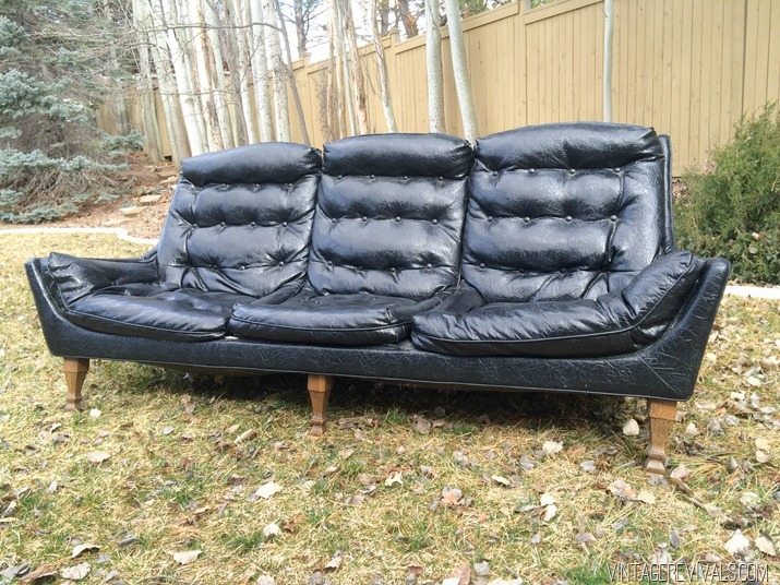
The black naugahyde was bad. Real bad.
VintageBlackSofa2

But the shape was so great. It was exactly what I wanted.

I hemmed and hawed over what to do and decided that I was not going to find a couch style that I liked more than this one. Buying vintage is awesome, but the fact of the matter is that you are buying something 40+ years old and sometimes it needs a little work done to be able to last another 40.

I called my friend Mark Luke that did the cushions for The Nugget to see if this was a project he wanted to tackle. (Luke’s Custom Upholstery for those in St. George. I cant recommend him enough!!)  He said it would be no problem, and told me how much fabric I would need. A project this size, with as much detail as this couch has (the entire thing is one cushion, the seat cushions are not removable) I knew that it was not something that I would be able to tackle. Simple reupholstery? All day. This? It would have been a freaking disaster.

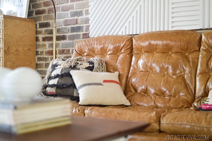
I kind of went back and forth about using real leather, and vinyl for a little bit. I ultimately decided on real because I am planning on having this thing forever and I want it to get better with age.
Vintage Leather Couch-16


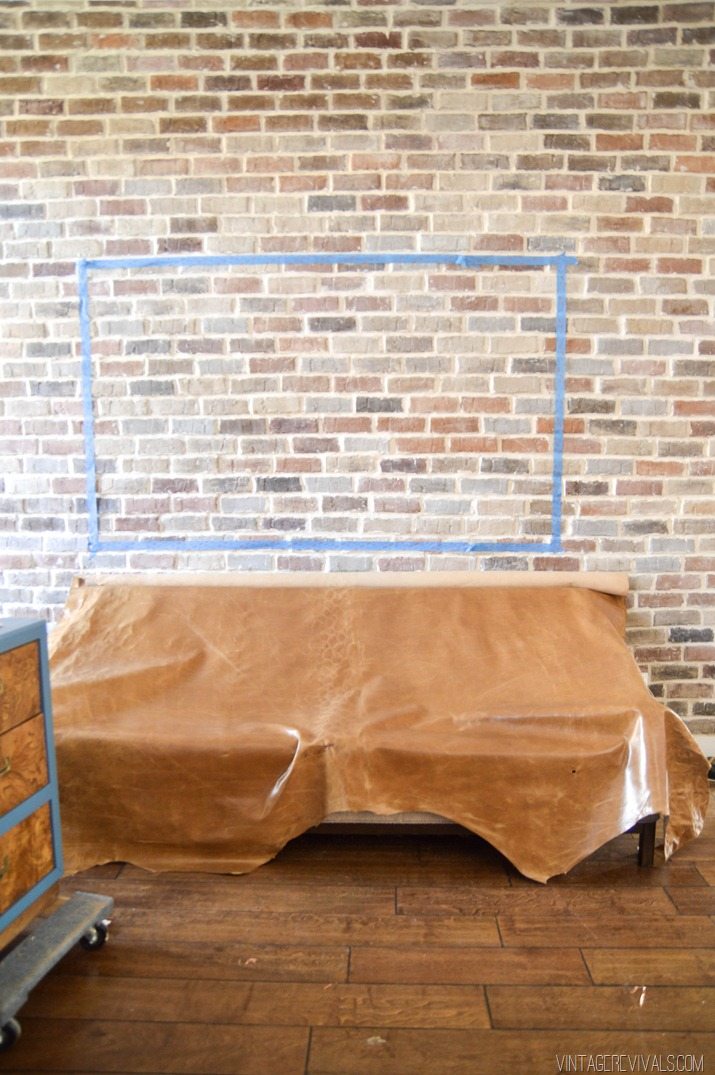
The leather that I ended up with is from Leather Hide Store. It’s a new line that they have called Restorations and the color is Wicker. This leather seems like it is supposed to distress over time. There is a slightly shiny coating on it and when you wrinkle it, it lightens where the folds are.

Leather Hide Store Restorations Leather

This little situation works great in my case because I want it to distress in places that it naturally would. (If you are looking for something that doesn’t distress, they have a really pretty camel that I was also looking at.) We haven’t had to clean it yet, and it’s only lived with us for about a week, but I will keep you guys updated on how it wears!

To celebrate the reuphlstery option, Leather Hide Store is running an exclusive promo for VR readers. If you use the code Restoration10, you will get an additional 10% off their already fantastic prices on the Restoration line. The coupon code is good for 30 days from today (and just a side note, the Restorations line is pretty popular, so shipping may be delayed for a few weeks if it goes into backorder)

Vintage Leather Couch

The last bit of changes we made were the awful legs that were on the poor thing. Back in the early days of Vintage Revivals I would have spray painted, and glazed them :). A few months ago I bought a pair of chairs off of CL. They weren’t anything amazing or specials, but they had really good MCM legs and were so cheap. Fast forward to last week, the legs were the exact height that I needed and because I bought 2 chairs, I had enough for all 5 legs. Love it when that happens!!
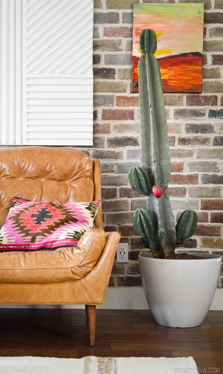
 

Loft Living Room Makeover vintagerevivals.com-33

When I came to grips with the reality that I probably wasn’t going to find my dream couch at the thrift store this time (sad!!) I figured out what I had in the budget for a couch. Court was all over spending more to get something that was comfortable, and that I loved (because he hated the orange couch so much.)

Looking on 1st dibs, and Ebay the reality of the situation was that, even if I could find a couch to buy, it was going to be at least $3k. The Hamilton from West Elm was going to be over $2k. I figured out the total cost for reupholstery, and it came in at just under $1500.00 (including the couch). That still sounds INSANE. $1500 is not nothing, but a dream couch, in real leather was totally worth it! Especially when I was still coming in lower than I was planning on.

I feel like with this couch saga my eyes were opened to what “They like it so much they would buy it again” really meant. If I found this couch online exactly the way that it is now, would I buy it? Not only that, but would I be over the moon excited about it?! That answer is a yes in the most serious Morgan Freeman voice I can muster. (Things always seem to hold so much more weight when he says them, right?!)

Loft Living Room Makeover vintagerevivals.com

Would I do it again? Morgan Freeman Yes. I will totally keep you guys updated on how the leather is wearing once we start breaking it in!

LoveYourGuts14 
 
 dont miss any of this series


Loft Living Room Sources

By Mandi | 03/23/2015 | 27 Comments

Oh my goodness, where to begin!?

How about by saying thanks for all of the love on the living room reveal post?  You guys just make my entire life.

It is absolutely insane to me how these quick turnaround room makeovers always seem to work out.  Living in Southern Utah there are not a lot of resources for buying treasures.  I mean, the options are Target, Homegoods, and a few thrift/consignment stores. I don’t typically buy a lot of stuff online (something about seeing it in person and having a hard time remembering to ship things back if I don’t want them come to mind.)  But for this space I did a little more online shopping and I’m pretty happy about it!

Loft Living Room Makeover vintagerevivals.com

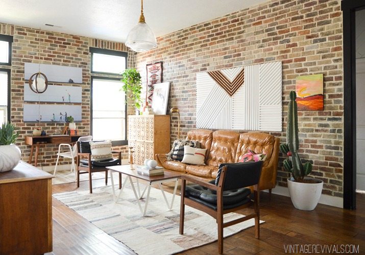
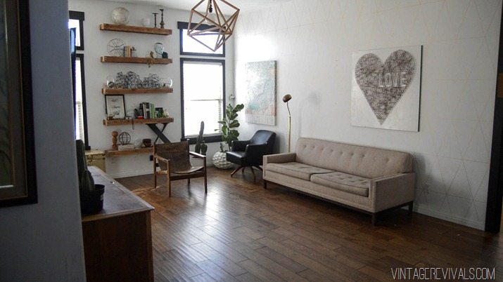
The couch was found on Craigslist for $150 and reupholstered (a whole post about this process is coming this week).  In Utah there is a store called Downeast, they sell returns from really great brands like West Elm, PB, and Restoration Hardware. I don’t usually find a lot of stuff there, but a last minute trip landed me the coffee table and pendant light.  The coffee table (from WE) was a super great price (around $100) same goes for the light, it was just over $100.

The tutorial for the giant white dowel art can be found here!

The black leather side chairs are from a local consignment store called Urban Renewal.  It is the one place in town that really carefully curates the stuff that they sell, it is a great place for prints and loads of inspiration.  Normally their furniture is out of my price range but these super comfy guys were a huge score at $55 each. The off white rope pillow on the black chair is from Homegoods, they had a ton of different styles when I was last there.

Loft Living Room Makeover vintagerevivals.com-35

The white and gray fringe pillow is made by Loloi.  I went to Vegas on the hunt for some fabric for a chair that I am reupholstering and found a couple of great pillows at Home Fabrics (this being one of them!) I have no idea where to send you guys to actually purchase it, some are sold on Urban Outfitters, but this one in particular is sold out on their site. 

The gray and red striped pillow is from CB2 (sold out).

Loft Living Room Makeover vintagerevivals.com-32

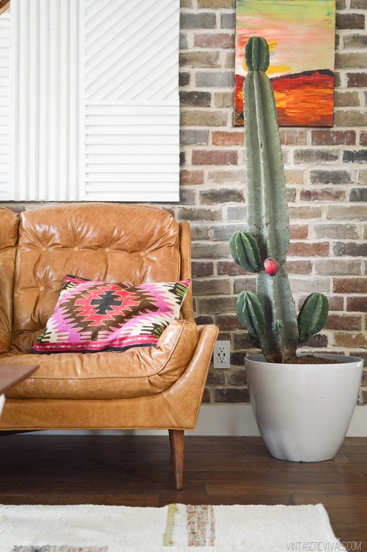
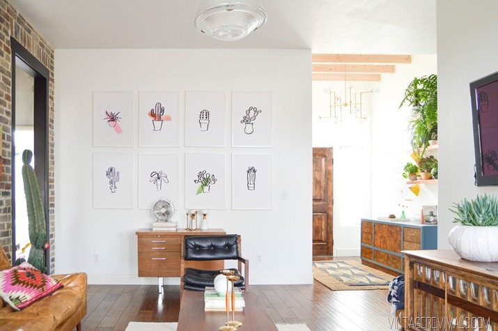
The pink and red kilim pillow is from Urban Outfitters.  The giant cactus is a Peruvian Apple Cactus that I found at a local nursery for around $60.  The simple white planter is from Lowes.  Also, I just need to point out (because you can see it in this picture) when we bricked the wall we swapped out the regular outlet for one that has USB ports and it is AWESOME.

Card Catalog and Wall hanging vintagerevivals.com

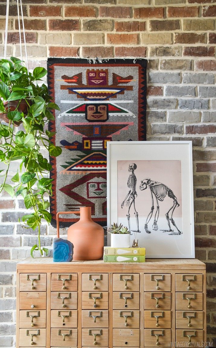
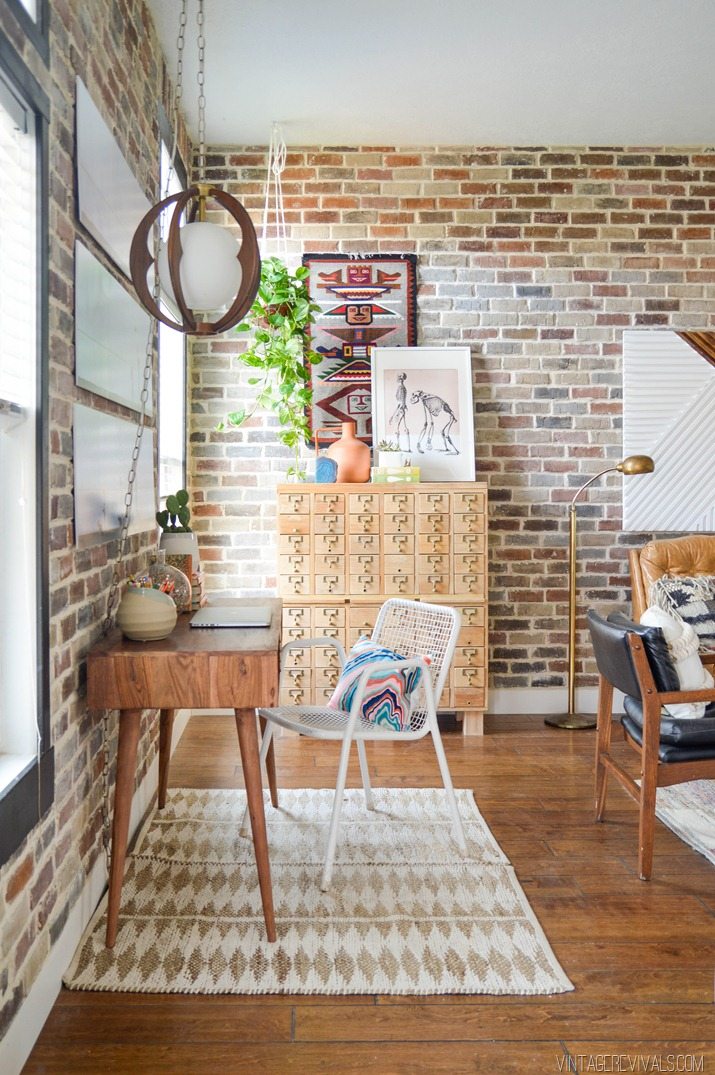
You can get all the dirty details on the Craigslist card catalog in this post.  The woven wall hanging was a consignment store find for around $30.  Lets just talk about the terra cotta vase for a second.  It is SO good.  And the best part is that its not actually terra cotta, it’s metal, so you don’t ever have to worry about that cute skinny arm breaking off.  The skeleton print was a happy accident that you can read about in this post.  Everything else was thrifted.


Unconventional Family Pictures vintagerevivals.com

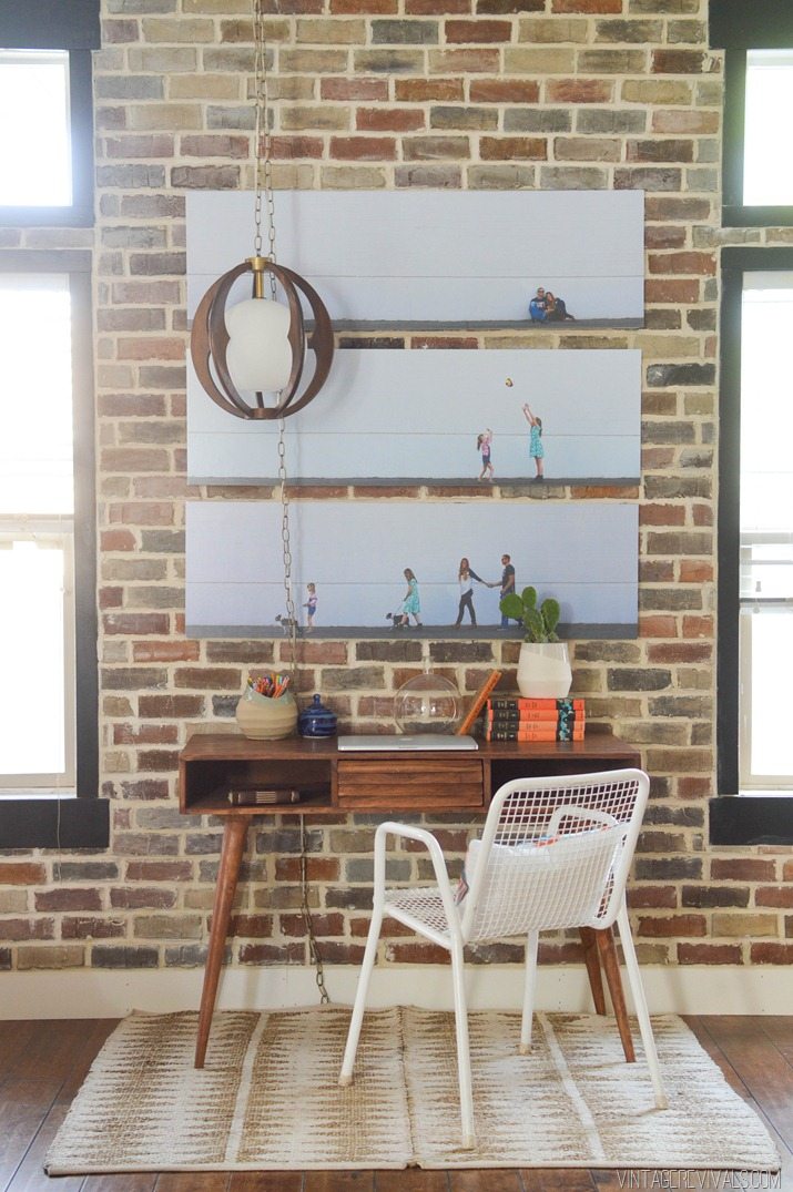
You can read all about the hanging light here, and how we rewired it here.  The family pictures.  Man I love those things so much.  We had them printed at Alphagraphics (if you are in St. George I HIGHLY recommend them, they are amazing to work with) I really wanted them printed on a canvas but with the room turnaround time we just couldn’t make it happen. 

The desk was a Homegoods find that you can read all about here (oh my gosh that post is so old!  Wahhhh! Dylan!  Be a little baby again!!!) I took out the colored drawer and moved the other one to the middle.  The rug was made with a paperclip.  You can find the tutorial for that one here.  Both planters are from Target (seafoam & white)

Loft Living Room Makeover vintagerevivals.com-41


Love the marbled pillow from CB2.  The colors are a little brighter in real life than they seem online.

Loft Living Room Makeover vintagerevivals.com-23

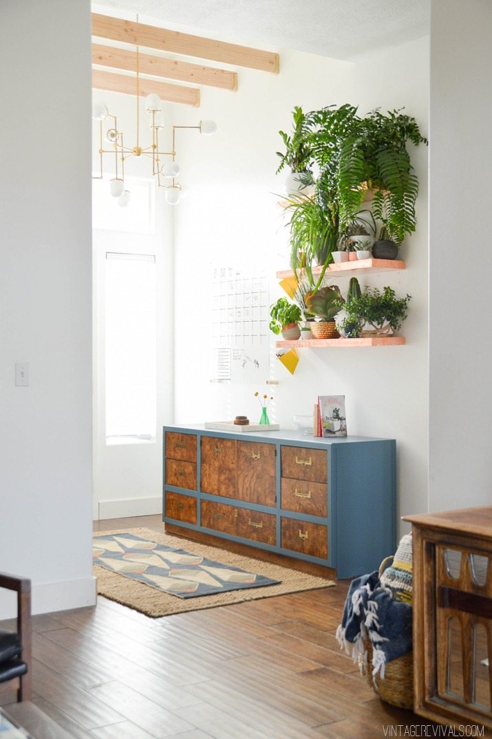
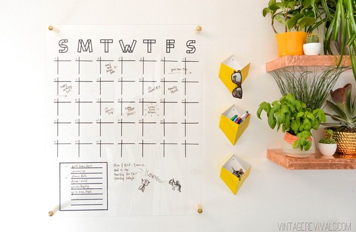
Tutorial for the copper shelves, and plexiglass calendar will be up on the blog soon!  I’m glad that you guys are as excited about those shelves as I am!  The large sisal rug is actually 2 of these guys from Target stitched together. When I originally ordered the patterned runner (WE clearance 70% off!) I was super excited, then when I got it, it looked so rinky dink in the entryway.  It needed to be twice as wide…oops.  So the sisals saved the day!  The rug is sold out, but they still have pillows with the same pattern on major clearance ($14.99!!!)

The tutorial for the bent arm chandelier is here, as well as the ceiling beams, and HI. art.

Loft Living Room Makeover vintagerevivals.com-25

The little metal yellow wall pockets add some fun color and are $8.95!!  I feel like I need one on every surface of my life.  Including in my car.

I have to say, I feel like Home Depot is majorly stepping it up in the plant department lately.  They have so many great cacti and large succulents it makes my heart happy!

Loft Living Room Makeover-7

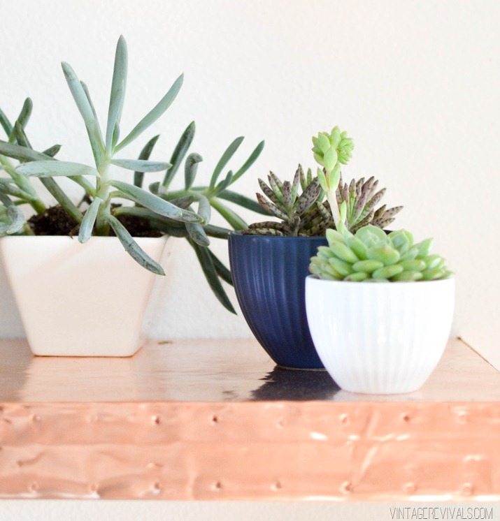
Most of the planters are from Target.  These little teeny dip bowls are the perfect size to pop a succulent into and they are only $1.99!

The slouchy linen basket is from Nate (I love him.) And just a heads up, there are a bunch of KILLER planters at Target in the garden section right now.


Nate Berkus Basket & Multi Colored Pillow vintagerevivals.com

This is the second Loloi pillow that I found at Home Fabrics, but YAY! they sell them at UO and as a rug at West Elm!   Large woven basket is Nate, naturally.


Loft Living Room Makeover vintagerevivals.com-20

All of the cactus prints will be available in the shop shortly! (until then there are lots of good ones!)

Phew.  Hope you guys made it through that and got the info that you were itching for!!  If I left something out, let me know below and I would be more than happy to pass the info along!

LoveYourGuts14


 dont miss any of this series


Loft Living Room & Entryway Makeover Reveal!

By Mandi | 03/19/2015 | 510 Comments

I cant even begin to put into words how much I love this living room makeover. It has been a whirlwind few weeks to get this puppy done, but it was SO worth it!!

I sure hope that you guys have enjoyed this #100reveal series with GE reveal® Lighting and The Home Depot as much as I have! $100 and a little creativity can go a long way!

VR_IntroPost_ForTwitter1


Lets just have a room refresher shall we?

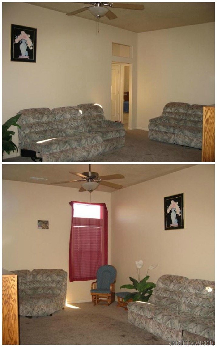
I love showing these pictures. THIS my friends, is what our house looked like on the MLS listing.

Living Room Before

Awesome right?! I love looking at these pictures, it so perfectly attests to what massive transformations can be in store for your house if you just stop worrying at get started!

This is what the living room looked like 2+ years ago (you can see the room reveal here). I love so many things about it still, but when the orange couch kicked the bucket, I knew that it was time to make a change.

Living Room Makeover @ Vintage Revivals-2-2


This is what the living room looked like when we started this series just a couple of weeks ago:

GE Reveal Light bulb-2

Cue sad trombone.

My inspiration for the space was an industrial-ish loft (because that is all I want in this world and lofts don’t exist in Southern Utah)

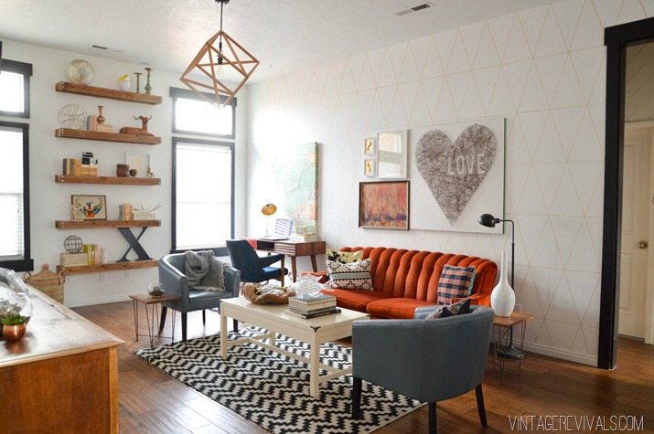
This is what it looks like now:

Loft Living Room Makeover vintagerevivals.com

Loft Living Room Makeover vintagerevivals.com-33

(So many pictures, click through to see them all!)

DIY Square Dowel Art

By Mandi | 03/18/2015 | 20 Comments

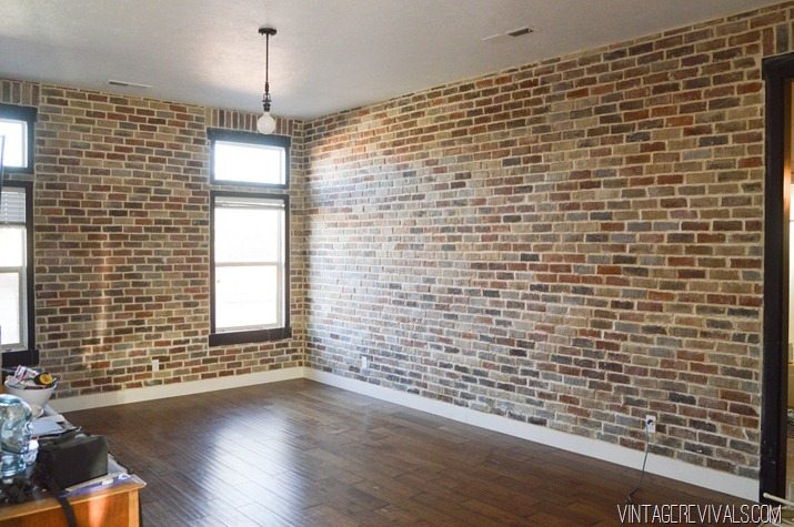
The great question surrounding this room makeover is will she or wont she paint the brick. Like I mentioned in my Feel the Fear post, I decided to keep it dark. (It can always be changed up at a later date) and I’ve been diggin it!

The thing is that it took this massively bright room:

Living Room Makeover @ Vintage Revivals[2]


And made it seriously darker:

Howtoinstallbrickveneerinsideyourhome171

PSA of the day, if you want your room to feel significantly larger, paint it a light color. When all of the furniture was out of the room after it was bricked it felt pretty teeny.

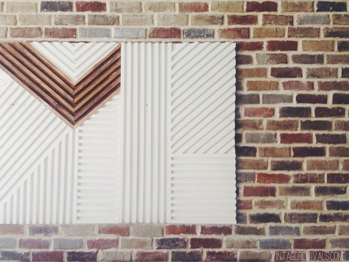
The easiest way to off set the dark wall was to use light colored art. It gave it dimension by adding another layer and it brightened everything up!

Quite a while ago I pinned this picture from a restaurant designed by Bells and Whistles and have been itching to recreate the wall treatment on a smaller scale. It is pure genius!

juiceservedhere-octoplace-10


A big white piece of art was what the decor dr. ordered and this was the cure.

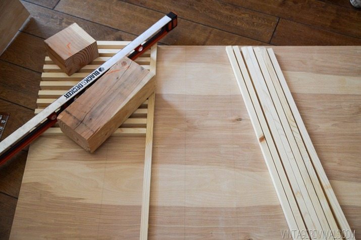
This project started the way every good project starts…with a trip to The Home Depot. I bought a piece of 1/2” plywood and had it cut to 3 1/2’x6’. I also scooped up about 5 1x8x10’s.

The first thing that we did was start ripping the 1×8’s on the table saw so that they were about 1” square. It is ok if they are absolutely perfect, really really close will work well too. 😉

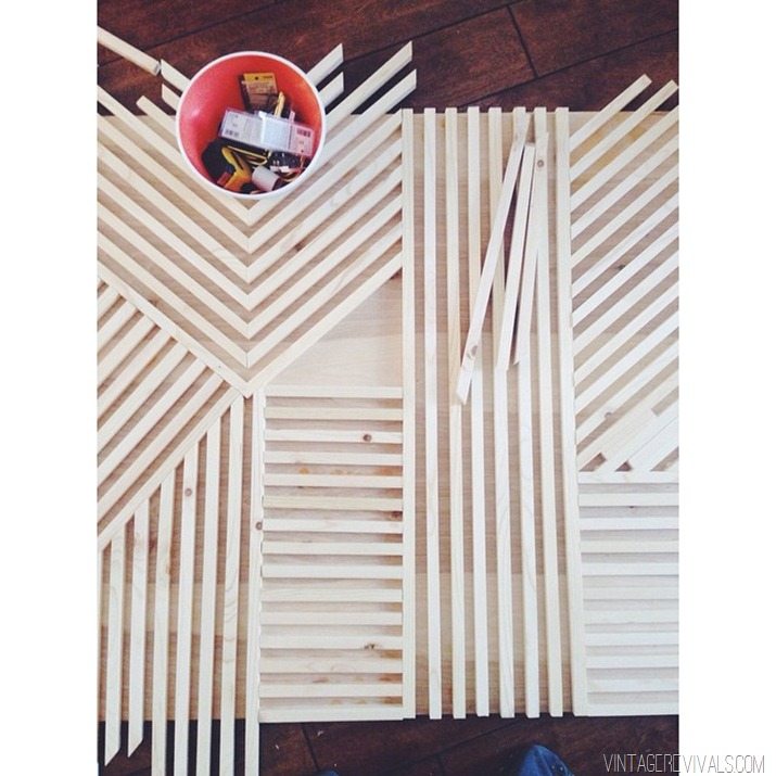
Start by setting your vertical line. Mark it will a pencil and make sure that it is level and perfectly straight, this is going to determine the angles for the rest of your piece.

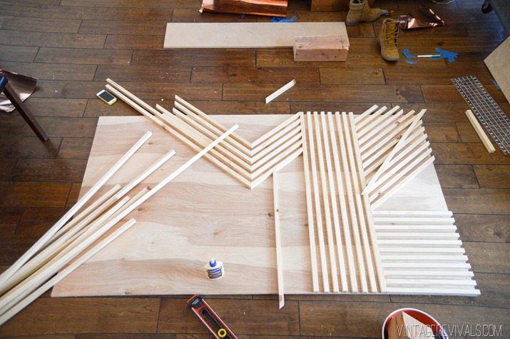
Once you have your vertical piece set all you do is work off of it.

DIY Modern Square Dowel Art-2


Spacing is so simple, you just use scraps in between your dowels.

DIY Modern Square Dowel Art-7

To attach the dowels I used my favorite wood glue Titebond III. I was originally planning on using the glue to hold them in place and then going back over it with a finishing nailer on the back but the glue held everything wonderfully by itself (I love it when that happens!)

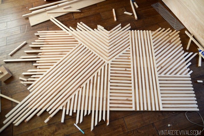
It can seem a little overwhelming when you are looking at all of the angles, but the only thing that you need to remember is that when you are working off of a 90 degree angle (like the one you’ve created with your straight piece) everything will always add up to 90. So if you cut a 40 degree angle, then the one working off it will be a 50 degree angle. This is kind of one of those things that I can explain to you, but I cant understand it for you, you just have to start working and you’ll TOTALLY see what I am talking about!

DIY Modern Square Dowel Art-3


When I started I was cutting everything exactly to the edge of the board but it was taking FOR.EVER. so I started leaving the edges off.

DIY Modern Square Dowel Art-6

DIY Modern Square Dowel Art-8


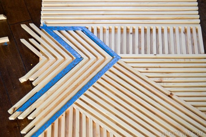
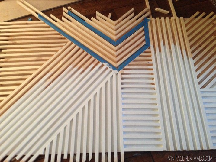
I taped off a small area for staining.

DIY Modern Square Dowel Art-9


And everything else got a few coats of white paint.

IMG_7340


There was a massive internal struggle about cutting the edges off once it was finished. I mean, they look really cool right? Ultimately I decided to trim it but I still love it untrimmed.

IMG_7355

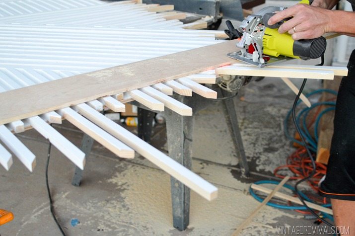
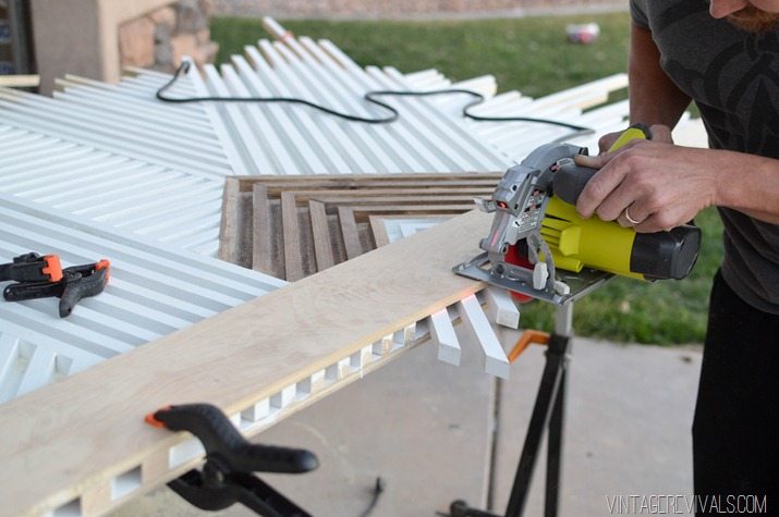
To trim it we used a straight board that was clamped on either side as a guide and used a skill saw.

DIY Modern Square Dowel Art-36


DIY Modern Square Dowel Art-34

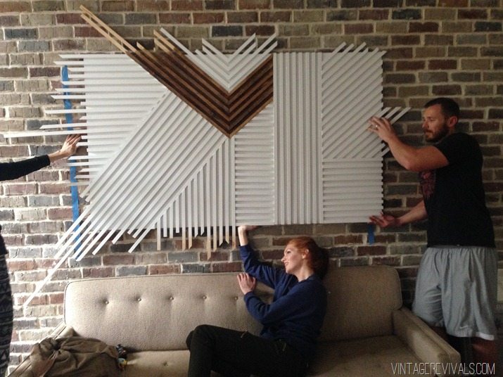
Mounting it on the brick wall got a little tricky. We ended up drilling directly through the face of the art, through the brick and into a stud. Then I filled the holes and painted over them.

IMG_7379

I cant wait for you guys to see the entire room tomorrow!!!

LoveYourGuts14 
 
 dont miss any of this series


Feel the Fear

By Mandi | 03/16/2015 | 26 Comments

Happy Monday!!

Oh. My gads. How is it already Monday!?! We have been working like crazy people round these parts. The living room and entryway are coming together and they are pushing me (more like shoving forcefully) outside my design comfort zone. I know that so many of you have these same feelings so I thought it might help at least one person to talk about it.

I know the things that I like in a room. White walls, raw wood, bursts of color, some sort of geometric. This is my comfort zone. I can totally live here. But lately I’ve just been itching to try something different. Because you never know what can happen unless you try it. So I’m trying it. And it is scary.

UpcycledandDIYedBedroomMakeoverIdeasvintagerevivals.com27

Here is what is going on. For now the brick in the living room is staying raw. That alone has made a huge difference. It moods the place up a lot. 2 of the 4 walls in the living room are white, but they aren’t the ones that you focus on when you walk into it so until you are actually IN the room all you see is the brick. The plan for balancing the darkness is to use lots of big bright pieces of art.

My usual bold colors are toned down a little and everything is sort of taking on a more masculine vibe (not totally, but definitely more than the usual).

10449072_867632459962299_519829404_n

I don’t consider myself a super neutral person but this room is way more neutral than anything I’ve done before.

Even though it feels a little awkward and I am not 1000% about it, I love the idea of a new vibe. So I’m pressing forward.

Why does it seem like such a big deal in my mind?! Lets be honest, it isn’t life or death, its just decorating! I know this, and yet, I wonder and worry. I am a massive fan of using what you can find. Thrifting and secondhand shopping are my lifeblood and when that happens you get what you get (complete that sentence).

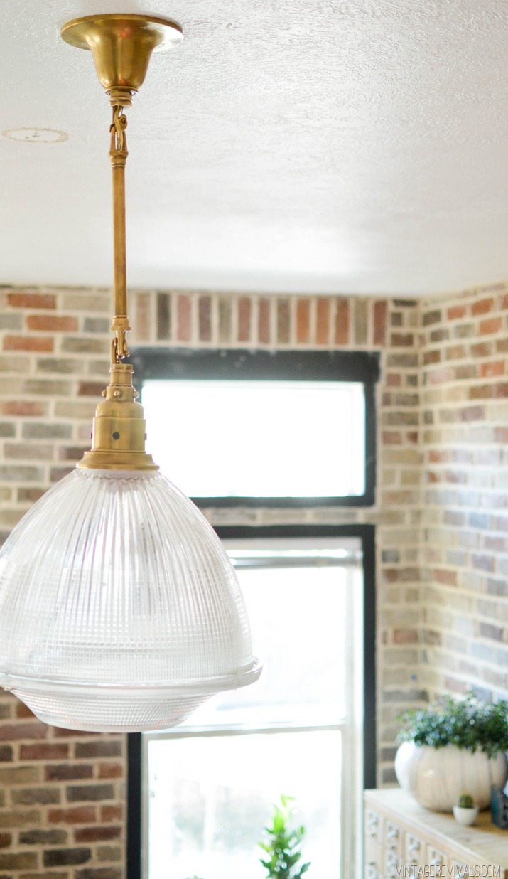
I scored this GIANT brass and glass pendant for $800 off (!!) and it totally goes with the loftiness.

Loft Living Room vintagerevivals.com


To me being fearless about design doesn’t mean that you don’t actually feel fear, it means that you feel it and move forward anyway.

Loft Living Room vintagerevivals.com-2

The entire room reveal is happening on Thursday and there is still SO much to do! You know on Top Chef when there is like 30 seconds left and everyone is FREAKING out and racing against the clock? Yes. That is reality at the Gubler’s right now. Fingers crossed we can pull this thing off!

LoveYourGuts14 
 
 dont miss any of this series


Rescuing A Craigslist Card Catalog

By Mandi | 03/13/2015 | 40 Comments

This is a DIY crime scene. If you are sensitive to graphic images consider yourself warned.

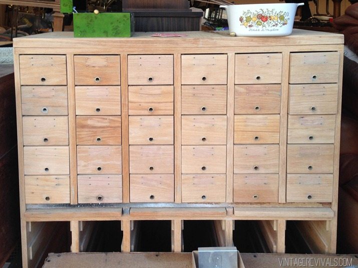
Last year when I was gearing up for The Hoard Sale I found a listing on Craigslist for 2 card catalogs. The pictures were bad, and the listing was super vague. But I mean, OF COURSE I had to contact the seller.

I found out that they were about 40 minutes away and were in rough shape…like they had lived in a barn outside for the last 35+ years. I cant remember what the original asking price was, I think well over $1000 but I ended up getting them both for $550 and they were able to deliver. Which was wonderful considering this thing weighs so much.

The pictures looked pretty bad, but MAAAAAAAN. It was worse than I thought.

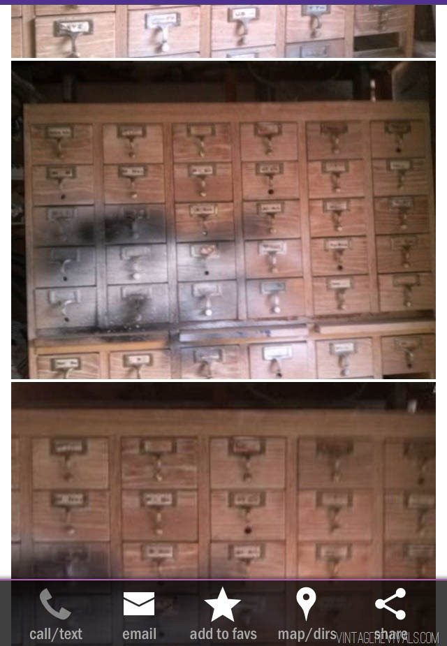
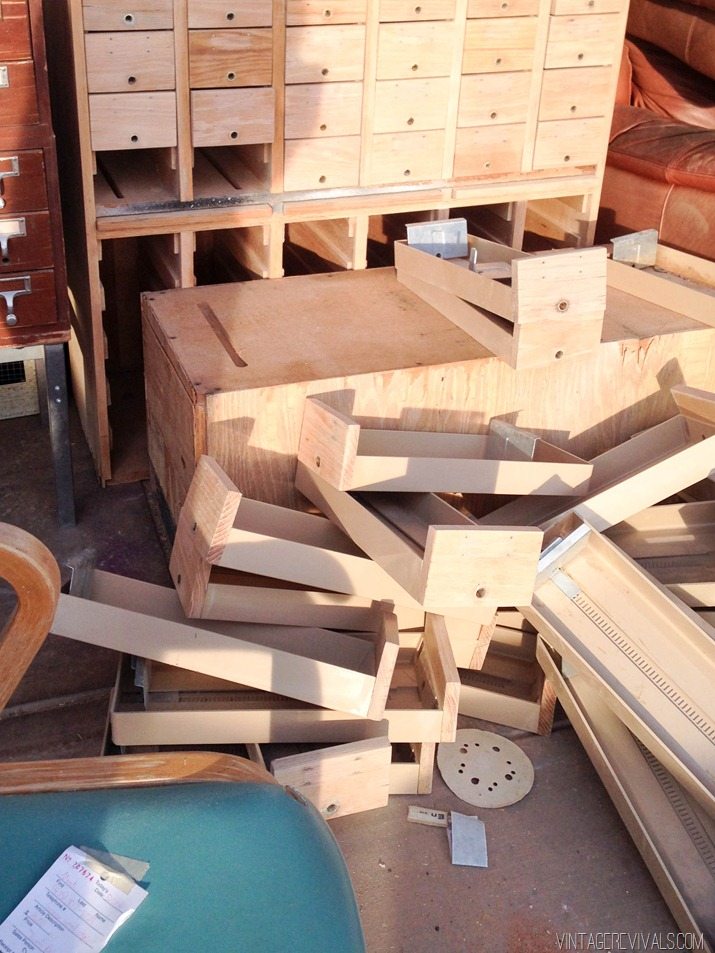
The previous owner had used the pull out shelves to spray paint. (screen shot from the ad)

Card Catalog vintagerevivals.com


WHYYYYYYYYYY?

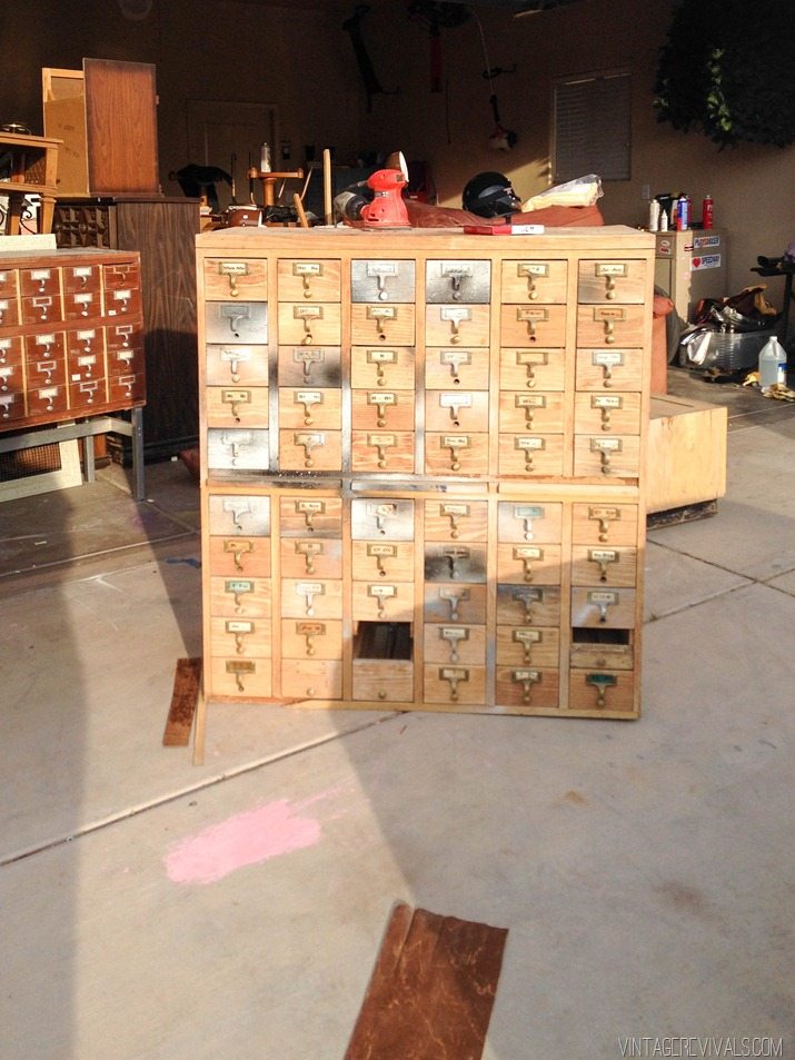
It was EVERYWHERE.

Card Catalog vintagerevivals.com-2

Not to mention that it had been living outside in the heat of Arizona. As you can imagine the veneer was toast. I’ve never seen anything like it, it was the consistency of shredded corn flakes. Luckily the drawer fronts were solid wood and were salvageable.

So I did what any normal person would do, I got to work saving the dang thing.

Card Catalog vintagerevivals.com-4


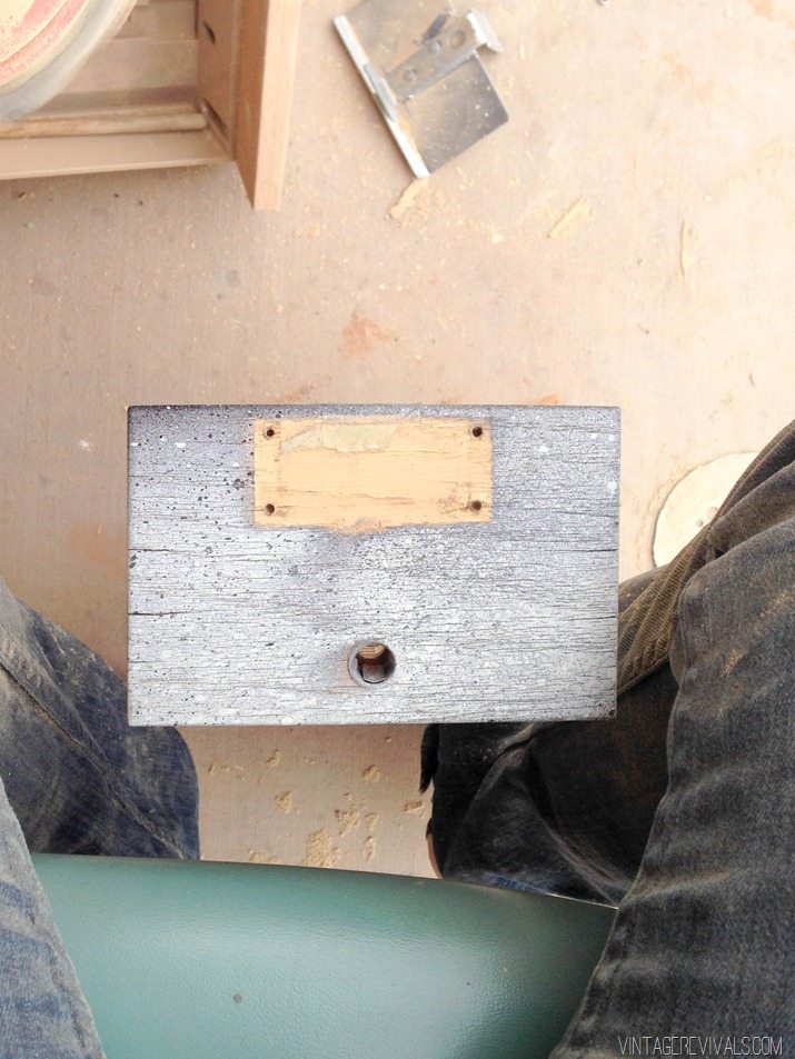
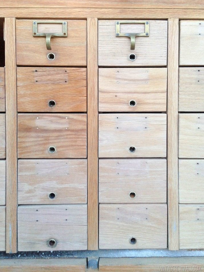
I needed to take the paint off of the hardware that had overspray, but I didn’t want it to look new. After testing a few different things I settled on Acetone. I put it in a large bowl and let the hardware soak for about 3 minutes. The spray paint melted off without altering the age of the brass.

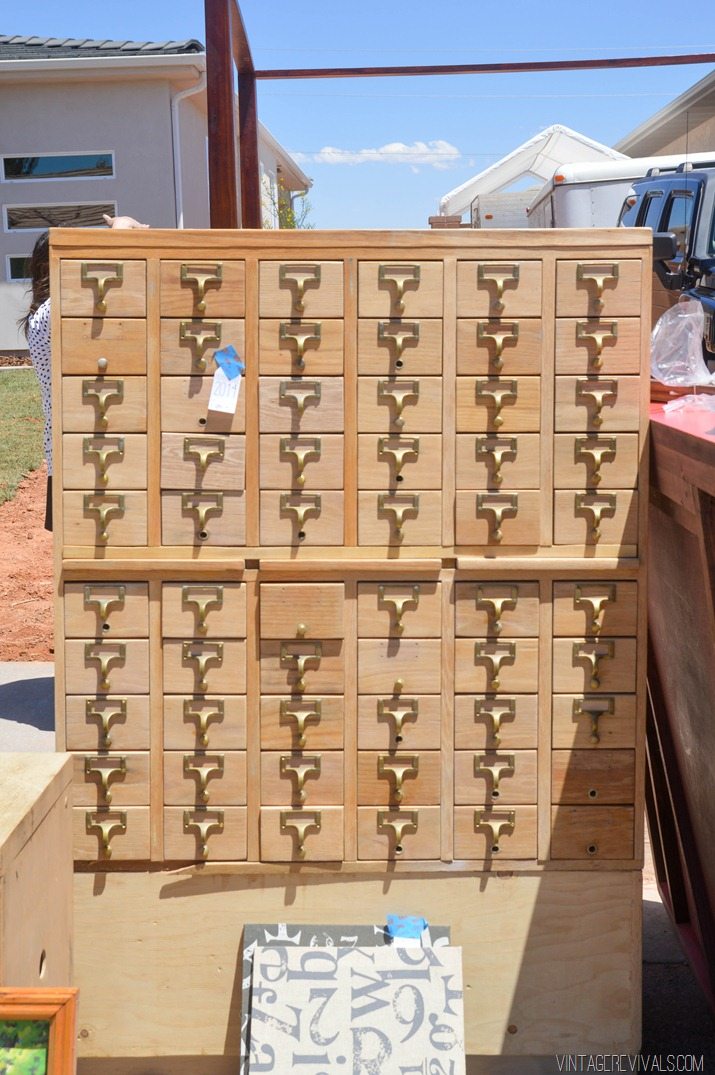
Every single one of the 58 (2 were missing) drawer fronts were sanded completely. The ones that didn’t have paint had a flakey topcoat that needed to be out of both of our lives.
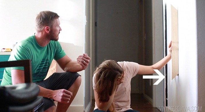
Card Catalog vintagerevivals.com-6


I LOVE how many different tones of wood are in it.

Card Catalog vintagerevivals.com-7


There were exactly 1 & 1/2 drawer fronts missing, as well as a few trim pieces (like the long one right under the bottom row of drawers)  So I went to Home Depot and matched the wood grain as much as I could. I feel like I remember ending up with oak.
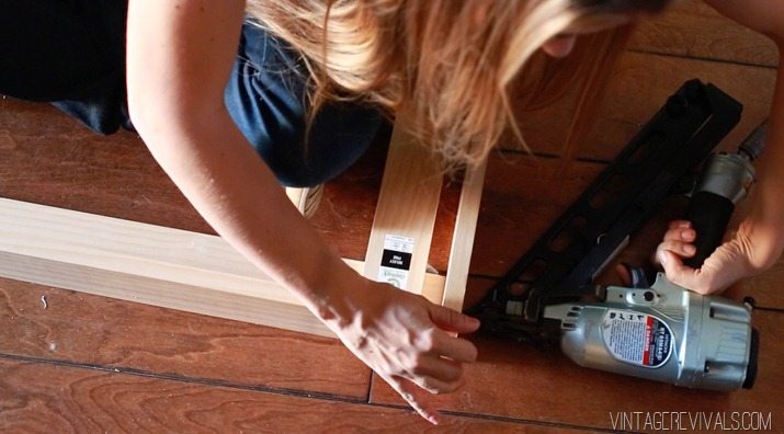
I used my saw to cut the drawer fronts and the trim pieces and attached them to the catalog directly


Card Catalog vintagerevivals.com-9

You can see in the picture above that it came with a pretty giant base complete with it’s own shredded corn flakes.

I debated on using Danish oil on it and tested a few drawers (the ones on the left) but decided that I liked the raw wood on the right better.

Card Catalog vintagerevivals.com-8


When it came time to sell it at The Hoard Sale I was having very mixed feelings about parting with it. Because dang these things are hard to find.

So I priced it higher (around $800 I think) and said if it sells, then its just not meant to be.

Card Catalog vintagerevivals.com-10

Much to my delight (and Court’s distain) it didn’t sell so for the last 9 months it’s been sitting in the back of the garage.

Lotioning, Oiling. Oiling. Lotioning

Until I couldn’t take it anymore!

Screen Shot 2015-03-13 at 10.51.52 AM

When we moved the entire thing inside (base and all) I wasn’t convinced. The problem wasn’t the card catalog, it was the base. The base needed to go. But the catalog on the floor looked super weird too. It just needed a little something.

I went to Home Depot (seriously you guys, multiple times a day.) and bought a hefty 4×4.

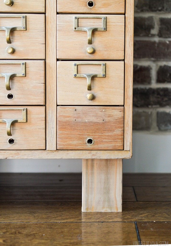
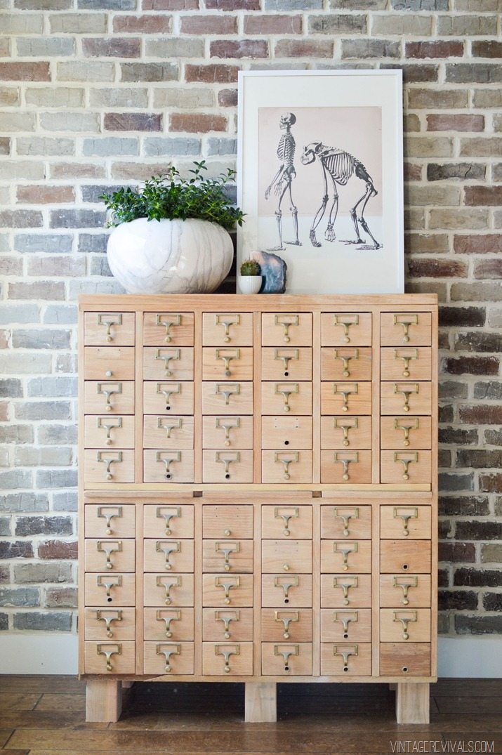
We cut it down into legs that are about 5” each. Then we bolted them to the thick base inside.

Card Catalog vintagerevivals.com-16


It lifts it up just enough.

Card Catalog vintagerevivals.com-13

Card Catalog vintagerevivals.com-11

Card Catalog vintagerevivals.com-15


Turned out pretty great!


UPDATE:  You have got to see how it looks in my living room reveal!  It turned out SO good!!!

LoftLivingRoomMakeovervintagerevivals.com16


LoveYourGuts14 
 
 dont miss any of this series


DIY Shadow Art + Video

By Mandi | 03/12/2015 | 333 Comments

Happy #100reveal Thursday!!

VR_Intro Post_For Twitter

You guys. I have got the COOLEST project for you today. As I was brainstorming ideas for these fun GE reveal® light bulb projects my natural train of thought was obviously to do something cool with light. But we’ve already rewired a light, and made an amazing chandelier for the entryway.

Something different was just what the Dr. ordered.

Something new.


Shadow Art DIY vintagerevivals

So armed with $100 to The Home Depot, and a GE reveal® light bulb I set out on my quest.

You know when you get an idea that just seems so crazy, and when you tell everyone in your life about it they genuinely don’t understand what you are explaining? No? Just me?

This project describes that perfectly. I have been super obsessed with shadow art lately, but it is always done on such a grand art installation scale.

I wanted a way to be able to simplify it enough to use it in my house. And probably not use it to make human shapes because that would be terrifying to stumble across in the middle of the night.

So after thinking long and hard about it for a minute or 2 I set out to see if it would work. If I could actually do something using light and shadow.


I conducted a little experiment and here is what I learned:

Screen Shot 2015-03-12 at 1.17.40 AM


It is entirely possible…IF you have the right kind of light bulb, and the right angle.

The light bulb is critical, it needs to give off enough light to cast a strong shadow and it also needs to be focused. A regular style light bulb disperses the light too much, but a reveal® indoor flood light worked perfectly.

The angle of the light, will lengthen + shorten your shadow, and the distance from the pegs will straighten out the letters (the further away the less skewed they are.)

So with this in mind we started with a little trip to my version of Disneyland…The Home Depot.

I bought a GE reveal® indoor flood light (and a regular one for the before and after) (4) 8’x1”x6”, a 3’x1”x1” wooden dowel and a 2×4’ sheet of underlayment.

After you’ve measured the exact size of the underlayment (this will serve as the backboard for everything) you are going to cut 2 pieces that measure the width of the underlayment horizontally (2’) and 2 pieces that measure the vertical distance between the 2 horizontal boards. This is a backer frame and will give you something to attach the face frame and the underlayment to.

Next you are going to cut 2 boards with 45 degree angles that have an inner measurement that match your underlayment.

PSA:  For the LOVE cut these angles so that they look like this:

DIY Shadow Art Frame vintagerevivals.com-2


Not like this:

DIY Shadow Art Frame

Court, I’m talking to you.

If you did not heed the above advice, head back to The Home Depot and buy yourself another couple of boards…#fun.

Once you have your boards cut the right way, use a nail gun to attach them to the back frame.

Shadow Art Project


Then put your underlayment on top and secure it with a few nails.

DIY Brass Bent Arm Chandelier


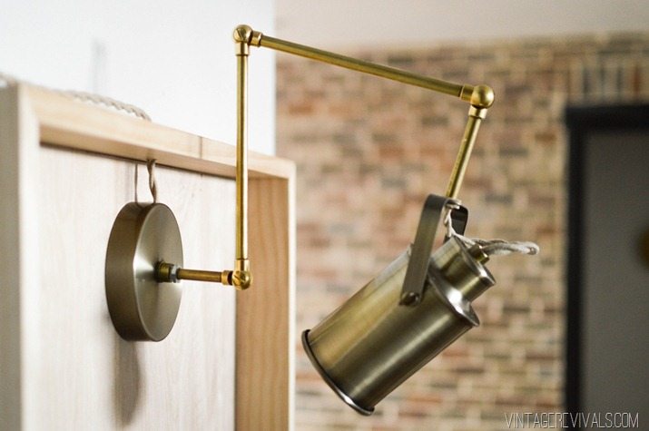
To make the light I took apart this cute desk lamp that I’ve had laying around and a few spare parts from the Bent Arm chandelier build.

All I did was deconstruct this light that I bought a while ago:

Screen Shot 2015-03-12 at 9.44.20 AM


And put it back together with the long arm in between the base and the socket (I wanted to be able to adjust the light angle as much as I need to.)  I also swapped in my favorite twisted lamp cord that looked better and had a higher wattage rating.

DIY Shadow Art vintagerevivals.com-6

Then I drilled a small hole in the center of the frame and fed the cute new wire through. The last bit of light construction was wiring a plug on the end. Its time for a common sense disclaimer, these bulbs can get warm, this isn’t a light that you will want to leave on for hours and hours. Yes? Yes.

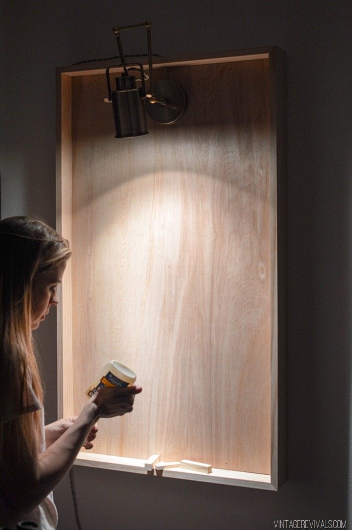
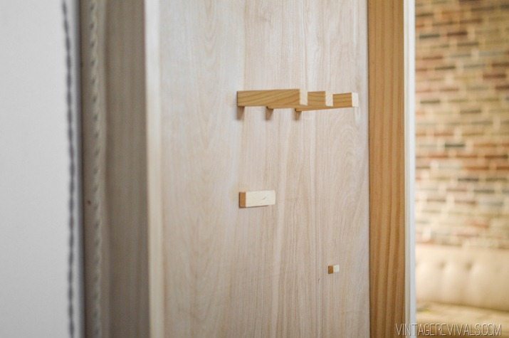
Once the light was hung inside the frame (with a small screw) it was time to place the dowels.

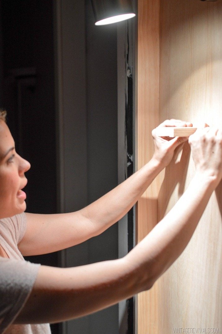
I did this part last so that I had complete control over the way that the shadow cast.

Shadow Art Project-2


Once I measured and marked where my short dowels (they measure 3.5”) were going to live, I used a small amount of Titebond III wood glue to adhere them to the board.

Shadow Art Project-6


A roll of painters tape works wonders to hold them in place while the glue dries.

Shadow Art Project-4

DIY Shadow Art vintagerevivals.com-8


Want to see what it turned into?

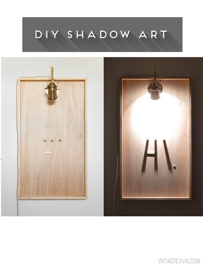
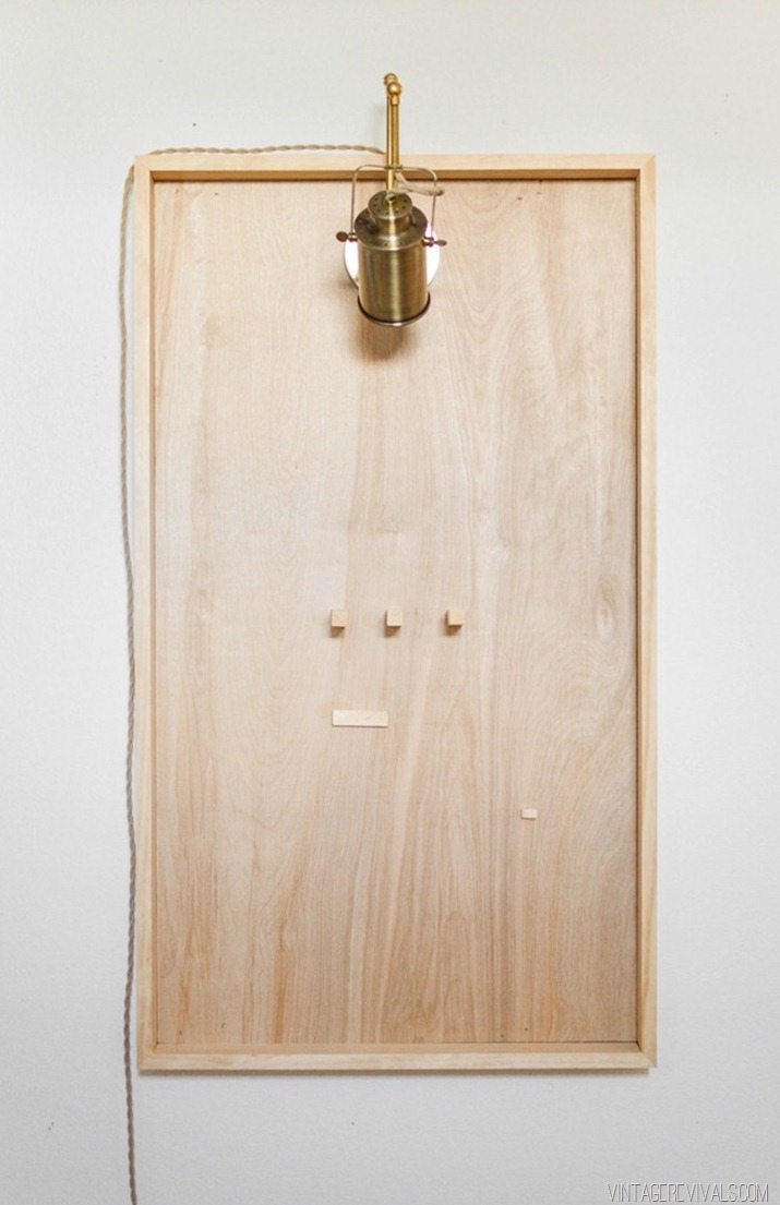
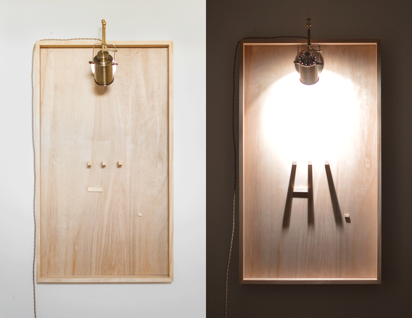
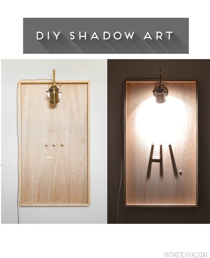
When the house lights are on and the spotlight is off you have this curious and delightfully inoffensive bit of wooden art on the wall.

DIY Shadow Art Light Off vintagerevivals.com


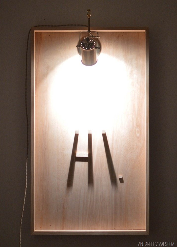
When you shut off the house lights, and turn on the spotlight you get a friendly little message:

DIY Shadow Art vintagerevivals.com


Amazing right?! I mean, who doesn’t want your decor to actually greet you!!? And for a grand total of less than $50 no less!

DIY-Shadow-Art-vintagerevivals.com


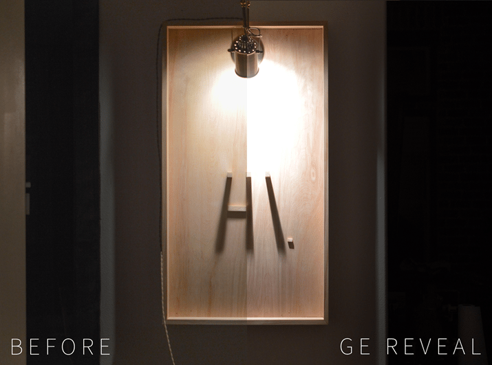
Because of the closeness of the light onto the board I was a little curious if you would even be able to tell a difference with the reveal® light bulb. Oh ye of little faith Mandi. Of course you can. Directly on the light it’s a little hard to tell a difference, but look at how much cleaner white the reveal® side is, and how much sharper the shadow. (Bulbs used were 40 W Soft White Spotlight vs 45 W reveal® Halogen Indoor Flood bulb.)

DIY Shadow Art GE Reveal Before and After vintagerevivals


Shadow Art DIY vintagerevivals

What do you think? Do you love it?!

Its time for another giveaway!! You know the drill, (10) winners will win a $100 Home Depot gift card, and a GE reveal® lighting package, all you have to do to enter is leave a comment and let me know what level of DIYer do you consider yourself to be and/or tell me about your favorite DIY project that you have completed!

ge_reveal_giveaway copy

LoveYourGuts14
 
 
 dont miss any of this series