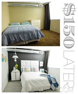
Getting close to wrapping up all of the posts about the $150 Room Makeover (yes, I know I still need to do the Herringbone throw, that one is next!!)
So go with me on this. When we walk into a space that we don’t so much love and see the boring, plain, not awesomeness of it, do you feel like you need $57,000 to totally change it? Like that is the only way to get this room to its full potential. Well guess what Candace Olsen? You don’t.
The biggest thing that you need are some guts.
You can change things on a MUCH smaller budget (I hope that I have proved this point by doing this room makeover). People think that if they have a small budget that they have to make small changes.
WRONG-O!
You can make great changes on a small budget!!
But sometimes.
Just sometimes.
You have to embrace the ugly.
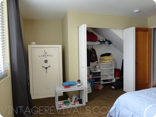
This GIANT safe that weighs 47 BILLION lbs. was the ugly in Grit’s room.

Would I have liked to put a cute chair and little table there with a mirror on the wall behind it? HECK YES.
Was it an option?
Nope.
The safe needed to say.
Balls.
When you are in this situation of having a literal giant elephant in the room the first things that come to mind are ways to cover it. You could build a screen, hang a curtain, make a sliding wall, build a bookcase that flips around when you pull the right combo of books. You know, crap like that. But then at some point reality sets in and you realize that none of those things are going to happen on your budget than can be blown in one trip to Target (please tell me I am not the only one that does that!? I mean what did I even buy??!)
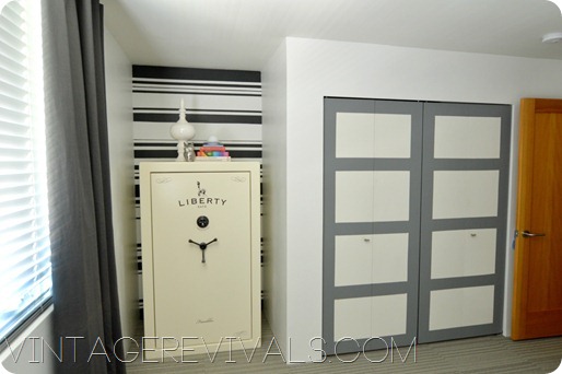
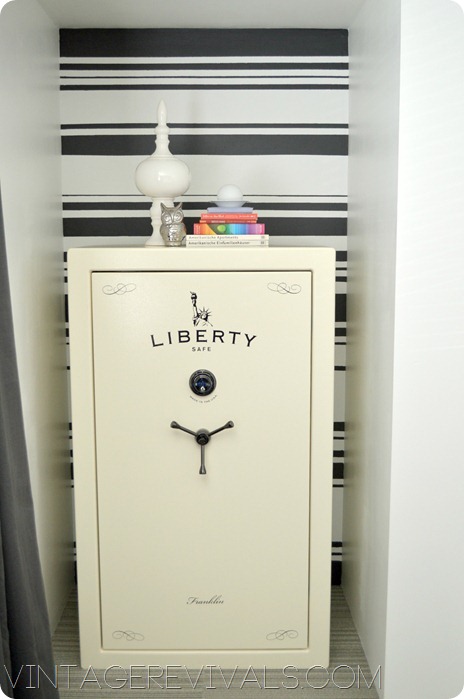
So instead of banishing this corner of the room and doing nothing I decided to embrace the ugly and make it look like the safe is SUPPOSED to be there. Smart right?!
We did this by bringing attention to the wall.
This project is really easy, all you need is a laser level and a couple of rolls of ScotchBlue.
In fact. Instead of showing you a few process pictures I made you a video of the ENTIRE process! (Don’t worry its only 2 minutes long!)
And just for fun here are some more before and afters:
In those pictures I had you thinking that we just loved the crap out of that safe right?!! Ha! That is what it means to embrace the ugly.
Make sure you check out the rest of the projects in the $150 Room Makeover:
And don’t forget to vote for your fave room for the Epic Room Makeover Giveaway! Voting is SO close I cant even look at it.
Love Your Guts, Mandi


Very nice. I’ve only added you to my Facebook recently, but I’m reading some of your back posts. I couldn’t find your RSS feed for Google. 🙂
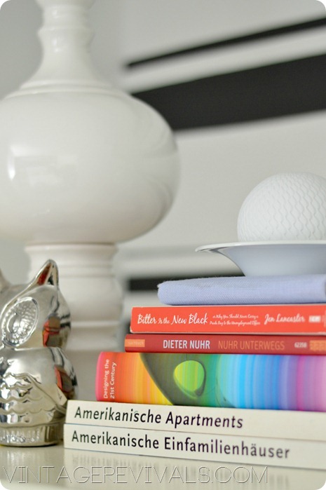
I particularly like the pinstripe addition. May I ask, the author to your two books on the bottom of the stack (Amerikanische Apartments und Amerikanische Einfamilienhaeuser)? TIA!
Oscar Rierra Ojeda
I loved the safe…I thought it was one of those pieces in a room that gave it character. I really like what you did with the wall behind it though. Super Fun!!!
This comment has been removed by the author.
amazing. the whole look..the wall, the safe, the accessories. seriously looks like a magazine picture.:)
I LOOOOOOOOVE it!! I want a giant safe in my room now!
I thought the safe was awesome to begin with! Don’t know why you hate it so much 🙂 The wall, however? Amazing! Makes me like the safe more, I think.
A cool, white safe is one thing. I dare you to make the TREADMILL in my apartment bedroom look like it’s supposed to be there haha! 😉 No but seriously- will you take me up on that dare?
If you had to have a safe, at least it’s a pretty cool, neutral-colored one…and I REEEALLY like the stripes behind it.
Thank you so much for being here for all of us! Days when I’m just not inspired to do much of anything you honestly make my guts smile! I think designers don’t give other designers enough love for inspiring them. You inspire me and you make my guts smile when it’s all foggy and weird and I have to go to yet another mid-century vintage shop with my clients. 🙂 I love the safe and how you made it shine and it would be awesome to see how you’d work with Carrie Lynn’s treadmill! Pretty please show us that! Much love from the Left Coast!
I thought the graphics on the safe were pretty cool to begin with (for some reason it gives me a retro vibe), but with your changes, it looks like artwork! Well played. xo
I really liked the safe, too, but what you did with that wall…pure awesome sauce!
I like the safe. It comes off as nautical to me and the stripes compliment it so well. Great job. Love your style, it is so unique in the bloggy world.
I dont think it is ugly at all – I love it!! But do love it even more with the stripes 🙂 Good job!
I need a laser level. This is so awesome!
The safe added character to the room–the stripes behind really amped it up! Very clever!!!
You’ve nailed not only the best strategy for decorating but also an essential truth of life.
“God grant me the serenity to accept the things I cannot change; courage to change the things I can;and wisdom to know the difference.”
Amen, sista! Love your guts, too.
Mandi, I am dying laughing right now, because when your first showed the safe I thought, “wait a minute, it’s not even that ugly! All it needs is some cute stuff on top and maybe some short, sexy legs…” and then boom, that’s pretty much what you did. It seems that Great Mandi(y)s think alike. Hardy har har.
I love the guts out of you and your blog, keep the good times comin!