Oh man I sure hope you guys are following Vintage Revivals on Instagram! If not, you are totally missing out! We started Phase 2 of the Merc reno!! If you are new, or need a refresher (it’s been a few years!) let me bring you up to speed.
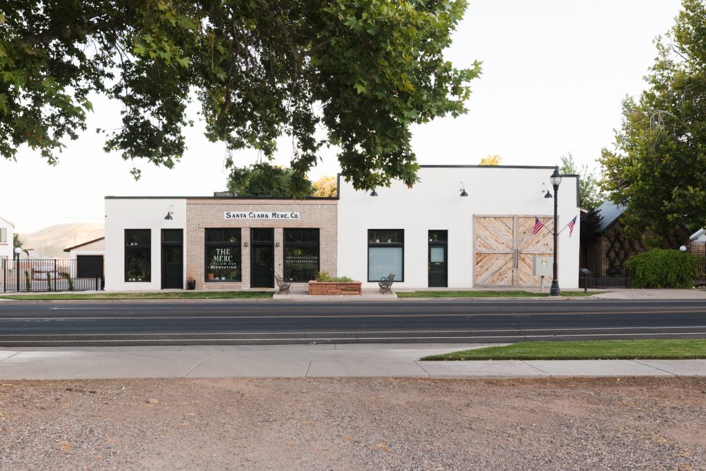
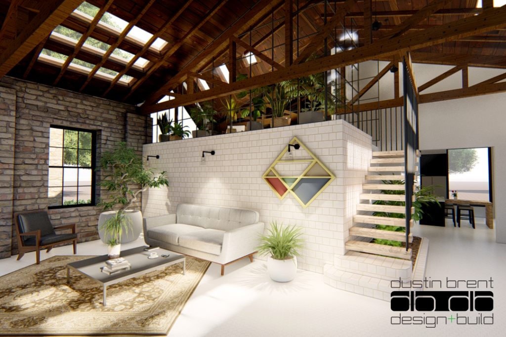
The Merc is a 100 yr old mercantile store that is our home! It was such a serendipitous find (you can read about it here!)
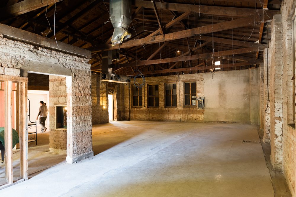
When we bought the Merc, we had to split the renovation of the building into 2 parts. Phase 1 is more functional small spaces like bedrooms, kitchen, bathrooms, etc. It was the original store side of the Merc and looked like this when we bought it.
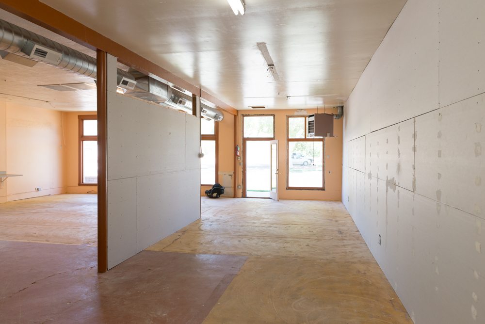
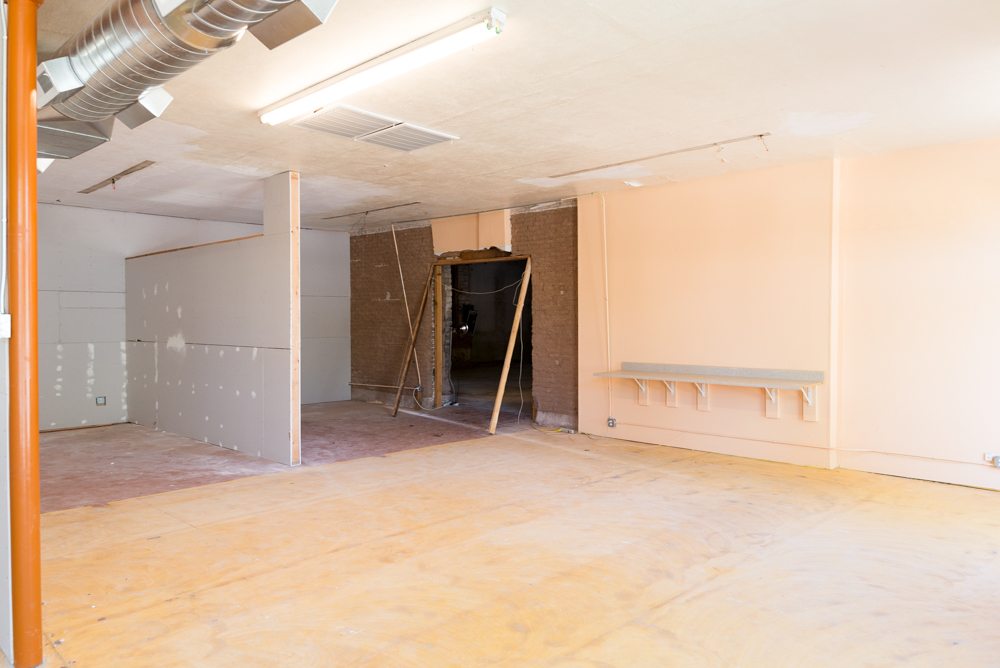
A patchwork of little additions, and just as many finishes on the walls. Concrete block, lathe and plaster, sheetrock.
You can see all of the posts about Phase 1 here!
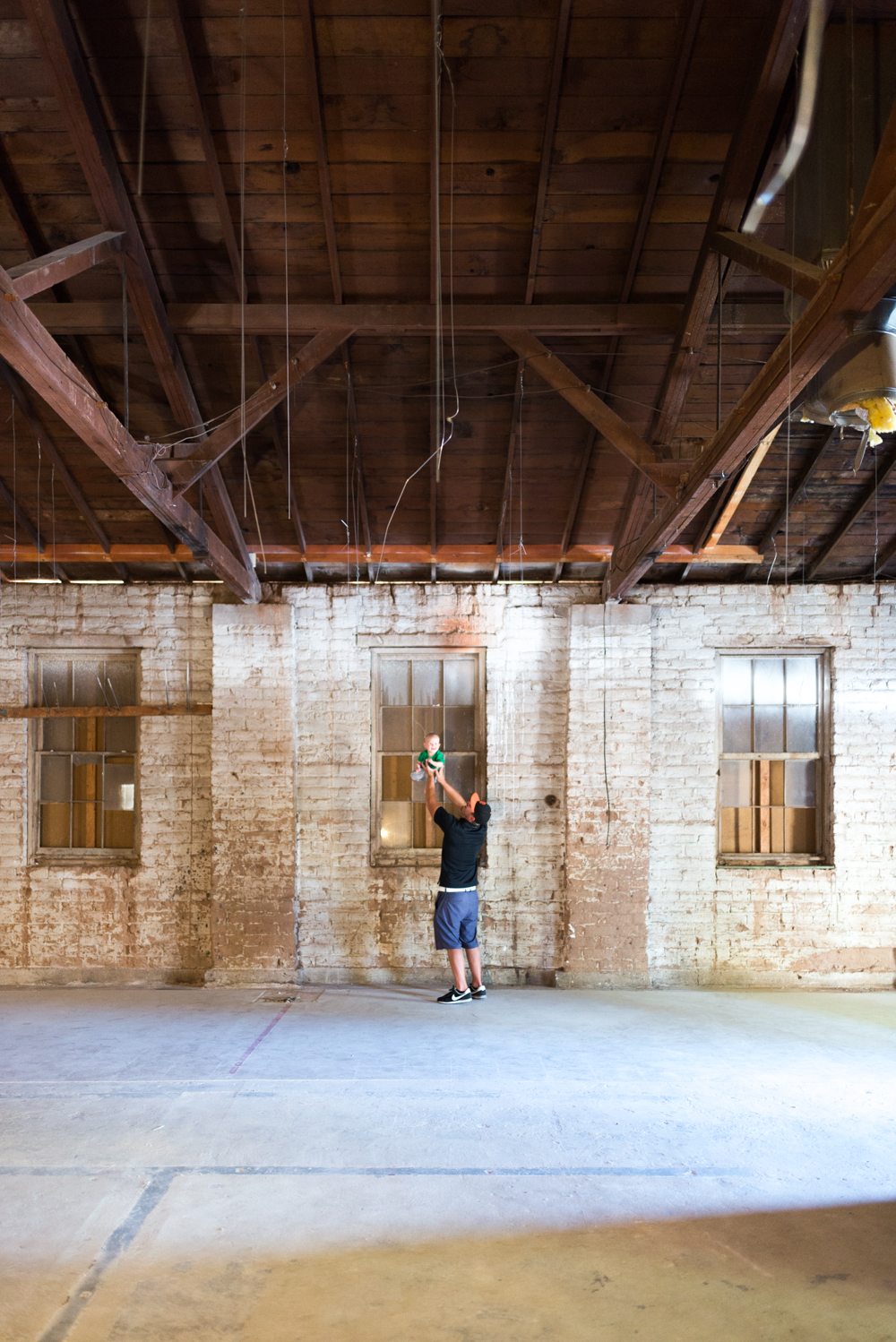
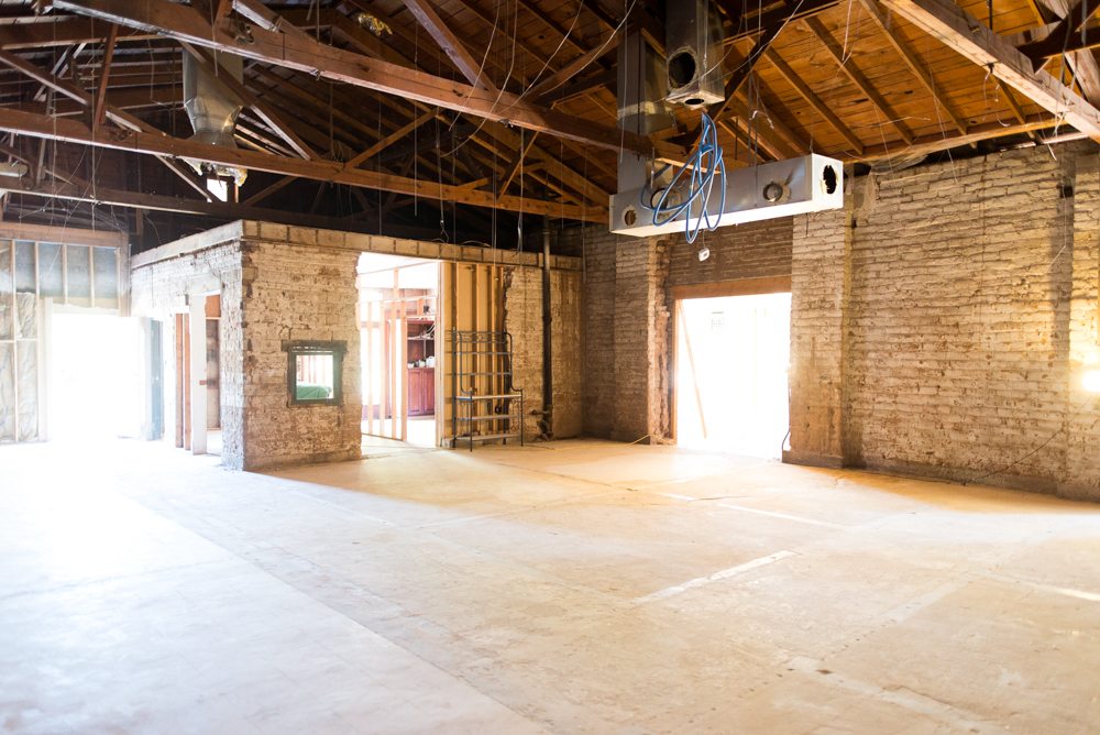
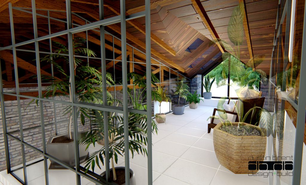
Phase 2 is the open living/dining space, and master suite. It was originally built as a garage for Southern Utah produce company and aside from what was the office (now our kitchen) it is a giant open space with original adobe brick walls, and a rough sawn cedar roof.
The plan was to get Phase 1 done, move in and start on Phase 2 right away.
But alas here we are almost 3 years after completing Phase 1 and moving in and finally getting things moving! Which brings me to today’s post. We have a major design element that needs to be decided on and I would love your help!
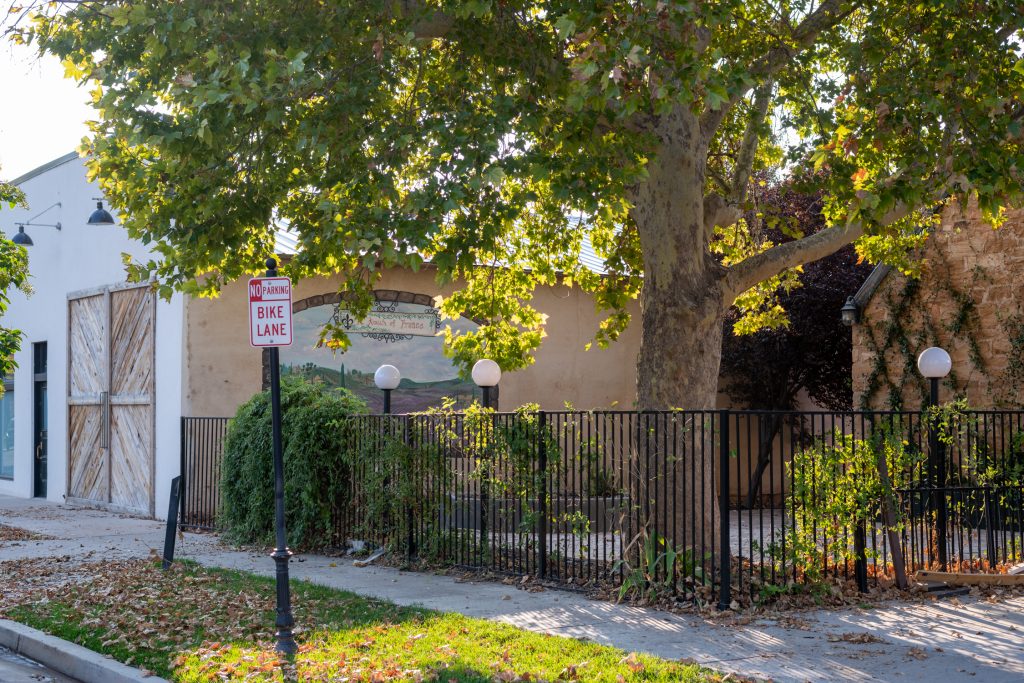
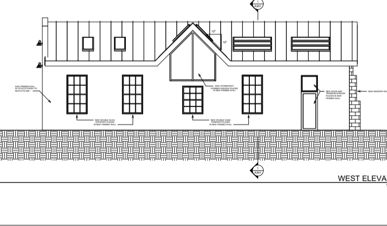
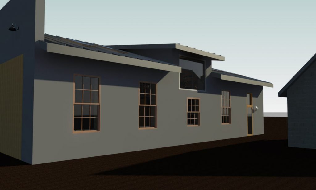
This is the current exterior elevation that we are going to be talking about!
See the wall with the mural? That is the west side of the Merc. It’s going to have all of the original windows opened up and we have to decide on a dormer style for the loft.
The Original Pitched Dormer Design:
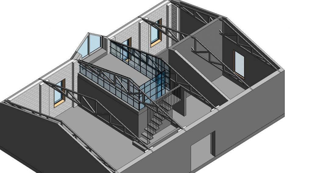
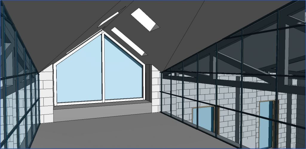
In Phase 2 there is an area above the mater bath/closet that we are turning into a loft. The intent behind it was to use up some of the vast vertical space and add square footage. Originally, we were going to take out part of the roof, and put in a giant pitched dormer with window at the end of it.
At the beginning of this week, we met with the framers and talked through what that would look like. I joke that nothing in the design of the Merc is safe or permanent. It’s always up for discussion. And what a discussion we had!
The issue (but not a deal breaker type issue) was the it was going to take a lot of work to add the dormer. Totally doable work, but a lot of it. As we were throwing ideas around, the contractor suggested changing the design from a pitched dormer to a shed dormer. This would give us more functional space on the interior, and it would be a lot easier to build out.
I was totally down! Dustin the greatest designer/general contractor in the world updated the plans and yesterday we met with our structural engineer again to make sure things were going to work. We talked through a lot of specs and ideas for fortifying the roof with this new design.
And then things took a turn for the modern.
Have you ever seen the show Grand Designs on Netflix? It’s filmed in Britain and follows people as they renovate and build their dream homes. It’s a must watch if you’ve never seen it! So many of the designs use old existing structures and then they add these crazy inspired modern additions. This is page straight out of Grand Designs. Dustin specializes in modern architecture and started sketching as we were talking.
My favorite phrase in design (and in life!) is “What if” which is how we ended up with 2 different design options. I am DYING to know what one you prefer! Let’s talk through both!
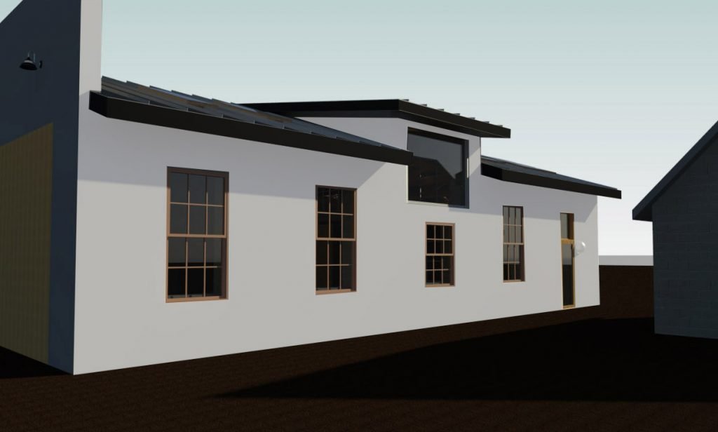
New Option #1: Shed Dormer
Here is the uncolored rendering!
Here’s what I don’t like:
Once I put it in photoshop and added the colors I surprisingly liked it a lot less. It looks farmhouse-y and isn’t really adding a lot to the design. It feels safe (which can be a good thing, or a bad thing.)
Here’s what I like:
It matches the historic vibe of the Merc. It’s seamless and inoffensive.
It’s got a massive increase in functionality over the pitched dormer. The interior loft space now has a head height of 8′ sloping down to 6.5′ at the window.
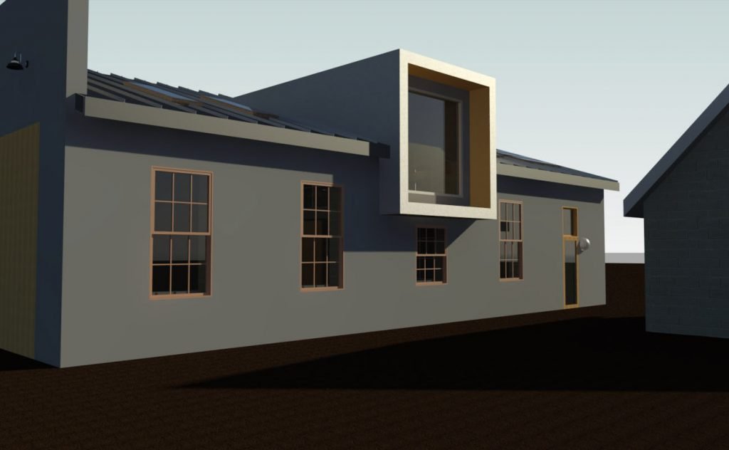
New Option #2: Box Dormer
Here’s what I don’t like:
When Dustin sent over the uncolored version I didnt love it. It felt too huge and thick and was the only thing that you saw when you looked at the elevation.
After a little time in photoshop and adding color though, I super love it! I think the original rendering made it stand out too much, but having it match the black of the roof pulls it back just enough.
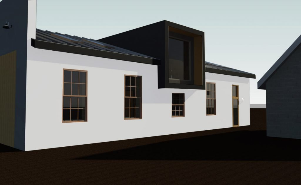
Here’s what I like:
The flat elevated ceiling is a game changer for the height of the loft. Originally with the pitched dormer the head height wasnt ideal. If you’ve ever been in a space with deeply pitched ceilings you know what I mean. With the shed dormer, the head height is improved, but with the box dormer, we have taken a fun addition that wasn’t super functional, and turned it into an actual room with 9′ ceilings! It can be absolutely anything now!
The design totally changes the whole side of this building. It is impactful and makes you have an opinion about it. I love forced opinions about design. It stands out, but in a cool way, not in an obnoxious attention seeking way.
Up to this point, we’ve restored the Merc pretty accurately, even uncovering the original brick and sign. Adding this feels like we’re putting our stamp on it.
Here are both options together, scroll back and forth and take them in!
What do you think?! Tell me everything!!
Black.box.dormer!!!!!!!!!! In love.
Option 2 also added the black made a huge difference I kind of hated it and then with the black I totally loved it
Option 2! It’s square like the rest of the merc and if you’re going to do it why not have the extra height in the ceilings!
Go for the second one!!! I’m in love!!!
The box dormer is a great design!
Black box dormer!!!! No debate
I like the shed style better… it looks more intentional. The second option looks like giant old style photo box to me. I get the space benefit, but it just looks too out of place for my taste. But honestly it’s your space, do whatever feels good for you ☺️
I’m with you on the shed style.
I’m with Becky. It does remind me of a vintage camera. I’m VERY anti-farmhouse style, but the shed style doesn’t feel obviously farmhouse to me. That said, I would NOT want anything looking farmhouses. So you best go with your gut.
Trust your gut! Do what you love ! You’ve waited a long time for this !!!! Sounds to me like your heart already knows which choice 💖
I think the box dormer looks so out of style for the rest of the building, but not enough to nix it if it’s way more functional for you. It’s just not doing the history of the building any justice.
Option 2 for sure. I agree, 1 is nice, but it does feel more farm house-y.
I vote for option 1, feels more like the Merc
Omgosh. That box dormer!!! :::swoon!!::
I like one. Because it’s kind of an older historic neighborhood and it fits the merc
Love option 2!!!!
Option 2! I completely agree on your thoughts before painting it, but WOW!!! It looks so great black!
At the moment I’m leaning towards option 2. But I’d LOVE to see the renderings with a couple of people drawn in to help with the scale. I’m not sure if it would then look obnoxiously large? Hopefully not 😂 The functionality of the room is huuuge ticks for option 2
Love the box but it looks way more expensive 🤔🤔🤔
Option 1. Yes it’s farmhouse but it less visually jarring. At first glance option 2 made me think of beetle juice when the mom rehabs the house. Either way I am sure you will work your magic and it will be delightful.
I like the way this is going! @mcalpinehouse has designed many beautiful shed dormers with divided light windows that might be a nice in-between solution. Check them out. 😊
Architect here! My vote is for 2 🙂
Another architect voting for option 2!
Another Architect – vote #2. But, can you remove the window below as it now feels out of scale and takes away from the moment? Or change the shape of that window – long horizontal without grids?
Option 2 for sure! While you’re doing the renovations it makes the most sense to make the new space as functional as possible by having higher ceilings, while still putting your stamp on what is your home. I love that you’re respecting the Merc’s history while still making it into a home that works for your family.
#2 put your stamp on it and get the extra height
Definitely two, option one feels safe but somehow also a bit more boring? Have you tried natural wood as well for the colour? That might also make it stand out a bit but I’d be curious to see the rendering, it brings in a touch of warmth.
Box!!!!! Omg it’s amazing!!!!!
2 for sure!!
Another architect vote for #2!!! This is your forever home, it’s not the time to make compromises and play it safe. Black box dormer FOR SURE!
Option 2 for sure!!
Number 2!! Number one adds nothing but space. Number 2 is elegant and respectful of the original but exciting too. Wow!!
I like the first one.
Architect here. I would do option 1. I think part of the charm of old buildings like the merc is their more subtle, understated exteriors compared to the extraordinary space within. Option 1 offers that subtly, especially since there is a large tree on that side of the building. I can see how option 2 would be nicer on the inside but I actually think the slightly lower ceiling space of option 1 in the loft adds to the intimacy and coziness of the plant loft next to the very high ceilings in the rest of the space.
Hard agree, Mackenzie! 2 feels like making a statement for statement sake. I know it’s a trend in recent years to juxtapose uber modern with historic, but I think it is indeed a trend, and will at some point feel dated. #1 is timeless.
I like the black box dormer. The original shed dormer idea I don’t like because it isn’t enough of a statement– it should stand out more or blend more. I think with that option, I’d opt to blend and match the window style below with something more vintage factory styled with panes so it looked more original. Barring that, black box all the way!
I agree on #2 being best and more interesting (and useful). But I don’t quite like the symmetry of it being slap in the middle. Would it be possible to move it over one window to the left, for example? The right might work, too, but to the left means it sort of communicates with the door to the very right, too, and also has a bit more space regarding the other building. As a jut-out, it just feels better if it can do that into a more open space.
I think it’s the door, too, that makes it even more necessary to not have the dormer in the middle, because the door would keep everything from feeling truly centered/balanced, while the dormer would still be in the more “boring” middle position.
But whatever you end up doing, I already love that you are even considering going with modern elements. I’m excited to see what will happen!
I like the improved functionality of #2.
I’m not sold on the fully dark color though. It feels very top-heavy. Maybe if it were the wall color? Or just the west facing surface was black to frame without weighting it down? Or if there were small windows in the sides?
I guess I’ll be the odd person out (at least so far) – I’m DEFINITELY Team Option 1. I’ve never been a fan of modern additions to historic buildings, and while I admit that painting the box dormer all black does minimize its visual impact, I think it’s not doing the Merc any favors. (Well, visually, on the outside, anyway. Definitely very practical internally!)
I want to see the black box, but if it were my house, I’d do option 1. 😂
If finances allow then 2!
I love the black box. Am curious though, what it would look like if you extended the box all the way to the ground.
Definitely interested in the rendering of this too!
Option 1! Maintain the historic vibe. But why can’t you raise it ( the ceiling) 1-2 more feet???
Good point. I prefer 1 also. I wonder if they need a slope for rain.
I’d choose option 1 to keep with the old style of the building.
If you are going to the expense, the big black box, because the inside will be much more functional.
Is it weird that all I can picture is Court dancing in that big window…?
Black box dormer!!!
So….wild thought, cuz that’s what we do around here. If you are raising it all to add the box dormer and nine foot ceilings for the loft, couldn’t you raise the bathroom elevation beneath it as well (since the upstairs will have the space from this), and have the whole bathroom be on the stepped up level, not just the toilet? PROJECT CREEP FTW!!! Obvi, I’m team box dormer, I love modern touches to historic renos.
Ohhh good question! We cant because of the rise of the stairs. They are at their max!
Box dormer for sure! Fits the merc style better inside and out
No 2 – if you are going to all the effort and expense of making a change, you want to really make a change and the juxtaposition of new on old is always so fun – and fabulous when done right!
I prefer option 1 because it fits more with the style of the Merc. I kind of have the philosophy when dealing with historic buildings that people are more caretakers than owners. I’m in favor of making it work for your family, but not necessarily changing the style. This building will outlast us all.
I usually love modern architecture, but that box dormer just looks like it was added on. The shed roof look so much better and matches the rest of the house.
I love the boxed dormer… that being said, I feel like you might need to add something somewhere else, a detail of some sort to make it look more intentional, rather then just the box. Something in the landscaping or the granary or along another part of the Merc that ties the modern element in. (If that makes sense).
I LOVE a black box dormer. And it looks great from the side elevation. But what I can’t tell from the rendering angles you shared, was how it looks from the front elevation. Or with both elevations in view (from the sidewalk).
Do the steps on the front elevation roof line (faux) look jarring? Or possibly not enough? If the front elevation weren’t already modernized a bit- and it were a more EXTREME contrast, I think it could work. But I worry the black box dormer will make the front look like you couldn’t fully commit. Whereas the shed dormer is a perfect match
I’m sorry, I really don’t like the box dormer. I understand why a modern element would be attractive, but something about this one just doesn’t work for me. I like how the shed roof looks like it is supposed to be there. I think what is creating a farmhouse vibe is the raised tin roof. Could the portion over the dormer be something else? That way it stands out in a more subtle way.
Like this: https://www.cmgmetals.com/metal-roof-network-finished-steel-diamond-shingles/
Or even a wood shake shingle to add warmth.
In either case, you certainly got the polarized opinions you wanted! 🙂
option one. the second one looks too out of place for me, even with the colouring changes.
When I look at the front of the building I think #1 just fits better.
I think #2 looks off a bit when I put the front beside it. I also think the sides of the box will block some light & views where # 1 is much more open. It’s hard to see the little courtyard area well in the pic you posted but I also think the box will overpower that area as well.
So my vote is solid for #1. Can’t wait to see what you decide!
While No. 2 is dramatic, I think it’s a bit sterile for the walls on the merc . I would like a little more height on the dormer and it would be perfect.
Option 1, I like that it’s staying with the original feel of the Merc. You worked hard to salvage that feel in phase one, don’t throw it out to create a statement. You need to look at the original idea when you designed it and make it work with your goals of the home. Will you really use the loft space? Will it be functional and used? Or are you making a statement for a statement sake? I understand you need to make a choice, but you also need to have a solid plan for the space and go from there. If it’s going to collect dust, save money to put elsewhere that you’ll enjoy more.
I’m a big fan of modern but… definitely #1. #2 just stands out like a sore thumb. #1 looks modern and tasteful and matches the feel of the rest of the Merc. But if you don’t like it, don’t waste your money on it!
I know I’m part of the odd man out on this one but….Option 1 feels right. I can understand the excitement and drama about option 2…. the shed dormer does feel intentional and like it belongs. Its a very big, serious decision to be making such a big statement. Its not like wallpaper that you can switch out. This is your roof. On a historic building. You should honor that rather than going for the wow factor.
OPTION 1 (but clearly I am not in the majority). Just my opinion, but I think Option 2 looks like an old fashioned camera; ALL I see is the box (or lens). Option 1 seems more ‘Merc’. Either way it will be amazing!
[PS Loved all the notes from the architects. I am *not* an architect, but I worked at an architecture firm for 20years] 🙂
#1. It’s just more pleasing to my eye.
Option 1! The shed dormer fits the overall look of the exterior so much better, rather than cut-and-pasting a modern addition on top.
#2 no question.
I love all 3 options and the dark roof so much! But the box dormer just says “look
at me!!” and has such an impact! I really like the extra space and openness it adds! If I could pick for me, I would want to add a roof to your box dormer design!
Fortune favors the bold. GO BOLD! (Option 2, obviously, duh!)
Option 1. Looks like it fits in style with the overall building. Option 2 looks odd and out of place.
Option 2 FOR SURE!! I think it fits with the renovated merc and is way more fun than option 1! Also I love Grand Designs and I wish the merc was on it!
Is there some sort of in-between option? The shed roof may be a little bland but the box dormer is just way over the top. I think it looks like a massive cyclops…there’s nothing to balance it out in scale or style. There’s got to be another way to get functional space, put your stamp on it (which I think you’ve already totally done) and still keep the historic feel of the building and the surrounding area. I vote #1 all the way.
I was thinking cyclops too 😉
#1 is less intrusive and blends better. #2 kinda sticks out like a sore thumb. IMHO
I love option number 1. Option 2 looks like something fell onto the roof and does not fit with the style of the Merc.
I like the shed dormer #1. It’s charming & looks like a home. The box dormer looks too industrial.
It makes me laugh when someone makes a modern house which is essentially a square or rectangle and we all go “wow what amazing design!” Its just a square, dude. But eh, the square looks kinda cool on the merc, I guess.
I like one or some combination of one and the former pitch. The black box is too jarring and doesn’t fit at all. I usually end up loving whatever you choose and I’m sure this will end up being no different. Good luck! Sounds like you have a big decision ahead of you!
Option 2 #ftw
How good are these comments?! I’m totally undecided, but very impressed with the caliber of opinions. They must be helping you think it through a whole bunch!
Definitely option 2. It’s modern and fresh.😍
i get what you are going for – but I don’t think 2 is quite right yet . . . still needs tweeking – it’s so out of sync with the rest . . . .but whatever you do I am sure it will be stunning!!!!
My reasons for voting for the box dormer are threefold. The original pitched dormer would have been similar to the pitch of the Granary, with both flanking the courtyard. I think the flatter pitch of the shed dormer would look a bit weird in comparison. If it’s going to be different, go for something super different and modern! Second, the box gives you the highest ceilings/most useable space. And third, that huge box window looks out on the courtyard and that gorgeous old sycamore tree. I would want the biggest, best view of that tree possible, because I am very much a tree person, and considering the number of plants in the Merc I suspect you have similar leanings.
I’m team #1. The box doesn’t seem natural to me. It’s like a new owner with a 180 degree difference in style decided to add on to the original Merc. It doesn’t flow with the current Merc’s vibe, in my opinion. But, your design choices are always spot-on so whatever you choose will be amazing!
I like option one. It seems to flow better with the exterior design of the Merc. Option two, while functional, seems like an odd afterthought. I know whichever design you guys choose will look awesome in the end! I am here for it.
Option 2!
You asked us to vote, so here’s mine: option 1. I don’t feel anything farmhouse coming from it, and I love how it “goes” with the rest of the building. Option 2 feels a bit forced to me, but just my opinion. You always do great work!
Option 2. You definitely want the higher ceiling and you know that you don’t want to go the safe route. It will be amazing.
Option 1 is my vote for the same reasons people mention above.
Good luck!
Black box!! #2 for sure.
I’m all for modern and big and bold things, but I don’t love the box. I don’t love the shed either. I wonder if that’s not the right spot for a big architectural statement.
I don’t know the layout of the Merc well, is there a way to do something with the grand views out the back towards the mountains?
Or another idea, what would it look like to pull the box in by ~ 5 feet or so and put a lil deck there? Maybe with some railings and potted plants up there it will soften the look.
Balcony, or upper deck, if it wasn’t clear!
Option 1 looks like it fits the age and character of the building better
Option 2 feels super out of place and like a big weird cyclops eye…. but the idea above of pulling it in an adding a balcony would be super cool. I’d vote 2 if you went that way
I feel option #1 is more classic. With #2 the scale seems off, the black definitely helps but to me it still doesn’t flow. I was thinking a balcony or Juliet balcony might help but not sure.
2!!!!!!!!!!!
There is absolutely no competition. I looked at both an the 2nd leaped off the page the second I saw it.
The first was instantaneously forgettable